Hello, can some one help me increase the size of my Logo on mobile view.
I can increase Logo size on desktop but not om mobile.
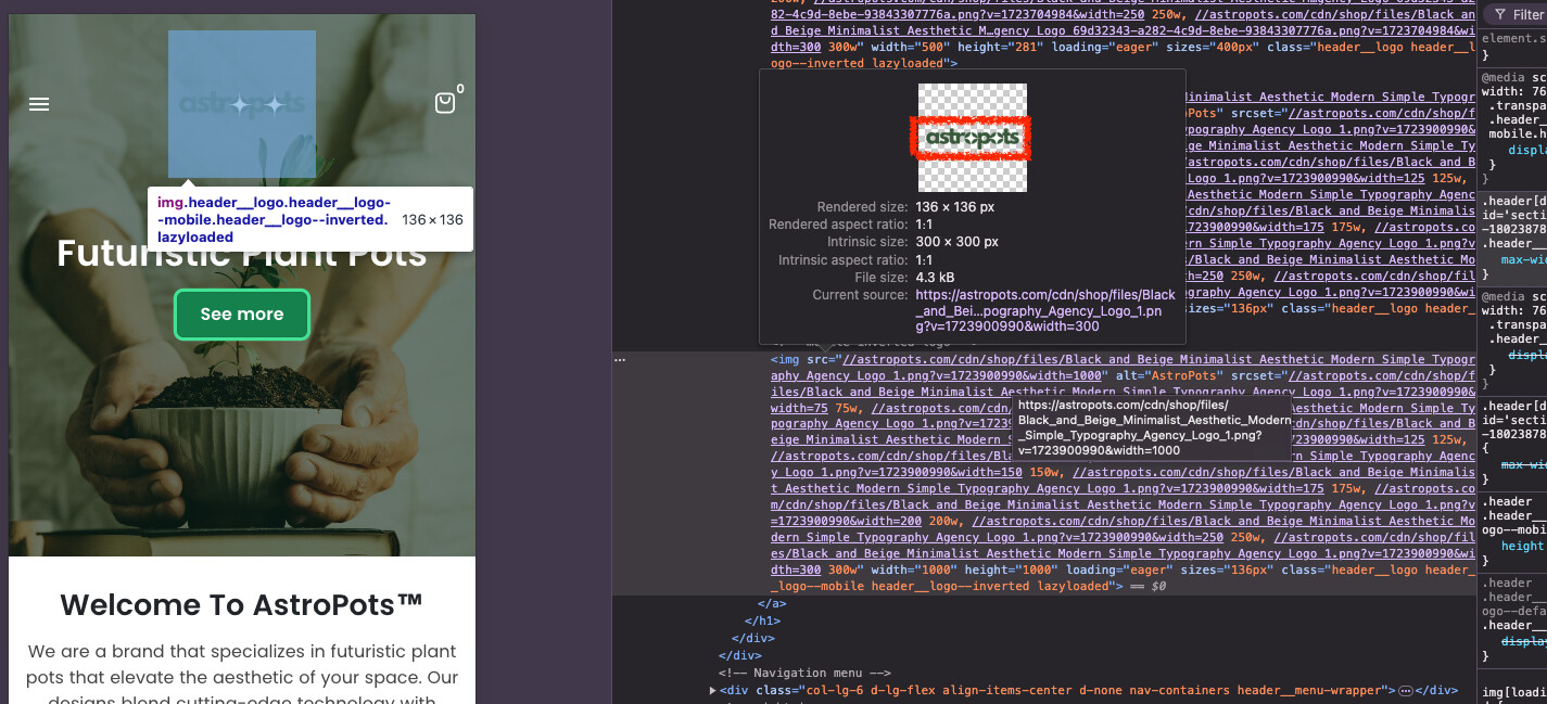
This is my website, https://astropots.com/
And just for reference, i don’t know a lot about coding. 
Hello, can some one help me increase the size of my Logo on mobile view.
I can increase Logo size on desktop but not om mobile.
This is my website, https://astropots.com/
And just for reference, i don’t know a lot about coding.
@astropots – please add this css to the very end of your theme.css file and check,
Shopify Admin → Online Store ->Theme → Edit code → theme.css
i also recommend to edit logo file and remove extra space around the actual logo
.header__logo.header__logo--mobile {max-width: 125px !important;}
Hi @astropots ,
I have reviewed your requirement, you just need to edit css script and the issue will be resolved. You can follow my instructions!
Step 1: Go to Admin → Online store → Theme > Edit code:
Step 2: Search for the file theme.css. And add this code snippet to the end of the file.
@media only screen and (max-width: 768px) {
    img.header__logo.header__logo--mobile.header__logo--inverted.lazyloaded {
        scale: 2 !important;
    }
}
In this step, you can change the scale of logo image as you want bigger or smaller.
In my example, I choose scale “2”.
Step 3: Save and reload home page.
=>> The result:
I hope these instructions will help you. If they are helpful, please give us likes and mark as the solution.
Have a nice day sir!
Hello @astropots
You can add code by following these steps
Go to Online Store → Theme → Edit code.
Open your theme.liquid file
Paste the below code before on theme.liquid
Was my reply helpful? Click Like to let me know!
Was your question answered? Mark it as an Accepted Solution.
Hi @astropots ,
I hope you’re doing well. I’ve reviewed your website, please follow the instructions below:
Step 1: Go to Admin → Online store → Theme > Edit code
Step 2: Find the file theme.css and add the below code snippet in the file
@media screen and (max-width: 767.98px) {
    .header .header__logo.header__logo--mobile {
        max-width: 100% !important;
    }
}
Step 3: Save the changes and reload website.
Thanks!
Was my reply helpful? Click Like to let me know!
Was your question answered? Mark it as an Accepted Solution.