How to make image banner fit to screen on mobile (dawn theme)

Hi,

I am looking to adapt the CSS script so my image banner takes the full screen of any mobile. I’ve already tried to adapt the script by myself (including with ChatGPT…) but I still might me missing something here… any help from this amazing community would be very much welcomed.

Thank you very much in advance!

Website’s URL is : www.alreadysetup.lu

Hi, it is really simple.

Step1: Go to Online Store > Themes > Edit Code.
Step2: Find theme.liquid and open it. Scroll to end of the page. Find tag and paste the code below before the tag.


Hope this works!

Hi @Rafaeldancesa ,

Glad to support you today.

You can check out my suggestion below to get your concern resolved:

  1. Go to Edit code on Online Store:

  1. add my code above the tag on Theme.liquid:

Eg:

I hope you find the answer helpful.

Kind & Best regards,
GemPages Support Team.

This won’t work for modern phones and portrait mobile screens.

max-width: 768px would be a better breakpoint.

source: statscounter.com

@Rafaeldancesa

  1. In your Shopify Admin go to online store > themes > actions > edit code
  2. Find Asset > section-image-banner.css and paste this at the bottom of the file:
@media only screen and (max-width: 480px) {
    .banner__content.banner__content--middle-left.page-width {
        min-height: 100vh !important;
    }
}
1 Like

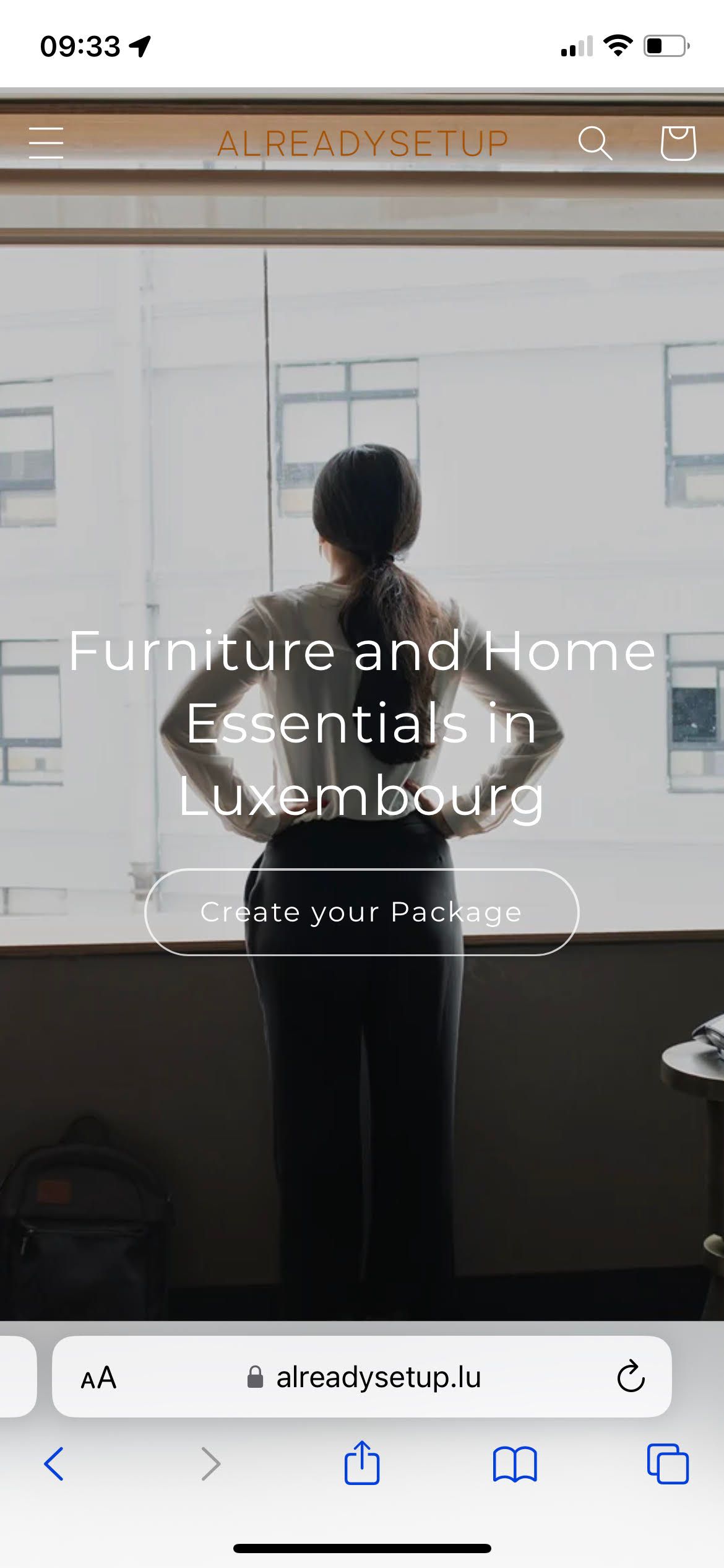
Amazing! It worked perfectly on my Iphone (cf. see attached)! Thank you very much!

May I take this opportunity to ask for your help and share the relevant CS Code to make the image banner fit to screen on (any) desktop screen size. (cf. see attached a screenshot taken from my 24’’ Dell P2423DE monitor). I would like the image banner to fit “almost” all the screen size when customers are landing on my website (like on Bonsoirs.com’s website attached.)

Thank you very much in advance !
Rafael

@Rafaeldancesa try this code.


Hope it works.

1 Like

I searched for this answer for hours! Thank You So much!