As the title explains.
I’m looking to move the Shop Now button on the Dawn theme to the left. I found some code online that wanted the button moved down but it didn’t work for that either.
I would also like to know how to make the ‘Shop Now’ button not be so large and centre in the mobile app. I’d like it in the same position as the desktop version.
I’ve attached an image of where I would like the button to be roughly. All help is greatly appreciated! 
1 Like
Please attach a link to your store.
Hi @Mallows ,
Sorry for experiencing this problem. I understand that you want to move the “Shop Now” button to the left. And same position in desktop view in mobile.
-
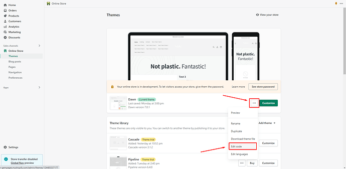
From your Admin page, go to Online store > Themes > click the three dots > Edit code
-
Find the Asset folder, and open the base.css file
-
Add the code below at the very end of the file.
@media screen and (min-width: 750px)
.banner__content.banner__content--bottom-center.page-width {
    justify-content: flex-start;
}

.banner__box.content-container.content-container--full-width-mobile.color-background-1.gradient {
    display: flex;
}
Hi @Mallows
This is Victor from PageFly - Shopify Page Builder App, I’d like to suggest this idea:
Online Store ->Theme ->Edit code
Assets ->Base.css
@media(min-width:1024px) {
.banner__content.banner__content--bottom-center.page-width {
    justify-content: flex-start !important;
}
.banner__box.content-container.content-container--full-width-mobile.color-background-1.gradient {
    display: flex;
}
}
Hope you find my answer helpful!
Best regards,
Victor | PageFly
Hello @Mallows ,
It’s the GemPages Support Team and we are glad to assist you today!
I would like to give you the recommendation to support you so kindly follow the steps below:
- Go to Online Store > Theme > Edit code of your current theme
-
Open your theme.liquid theme file
-
Paste the below code before
Let us know how it works for you.
Best regards,
GemPages Support Team
![]()

