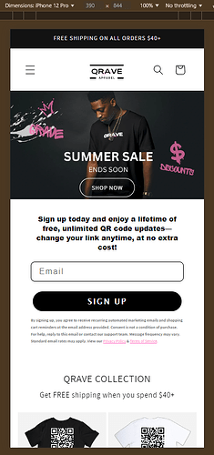
Hi! I am having trouble with my shop now button on my home page. It looks perfect on deskstop but on mobile its all big and in the center of the screen overlapping text. Ill attach a picture below of what I want it to look like. My stores url is qrave.store and I am using dawn theme. Also reminder I ONLY want it to change the mobile button postition. Thanks
Topic summary
A Shopify store owner using the Dawn theme is experiencing layout issues with a “Shop Now” button that displays correctly on desktop but appears oversized and misaligned on mobile, overlapping text.
Solutions Provided:
Multiple respondents offered CSS fixes involving:
- Navigating to Admin → Online Store → Theme → Edit Code
- Locating the
theme.liquidfile - Adding custom CSS code before the
</body>or</head>tag to adjust mobile button positioning and sizing
Follow-up Issue:
After the initial fix worked, the user reported a second problem: buy options overlapping on product pages, but only on desktop (mobile displays correctly). A CSS solution was provided for this issue as well.
Status: The discussion appears resolved with working code snippets provided for both issues.
@qrave ,
Step 1. Go to Admin → Online store → Theme > Edit code
Step 2. Find the file theme.liquid.
Step 3. Add this code before
Result:
- Here is the solution for you @qrave
- Please follow these steps:
- Then find the theme.liquid file.
- Then add the following code at the before tag and press ‘Save’ to save it.
- Here is the result you will achieve:
- Please press ‘Like’ and mark it as ‘Solution’ if you find it helpful. Thank you.
thank you that worked perfect but do you think you could help me with one more issue. On the page for the shirt the buy options are overlapping but this issue is only for desktop on mobile its fine. Ill attach what it looks like below.


