Hi,
How to send the mega menu below or under the mega menu sub menus to under the title header like it shown in the reference image
url - https://jkv6etaxearo1rr6-88161681693.shopifypreview.com
Hi,
How to send the mega menu below or under the mega menu sub menus to under the title header like it shown in the reference image
url - https://jkv6etaxearo1rr6-88161681693.shopifypreview.com
Hey @Shivam_Learning
Follow these Steps:
Go to Online Store
Edit Code
Find theme.liquid file
Add the following code in the bottom of the file above tag
RESULT:
If I managed to help you then, don’t forget to Like it and Mark it as Solution!
Best Regards,
Moeed
Hello @Shivam_Learning
Go to online store ---------> themes --------------> actions ------> edit code------->main.css
at the end of the file and save.
@media (min-width: 769px) {
.child-nav.md\:grid.md\:nav-gap-x-16.md\:nav-gap-y-4.md\:grid-cols-4.self-start.xl\:grid-cols-4 {
display: flex;
flex-flow: column;
align-items: center;
row-gap: 5px;
}
.mega-nav--columns .child-nav__item, .mega-nav--columns .main-nav__grandchild {
margin-left: -40rem;
margin-top: 23px;
}
}
result
If this was helpful, hit the like button and accept the solution.
Thanks
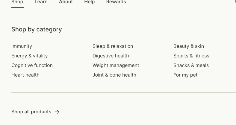
Hi thanks, The below menu should look horizontal 3x3 like the reference
Go to online store ---------> themes --------------> actions ------> edit code------->main.css
at the end of the file and save.
.main-nav__item.child-nav__item {
margin-left: -21rem !important;
margin-top: 35px !important;
}
.xl\:grid-cols-4 {
grid-template-columns: repeat(3,minmax(0,1fr));
}
}
result
If this was helpful, hit the like button and accept the solution.
Thanks
Thanks for accepting the solution
please hit like button also.