Is there a way to get rid of the white space on mobile when it fits desktop or to add different amounts of padding from mobile to desktop?
1 Like
Hi @UPPFUEL
I check your store seem like your using different section.
![]()
This is not a banner section this is a Rich Text section. This section are not design with a bigger image. Im not sure how you manage to insert the image in the rich text.
![]()
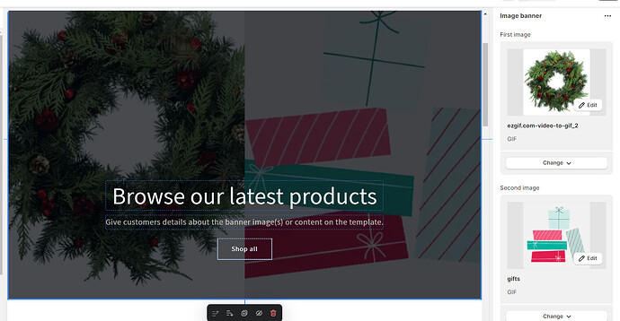
The Image banner should look like this.
And with the adjustable height.
Please don’t forget to Like and Mark Solution to the post that helped you. Thanks!
Yeah I used a custom css code
{
background: url(“https://cdn.shopify.com/s/files/1/0764/6819/1509/files/Screenshot_2024-01-06_at_6.17.57_PM.png?v=1704583092”)
no-repeat center;
background-size: 100%;
}
but i tried to use a banner image but the image is way to wide so it was why used rich text and added this code to make it look right


