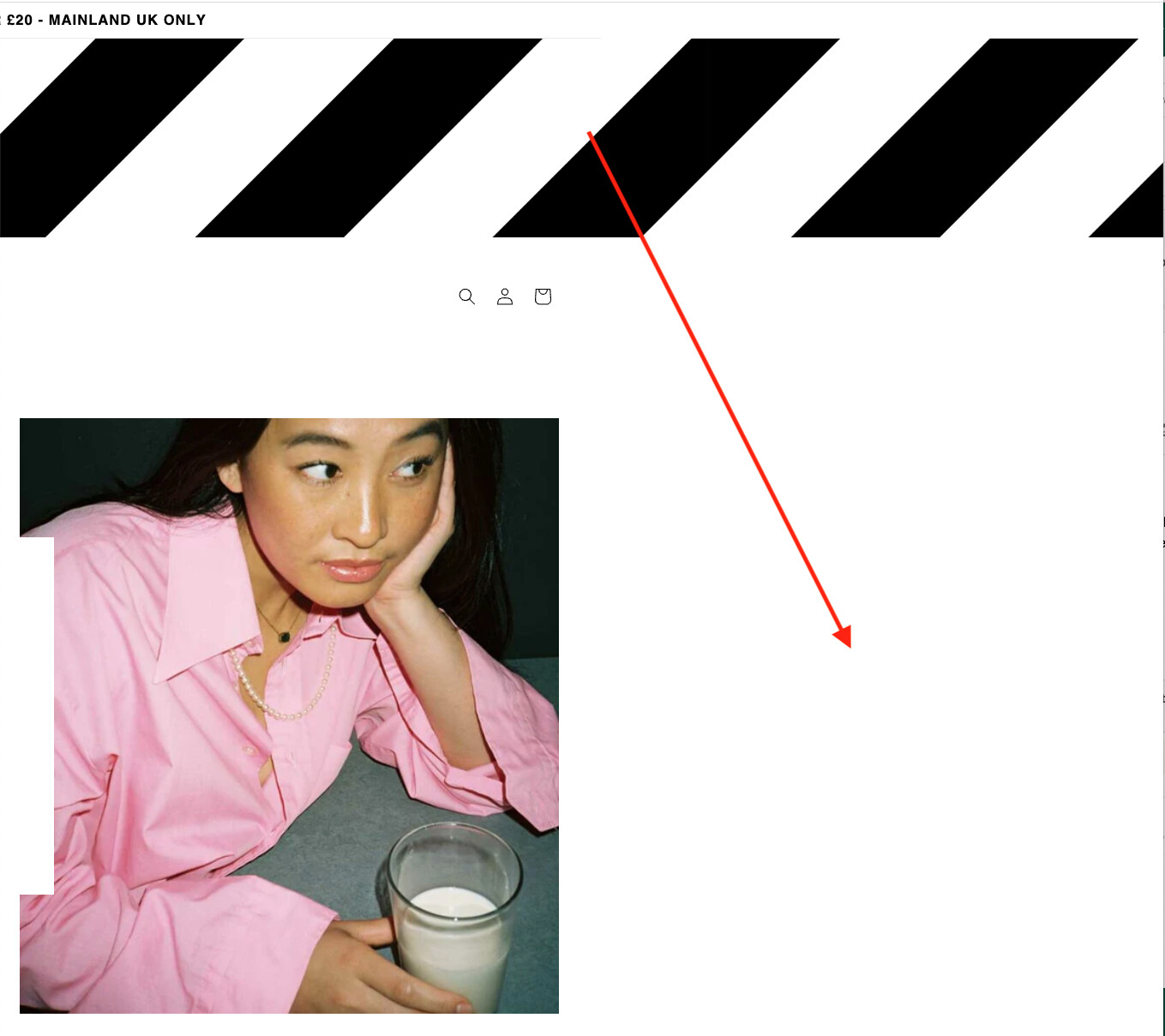
We want an image in our header (between the announcement bar and header navigation). We added a custom liquid section with the code linking to the uploaded image in our library. However the image is not automatically resizing for the screen (desktop or mobile). This means you can scroll to the right beyond the normal page width to a lot of white space (see image below).
Anyone know how to get the stripes image to resize automatically based on the screen / device? Thanks in advance!
Add the following code to the bottom of your base.css file:
.section-sections--16191458836688__efa52740-eb57-4816-98ee-e9a49aa0e8e9-padding img {
    max-width: 100%;
    height: auto;
}
Hi @BeSproud ,
This is Anthony from Beae Landing Page Builder, and I’m happy to assist you today.
While I acknowledge that this issue falls short of the desired outcome, I have an idea that I believe might be of help:
- Go to Online Store → Theme → Edit code
- Open your theme.liquid file
- Paste below code before :
Best regards,
Anthony
1 Like
AMAZING!!! That worked!! Thank you so much! Really appreciate it!