Hello, can someone help me to make the images from the collection list smaller in Streamline?
The site is charmz.de.
The images are very big and I would need more than 4 in a row.
I tried a solution but it won’t work.
Hope someone can help me out.
Hello, can someone help me to make the images from the collection list smaller in Streamline?
The site is charmz.de.
The images are very big and I would need more than 4 in a row.
I tried a solution but it won’t work.
Hope someone can help me out.
Hi,
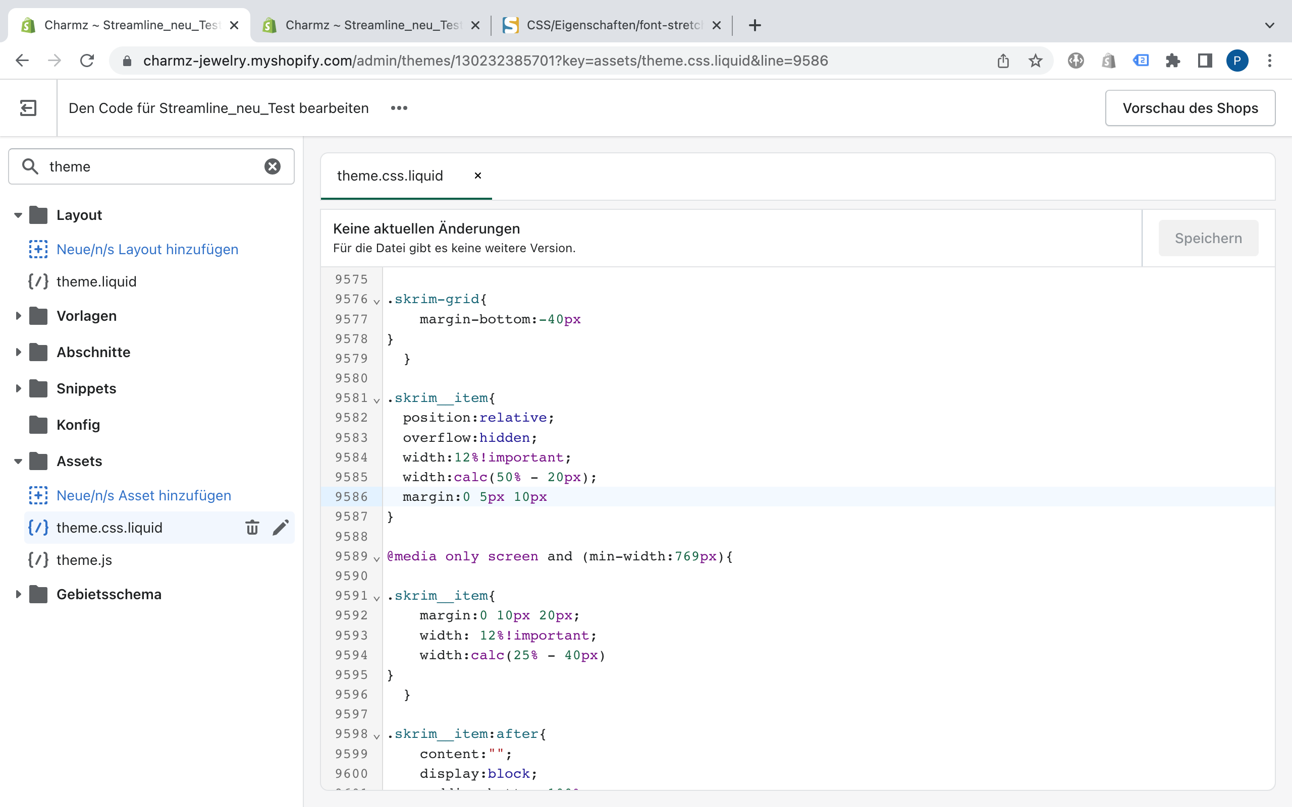
To resolve the issue, please add !important next to 10% in the theme.css.
If you want to make 6 images in a row, make it 12% & add !important as below.
@media only screen and (min-width: 769px) {
.skrim__item {
    margin: 0 20px 40px;
    width: 12% !important;
    width: calc(25% - 40px);
  }
}
You may need to adjust the margin for better look.
Hope it helps.
Thanks.
Hi @PU91 ,
You just need to remove the code here, it will work fine, because you have declared 2 width for it, so it will get the 2nd declaration.
Hope it helps!
Thank you so much, it works perfect, but how can I adjust the text in the desktop and the mobile version, that it fits the new size?
Thanks Patrick
Thank you so much, this works also perfect, just the same problem with the text.
Thanks, Patrick
Hi,
To adjust the font size, please use the code below.
@media only screen and (min-width: 769px) {
  .skrim__underline-me {
    font-size: 24px;
  }
}
@media only screen and (max-width: 768px) {
  .skrim__underline-me {
    font-size: 18px;
  }
}
The top part is for PC (screen size 769px or bigger) and
the bottom part is for Mobile (screen size 768px or smaller).
Mostly the break point is 750px but your theme is using 769px.
However, please adjust the font-size per your needs.
Hope it helps.
Thanks.
Hi @PU91 ,
Go to Assets > theme.css and paste this at the bottom of the file:
@media only screen and (min-width: 769px){
	/* font size for desktop */
	.skrim__title {
		font-size: calc(var(--typeHeaderSize)*.57);
	}
}
/* font size for mobile */
.skrim__title {
    font-size: calc(var(--typeHeaderSize)*.57*.85);
}
If it helped you solve your issue, please mark it as a solution. Thank you and good luck.
Works perfect, thank you so much for your help.