So i am just playing around and i was hoping to learn how to solve this issue both here specifically and going forward. When using Image with text overlay, the image resize for mobile is very zoomed in.
The site is in demo:
https://8ipfhzuxn1bmylue-72140980502.shopifypreview.com
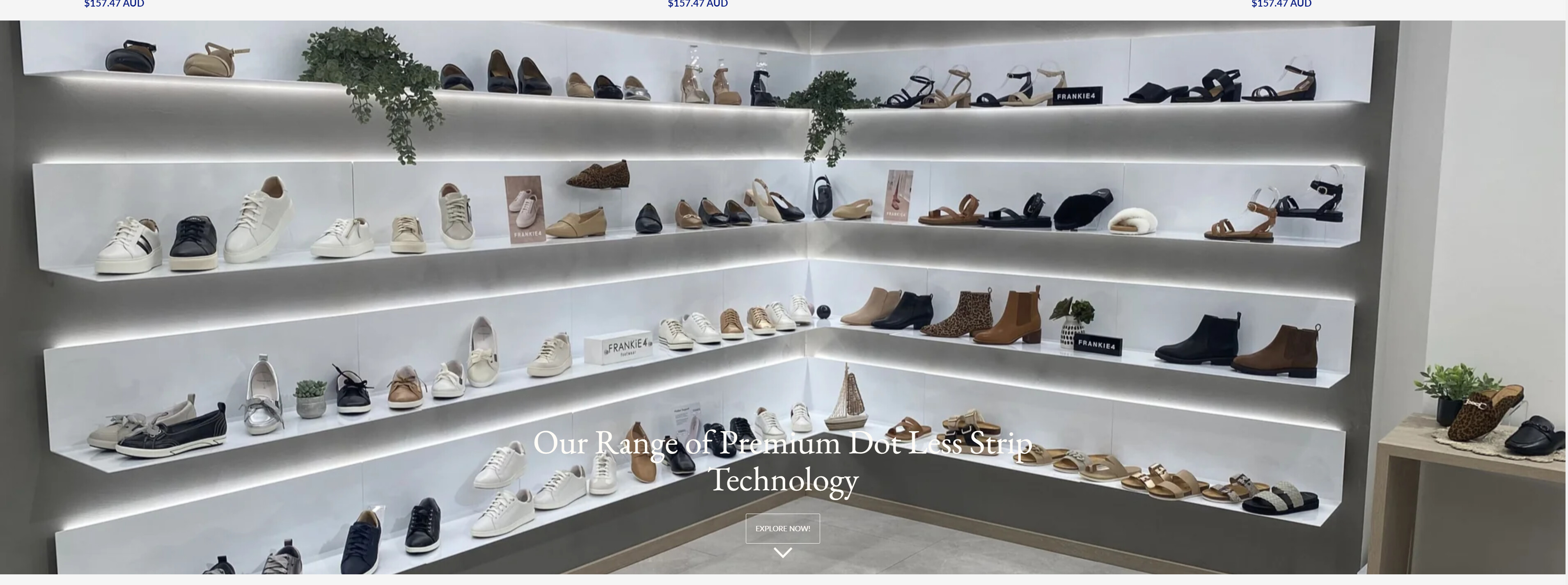
Currently, it displays fine on desktop but in mobile display it shows only the solid red centre section (it crops out a lot of the image). I would like to show a smaller version of the image if possible on mobile so that more of the image can be displayed. Alternately, I would like that when a mobile display is detected it shows a different image altogether (that way i can use an appropriate manually resized image).
Any help would be appreciated
screen shots below: