Hey Everyone!
I’m having an issue with my email templates in Klaviyo. I’m using four templates: “Refund has been issued,” “Your order has shipped,” “Your order has been delivered,” and “Thanks for your purchase.”
When I conduct test orders, the emails I receive show “No Image” instead of the product image that should be displayed.
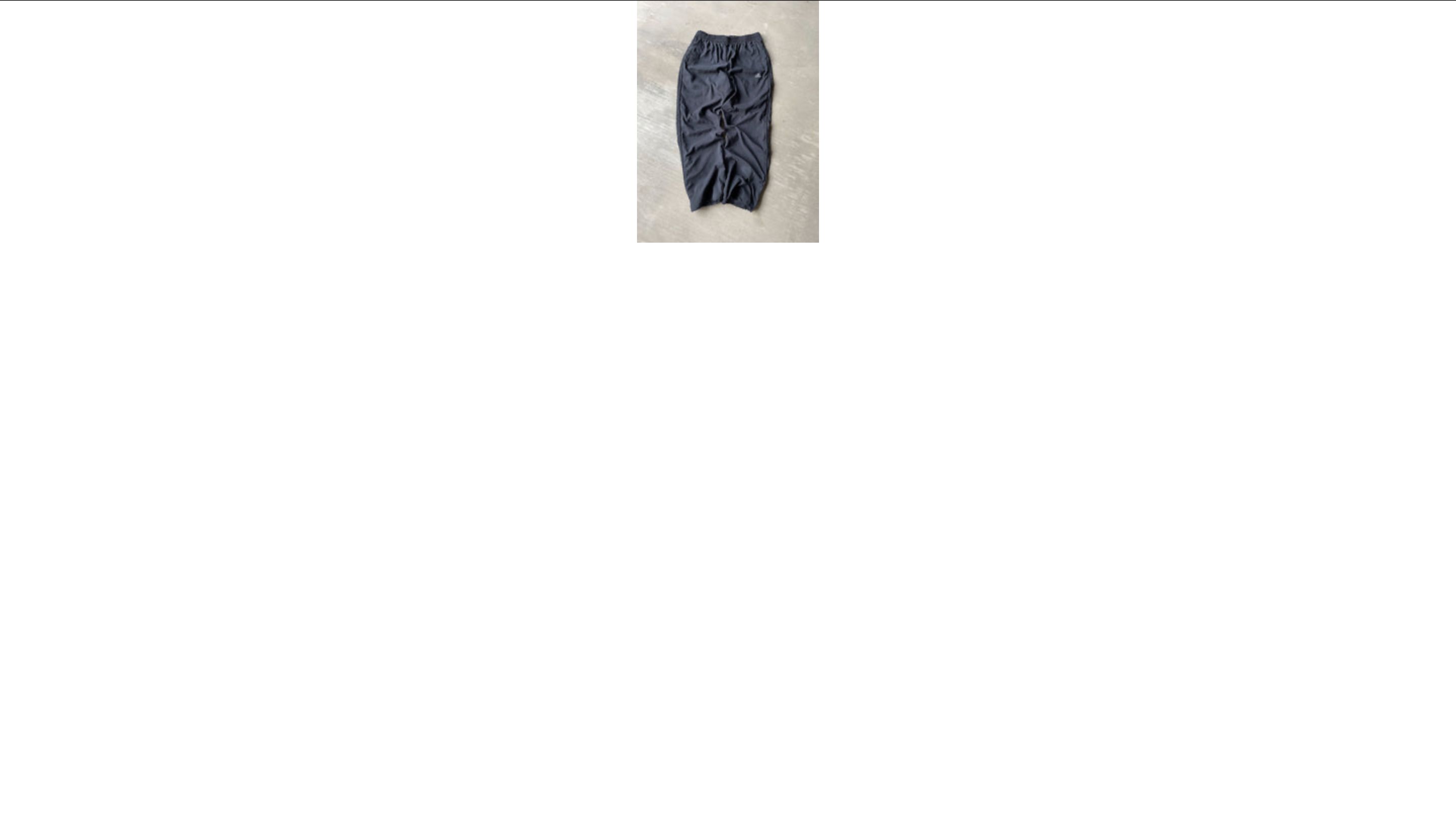
This problem doesn’t occur with all products; for some, everything works perfectly fine (e.g., Adidas Vintage Trackpants ).
I believe the issue lies with the image URLs. I used ChatGPT to help solve this problem, and it suggested adding the following code to my templates to verify if the links work properly:
Check image link
When I purchase the linked product above and click on the “Check image link” button, I can see the image in the browser. However, when I use the same approach with other products, I still get the “No Image” message.
Interestingly, the rest of the templates I created with Shopify display the images perfectly fine.
I’ve already reached out to Klaviyo and Shopify Support, but they weren’t able to assist me.
I would appreciate any help or suggestions to resolve this issue!
Thanks in advance!
BTW here is my Web-site password: Snd.Shp.2023
Here is my email template code:
a:link {color:#1a1a1a;font-weight:normal;text-decoration:underline;font-style:normal}
a:visited {color:#1a1a1a;font-weight:normal;text-decoration:underline;font-style:normal}
a:active {color:#1a1a1a;font-weight:normal;text-decoration:underline;font-style:normal}
a:hover {color:#1a1a1a;font-weight:normal;text-decoration:underline;font-style:normal}@import url([https://static-forms.klaviyo.com/fonts/api/v1/SzXfrk/custom_fonts.css](https://static-forms.klaviyo.com/fonts/api/v1/SzXfrk/custom_fonts.css));
#outlook a {
padding: 0
}
body {
margin: 0;
padding: 0;
-webkit-text-size-adjust: 100%;
-ms-text-size-adjust: 100%
}
table, td {
border-collapse: collapse;
mso-table-lspace: 0;
mso-table-rspace: 0
}
img {
border: 0;
line-height: 100%;
outline: none;
text-decoration: none;
-ms-interpolation-mode: bicubic
}
p {
display: block;
margin: 13px 0
}
@media only screen and (min-width: 480px) {
.mj-column-per-100 {
width: 100% !important;
max-width: 100%
}
}
.moz-text-html .mj-column-per-100 {
width: 100% !important;
max-width: 100%
}
@media only screen and (max-width: 480px) {
div.kl-row.colstack div.kl-column {
display: block !important;
width: 100% !important
}
}
.hlb-subblk td {
word-break: normal
}
@media only screen and (max-width: 480px) {
.hlb-wrapper .hlb-block-settings-content {
padding: 9px !important
}
.hlb-logo {
padding-bottom: 9px !important
}
.r2-tbl {
width: 100%
}
.r2-tbl .lnk {
width: 100%
}
.r2-tbl .hlb-subblk:last-child {
padding-right: 0 !important
}
.r2-tbl .hlb-subblk {
padding-right: 10px !important
}
.kl-hlb-stack {
display: block !important;
width: 100% !important;
padding-right: 0 !important
}
.kl-hlb-stack.vspc {
margin-bottom: 9px
}
.kl-hlb-wrap {
display: inline-block !important;
width: auto !important
}
.kl-hlb-no-wrap {
display: table-cell !important
}
.kl-hlb-wrap.nospc.nospc {
padding-right: 0 !important
}
}
@media only screen and (max-width: 480px) {
.component-wrapper .mob-no-spc {
padding-left: 0 !important;
padding-right: 0 !important
}
}
@media only screen and (max-width: 480px) {
.kl-text {
padding-right: 18px !important;
padding-left: 18px !important
}
}
@media only screen and (max-width: 480px) {
.kl-split-subblock.top .spacer, .kl-split-subblock.bottom .spacer {
padding: 0 !important
}
.kl-split-subblock.top .spacer {
padding-bottom: 9px !important
}
.kl-split-subblock.top {
display: table-header-group !important;
width: 100% !important
}
.kl-split-subblock.bottom {
display: table-footer-group !important;
width: 100% !important
}
}
@media only screen and (max-width: 480px) {
.kl-table-subblock.use-legacy-mobile-padding {
padding-left: 9px !important;
padding-right: 9px !important
}
}
@media only screen and (max-width: 480px) {
td.kl-img-base-auto-width {
width: 100% !important
}
}
@media screen and (max-width: 480px) {
.kl-sl-stk {
display: block !important;
width: 100% !important;
padding: 0 0 9px !important;
text-align: center !important
}
.kl-sl-stk.lbls {
padding: 0 !important
}
.kl-sl-stk.spcblk {
display: none !important
}
}
@media only screen and (max-width: 480px) {
table.mj-full-width-mobile {
width: 100% !important
}
td.mj-full-width-mobile {
width: auto !important
}
}
img {
border: 0;
height: auto;
line-height: 100%;
outline: none;
text-decoration: none;
max-width: 100%
}
.root-container {
background-repeat: repeat !important;
background-size: auto !important;
background-position: left top !important
}
.root-container-spacing {
padding-top: 50px !important;
padding-bottom: 20px !important;
font-size: 0 !important
}
.content-padding {
padding-left: 0 !important;
padding-right: 0 !important
}
.content-padding.first {
padding-top: 0 !important
}
.content-padding.last {
padding-bottom: 0 !important
}
@media only screen and (max-width: 480px) {
td.mobile-only {
display: table-cell !important
}
div.mobile-only {
display: block !important
}
table.mobile-only {
display: table !important
}
.desktop-only {
display: none !important
}
}
@media only screen and (max-width: 480px) {
.table-mobile-only {
display: table-cell !important;
max-height: none !important
}
.table-mobile-only.block {
display: block !important
}
.table-mobile-only.inline-block {
display: inline-block !important
}
.table-desktop-only {
max-height: 0 !important;
display: none !important;
mso-hide: all !important;
overflow: hidden !important
}
}
p {
margin-left: 0;
margin-right: 0;
margin-top: 0;
margin-bottom: 0;
padding-bottom: 1em
}
@media only screen and (max-width: 480px) {
.kl-text > div, .kl-table-subblock div, .kl-split-subblock > div {
font-size: 14px !important;
line-height: 1.3 !important
}
}
h1 {
color: #1a1a1a;
font-family: Helvetica, Arial, sans-serif;
font-size: 32px;
font-style: normal;
font-weight: 700;
line-height: 1.1;
letter-spacing: 0;
margin: 0;
margin-bottom: 20px;
text-align: left
}
@media only screen and (max-width: 480px) {
h1 {
font-size: 40px !important;
line-height: 1.1 !important
}
}
h2 {
color: #1a1a1a;
font-family: Helvetica, Arial, sans-serif;
font-size: 28px;
font-style: normal;
font-weight: 400;
line-height: 1.1;
letter-spacing: 0;
margin: 0;
margin-bottom: 16px;
text-align: left
}
@media only screen and (max-width: 480px) {
h2 {
font-size: 32px !important;
line-height: 1.1 !important
}
}
h3 {
color: #1a1a1a;
font-family: Helvetica, Arial, sans-serif;
font-size: 24px;
font-style: normal;
font-weight: 400;
line-height: 1.1;
letter-spacing: 0;
margin: 0;
margin-bottom: 12px;
text-align: left
}
@media only screen and (max-width: 480px) {
h3 {
font-size: 24px !important;
line-height: 1.1 !important
}
}
h4 {
color: #1a1a1a;
font-family: "Helvetica Neue", Arial;
font-size: 18px;
font-style: normal;
font-weight: 400;
line-height: 1.1;
letter-spacing: 0;
margin: 0;
margin-bottom: 9px;
text-align: left
}
@media only screen and (max-width: 480px) {
h4 {
font-size: 18px !important;
line-height: 1.1 !important
}
}
@media only screen and (max-width: 480px) {
.root-container {
width: 100% !important
}
.root-container-spacing {
padding: 10px !important
}
.content-padding {
padding-left: 0 !important;
padding-right: 0 !important
}
.content-padding.first {
padding-top: 0 !important
}
.content-padding.last {
padding-bottom: 0 !important
}
.component-wrapper {
padding-left: 0 !important;
padding-right: 0 !important
}
}
Thanks for your purchase!
This email is to confirm your order on {{ date | date: "%m/%d/%Y" }}. Your order number is {{ order_number }} .
Billing Address:
{{ billing_address.name }}
{% if requires_shipping %}
Shipping Address:
{{ shipping_address.name }}
{% endif %}
{% if line_items %}
{% for line in line_items %}
{% endfor %}
{% else %}
{% endif %}
{{ line.title }}
Quantity: {{ line.quantity }}
{% if discounts %} Discount (code: {{ discounts.first.code }}): {{ discounts_savings|money }}Subtotal: {{ subtotal_price|money }}{{ tax_line.title }}: {{ tax_line.price|money }}Shipping: {{ shipping_price|money }}Total: {{ total_price|money }}
The issue might not be with the URLs. Have you checked if Klaviyo’s settings are overriding the image display or if there’s a cache problem?
sndshp
May 27, 2024, 11:04am
4
Hey
No i haven’t, how can i make it ?
To check if Klaviyo’s settings are overriding the image display or if there’s a cache problem, first, log into Klaviyo and edit the specific campaign or flow where the issue is. Ensure the image URLs are correct and the images aren’t hidden or affected by HTML/CSS overrides.
Next, open the image URLs in your browser to verify they’re accessible and in a supported format like JPG or PNG. Clear your browser cache or use incognito mode, and try a different browser to rule out cache issues. Send test emails to apps like EmailOnAcid and use Klaviyo’s email preview tool to see if the issue persists.
Hope this helps


