I’m using Bundle Builder by Kitenzo for my Shopify web app, kraftology.co. The theme of the web app is Stiletto. The bundle builder page is located at: https://kraftology.co/apps/bundles/bundle/146124
The issue I’m encountering is that on mobile devices, only one product appears per row. I’d like to display two products per row instead. The “Products per row” setting in the Design Editor seems to apply only to desktop layouts.
To address this, I added the following custom CSS to display two products per row on mobile:
@media screen and (max-width: 767px) {
  html, body {
    overflow-x: hidden;
  }

  .bundle-builder-app--bundle--section--product-list--centred {
    display: grid !important;
    grid-template-columns: repeat(2, 1fr) !important;
    gap: 1rem;
    width: 100%;
    box-sizing: border-box;
    padding: 0 1rem;
    max-width: 100%;
    margin: 0 auto;
  }

  .bundle-builder-app--bundle--section--product-list--centred > li {
    display: flex;
    flex-direction: column;
    align-items: center;
    min-width: 0;
  }

  .bundle-builder-app--bundle--section--product-list--centred img {
    height: 150px;
    object-fit: contain;
    width: 100%;
  }
}
This partially works, but there are still a few issues:
- Some product images are not the same size as the others (some are big, some are small).
- Left and right margins are not equal (left being narrower).
- The product grid is not centered horizontally (leaning towards the left).
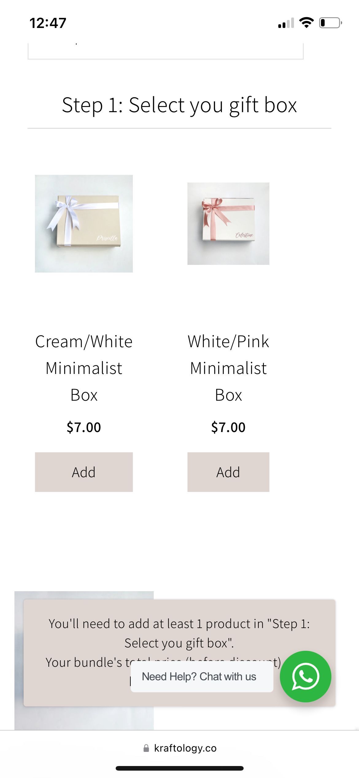
Here are some screenshots for reference:
You have several stylesheets being loaded so it’s hard to pinpoint where you can put this but it looks like there may be a custom.css file with the bundler app. You can try putting this at the bottom. The ‘important’ flags are there because without direct access to your code it’s the only way for me to see the changes correctly.
@media screen and (max-width: 767px) {
    .bundle-builder-app--bundle--section--product-list--centred {
        display: grid !important;
        margin-right: 0;
        column-gap: 8px;
    }

    .bundle-builder-app--products-per-row--4--centred {
        width: 100% !important;
        max-width: none !important;
        margin: 0 !important;
        padding: 0px !important;
    }
}
Hi there,
This was actually my previous code. It turns out, it works when I remove the following block:
.bundle-builder-app--bundle--section--product-list--centred {
        display: grid !important;
        margin-right: 0;
        column-gap: 8px;
    }
However, there’s still a box that doesn’t follow the structure.
I’m using Iphone 12.
Resolved this issue with the following code:
@media screen and (max-width: 767px) {
    .bundle-builder-app--bundle--section--product-list--centred {
        display: grid !important;
        grid-template-columns: 1fr 1fr; /* Define two equal-width columns */
        grid-gap: 8px; /* Shorthand for row-gap and column-gap */
        margin-right: 0;
    }

    .bundle-builder-app--products-per-row--4--centred {
        width: auto !important; /* Let the grid control the width */
        max-width: none !important;
        margin: 0 !important;
        padding: 0px !important;
    }
}
By defining grid-template-columns, I explicitly tell the grid to create two columns. Also, instead of forcing the product items to be 100% wide, I set their width to auto. This allows the grid to control their width so they fit within the defined columns. Lastly, I used grid-gap to set both the row and column gaps to 8px for spacing. It replaces column-gap for better readability.