Hi @Andrecolap ,
If you want to these changes then follow the steps below:
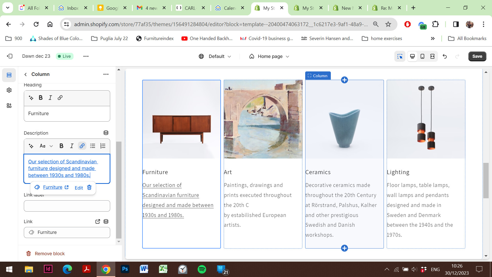
Step 1:
Go to “Online Store.”
Edit Code.
Search for the “multicolumn.liquid” file.
Locate the {% schema %} tag and paste the provided code.
{
  "type": "url",
  "id": "link-1",
   "label": "Image Link"
 },
(Include the provided screenshot for reference)
Step 2:
Find the
element with the class “multicolumn-list.”
Replace the existing code.
        {%- liquid
          assign highest_ratio = 0
          for block in section.blocks
            if block.settings.image.aspect_ratio > highest_ratio
              assign highest_ratio = block.settings.image.aspect_ratio
            endif
          endfor
        -%}
        {%- for block in section.blocks -%}
          {%- assign empty_column = '' -%}
          {%- if block.settings.image == blank
            and block.settings.title == blank
            and block.settings.text == blank
            and block.settings.link_label == blank
          -%}
            {%- assign empty_column = ' multicolumn-list__item--empty' -%}
          {%- endif -%}

          - {%- if block.settings.image != blank -%}
                  {% if section.settings.image_ratio == 'adapt' or section.settings.image_ratio == 'circle' %}
                    {% assign spaced_image = true %}
                  {% endif %}


                      {%- liquid
                        assign number_of_columns = section.settings.columns_desktop
                        assign number_of_columns_mobile = section.settings.columns_mobile
                        assign grid_space_desktop = number_of_columns | minus: 1 | times: settings.spacing_grid_horizontal | plus: 100 | append: 'px'
                        assign grid_space_tablet = number_of_columns_mobile | minus: 1 | times: settings.spacing_grid_horizontal | plus: 100 | append: 'px'
                        assign grid_space_mobile = number_of_columns_mobile | minus: 1 | times: settings.spacing_grid_horizontal | divided_by: 2 | plus: 30 | append: 'px'
                        if section.settings.image_width == 'half'
                          assign image_width = 0.5
                        elsif section.settings.image_width == 'third'
                          assign image_width = 0.33
                        else
                          assign image_width = 1
                        endif
                      -%}
                      {% capture sizes %}
                        (min-width: {{ settings.page_width }}px) calc(({{ settings.page_width }}px - {{ grid_space_desktop }}) * {{ image_width }} /  {{ number_of_columns }}),
                        (min-width: 990px) calc((100vw - {{ grid_space_desktop }}) * {{ image_width }} / {{ number_of_columns }}),
                        (min-width: 750px) calc((100vw - {{ grid_space_tablet }}) * {{ image_width }} / {{ number_of_columns_mobile }}),
                        calc((100vw - {{ grid_space_mobile }}) * {{ image_width }} / {{ number_of_columns_mobile }})
                      {% endcapture %}
                      {{
                        block.settings.image
                        | image_url: width: 3200
                        | image_tag:
                          loading: 'lazy',
                          widths: '50, 75, 100, 150, 200, 300, 400, 500, 750, 1000, 1250, 1500, 1750, 2000, 2250, 2500, 2750, 3000, 3200',
                          sizes: sizes,
                          class: 'multicolumn-card__image'
                      }}


                {%- endif -%}

                  {%- if block.settings.title != blank -%}
                    ### {{ block.settings.title }}
                  {%- endif -%}
                  {%- if block.settings.text != blank -%}
                    {{ block.settings.text }}

                  {%- endif -%}
                  {%- if block.settings.link_label != blank -%}

                      {{- block.settings.link_label | escape -}}
                       {% render 'icon-arrow' %}
                  {%- endif -%}


        {%- endfor -%}
To this
        {%- liquid
          assign highest_ratio = 0
          for block in section.blocks
            if block.settings.image.aspect_ratio > highest_ratio
              assign highest_ratio = block.settings.image.aspect_ratio
            endif
          endfor
        -%}
        {%- for block in section.blocks -%}
          {%- assign empty_column = '' -%}
          {%- if block.settings.image == blank
            and block.settings.title == blank
            and block.settings.text == blank
            and block.settings.link_label == blank
          -%}
            {%- assign empty_column = ' multicolumn-list__item--empty' -%}
          {%- endif -%}

          - {%- if block.settings.image != blank -%}
                  {% if section.settings.image_ratio == 'adapt' or section.settings.image_ratio == 'circle' %}
                    {% assign spaced_image = true %}
                  {% endif %}


                    {%- if block.settings['link-1'] == blank -%}


                          {%- liquid
                            assign number_of_columns = section.settings.columns_desktop
                            assign number_of_columns_mobile = section.settings.columns_mobile
                            assign grid_space_desktop = number_of_columns | minus: 1 | times: settings.spacing_grid_horizontal | plus: 100 | append: 'px'
                            assign grid_space_tablet = number_of_columns_mobile | minus: 1 | times: settings.spacing_grid_horizontal | plus: 100 | append: 'px'
                            assign grid_space_mobile = number_of_columns_mobile | minus: 1 | times: settings.spacing_grid_horizontal | divided_by: 2 | plus: 30 | append: 'px'
                            if section.settings.image_width == 'half'
                              assign image_width = 0.5
                            elsif section.settings.image_width == 'third'
                              assign image_width = 0.33
                            else
                              assign image_width = 1
                            endif
                          -%}
                          {% capture sizes %}
                        (min-width: {{ settings.page_width }}px) calc(({{ settings.page_width }}px - {{ grid_space_desktop }}) * {{ image_width }} /  {{ number_of_columns }}),
                        (min-width: 990px) calc((100vw - {{ grid_space_desktop }}) * {{ image_width }} / {{ number_of_columns }}),
                        (min-width: 750px) calc((100vw - {{ grid_space_tablet }}) * {{ image_width }} / {{ number_of_columns_mobile }}),
                        calc((100vw - {{ grid_space_mobile }}) * {{ image_width }} / {{ number_of_columns_mobile }})
                      {% endcapture %}
                          {{
                            block.settings.image
                            | image_url: width: 3200
                            | image_tag:
                              widths: '50, 75, 100, 150, 200, 300, 400, 500, 750, 1000, 1250, 1500, 1750, 2000, 2250, 2500, 2750, 3000, 3200',
                              sizes: sizes,
                              class: 'multicolumn-card__image'
                          }}


                    {%- else -%}


                          {%- liquid
                            assign number_of_columns = section.settings.columns_desktop
                            assign number_of_columns_mobile = section.settings.columns_mobile
                            assign grid_space_desktop = number_of_columns | minus: 1 | times: settings.spacing_grid_horizontal | plus: 100 | append: 'px'
                            assign grid_space_tablet = number_of_columns_mobile | minus: 1 | times: settings.spacing_grid_horizontal | plus: 100 | append: 'px'
                            assign grid_space_mobile = number_of_columns_mobile | minus: 1 | times: settings.spacing_grid_horizontal | divided_by: 2 | plus: 30 | append: 'px'
                            if section.settings.image_width == 'half'
                              assign image_width = 0.5
                            elsif section.settings.image_width == 'third'
                              assign image_width = 0.33
                            else
                              assign image_width = 1
                            endif
                          -%}
                          {% capture sizes %}
                        (min-width: {{ settings.page_width }}px) calc(({{ settings.page_width }}px - {{ grid_space_desktop }}) * {{ image_width }} /  {{ number_of_columns }}),
                        (min-width: 990px) calc((100vw - {{ grid_space_desktop }}) * {{ image_width }} / {{ number_of_columns }}),
                        (min-width: 750px) calc((100vw - {{ grid_space_tablet }}) * {{ image_width }} / {{ number_of_columns_mobile }}),
                        calc((100vw - {{ grid_space_mobile }}) * {{ image_width }} / {{ number_of_columns_mobile }})
                      {% endcapture %}
                          {{
                            block.settings.image
                            | image_url: width: 3200
                            | image_tag:
                              widths: '50, 75, 100, 150, 200, 300, 400, 500, 750, 1000, 1250, 1500, 1750, 2000, 2250, 2500, 2750, 3000, 3200',
                              sizes: sizes,
                              class: 'multicolumn-card__image'
                          }}


                    {%- endif -%}


                {%- endif -%}

                  {%- if block.settings.title != blank -%}
                    ### {{ block.settings.title }}
                  {%- endif -%}
                  {%- if block.settings.text != blank -%}
                    {{ block.settings.text }}

                  {%- endif -%}
                  {%- if block.settings.link_label != blank -%}

                      {{- block.settings.link_label | escape -}}
                       {% render 'icon-arrow' %}
                  {%- endif -%}


        {%- endfor -%}
(Include the provided screenshot for reference)
Step 3:
Find the tag in this file.
Paste the provided code.
.section-{{ section.id }}.inline-richtext a, .section-{{ section.id }}.rte p a {
    text-decoration: none;
}
(Include the provided screenshot for reference)