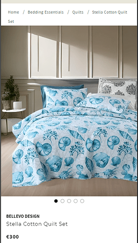
Hey, is there a way to make my product images full width on MOBILE view only? I will add a picture of the issue and desired outcome below. Thanks in advance!
You can’t see it in the picture, but there are small white lines on the left and right side of the picture on my website. It is easier to see on the actual product page: https://bellevodesign.com/products/stella-navy-washed-cotton-bedding-set
My store: https://bellevodesign.com
The issue:
Desired outcome:
1 Like
Hi @bellevo
check this one,.
- From you Admin page, go to Online Store > Themes
- Select the theme you want to edit
- Under the Asset folder, open the main.css(base.css, style.css or theme.css)
- Then place the code below at the very bottom of the file.
@media only screen and (max-width: 749px){
section#MainProduct-template--21762617311576__main .page-width {
    padding: 0;
}
section#MainProduct-template--21762617311576__main .product__info-wrapper {
    padding: 0 1.5rem;
}
}
Please don’t forget to Like and Mark Solution to the post that helped you. Thanks!
1 Like
Hey, I added this to the bottom of “Base.css” but nothing happened.
@media only screen and (max-width: 600px) {
.page-width {
 padding: 0px !important;
}
.product__info-wrapper {
padding: 0 1.5rem !important;
}
}
- Can you try adding it in the last line file base.css @bellevo
- Please press ‘Like’ and mark it as ‘Solution’ if you find it helpful. Thank you.
1 Like
Didn’t do anything either, still white edges on the product image. Thank you though.
Anyone know how to fix this?
try to add on the theme editor. Go to product page.
When you click the prodcut info on the left side there will new tab will come out > scroll down and find this one.
Paste the code here and save. Thanks!
1 Like
Hey, I cannot paste it there, it is giving me an error. I will add a picture below.


