A user is experiencing responsive design issues with heart icons and social media elements on their Shopify store. The main problem: when heart icons are sized correctly for mobile view, they appear too large on desktop, and vice versa.
Specific requests:
How to set different icon sizes for mobile vs desktop views
How to remove “<1/3>” text below hearts on mobile while keeping navigation arrows functional
Need white outline social media icons for Instagram, TikTok, YouTube, and Twitter
Current status:
A helper provided CSS media query code to:
Adjust heart icon sizes on desktop (targeting screens 1024px+)
Hide the “<1/3>” element on mobile (max-width 768px)
The user reports the heart icon code didn’t work as expected and notes difficulty locating where the social media icons are hosted in the theme files when inspecting elements. The discussion remains ongoing as the sizing issue persists and the social media icon request is unresolved.
Summarized with AI on November 3.
AI used: claude-sonnet-4-5-20250929.
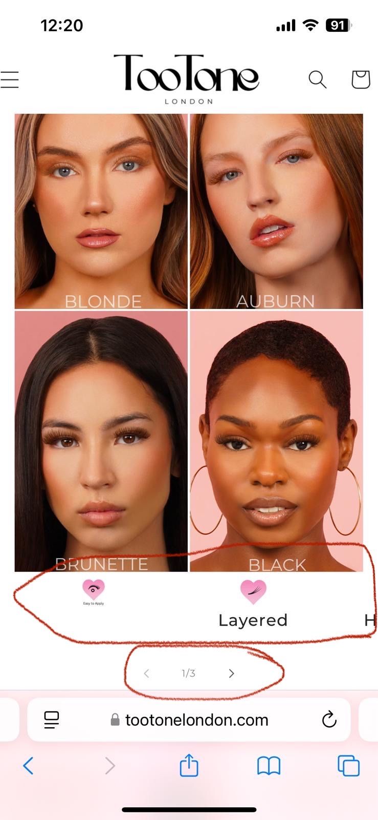
I’ve attached photos of both mobile and web view. The issue is that when we adjust the heart icon sizes to look correct on mobile (e.g., heart under black on mobile view), they appear too large on desktop and we want it to look like the heart size under blonde on desktop view. How do I have different sizes for mobile and desktop?
Is there a smart, responsive solution for this?
Additionally:
Could I have the codes for white outline social media icons for Instagram, TikTok, YouTube, and Twitter (like in the attached photo).
How can I remove the <1/3> under the hearts on mobile so they scroll seamlessly, but the arrows remain hidden?
Could you let me know where the Instagram and TikTok icon images are hosted? Please provide the link to those images so I can review them.
I hope this helps