Hi,
I’d like to move the homepage text up on mobile only.
Currently on desktop it looks great:
On mobile however its too low 

I would like it moved please. thank you !
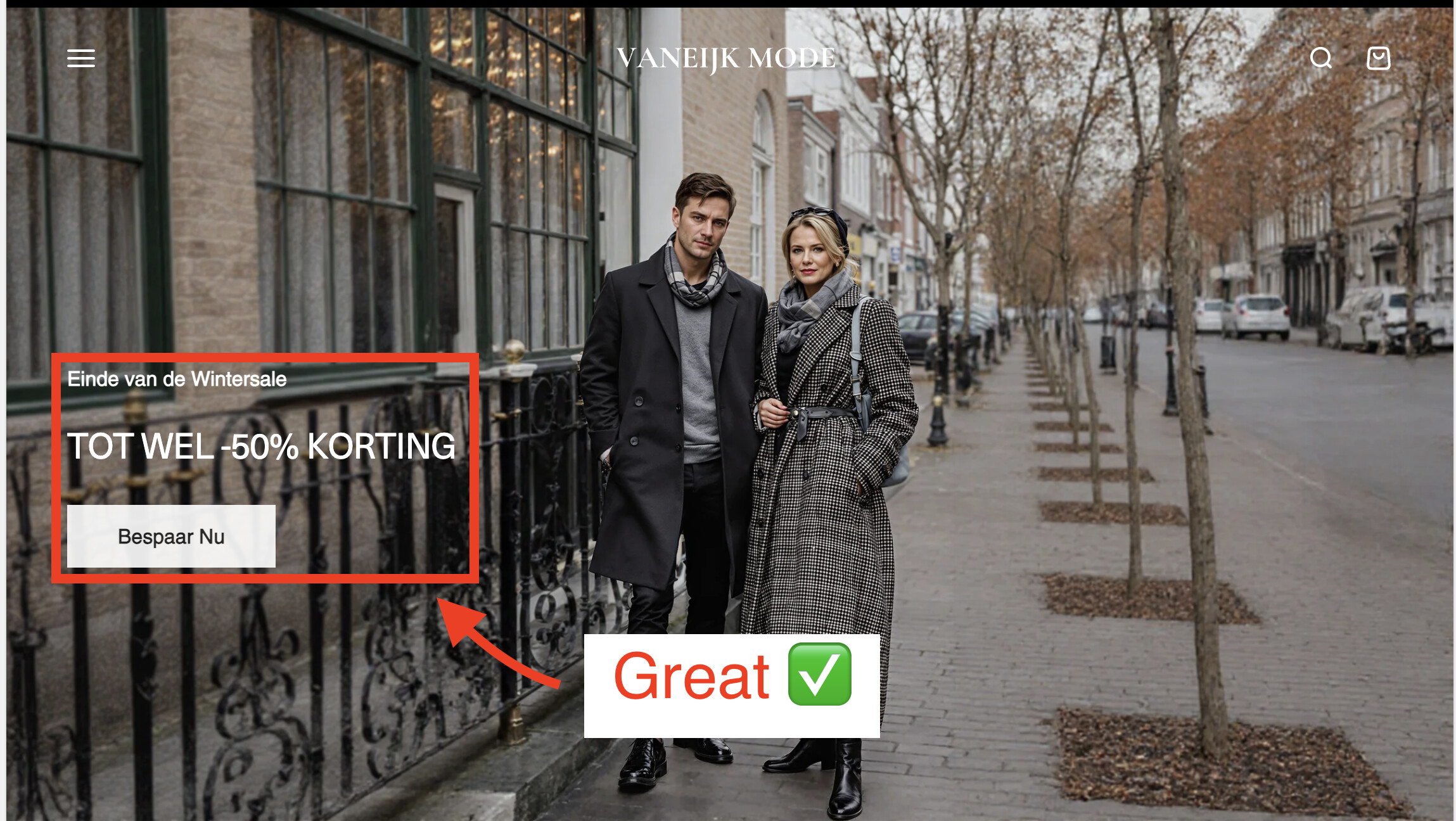
Hi,
I’d like to move the homepage text up on mobile only.
Currently on desktop it looks great:
On mobile however its too low
I would like it moved please. thank you !
Hi @kingbeanz
@media(max-width:768px){
.place-self-end-start {
    margin-top: 14rem !important;
    place-self: center start !important;
}
}
If my reply is helpful, kindly click like and mark it as an accepted solution.
Thanks!
Use our Big Bulk Discount app to boost your sales!  (https://apps.shopify.com/big-bulk-discount). Easy to set up and perfect for attracting more customers with bulk discounts. Try it now and watch your revenue grow!
Result:
Access your Shopify admin panel:
Go to your Shopify admin.
In the left-hand menu, click on “Online Store” > “Themes.”
Under your active theme, click “Actions” > “Edit code.”
Locate your theme’s CSS file:
Find the assets folder and look for a file like theme.css, styles.css, or any other stylesheet that applies to your theme.
Open that file.
Add the CSS code:
@media only screen and (max-width: 700px) {
  #shopify-section-template--24706837119319__slideshow .content-over-media > div {
    top: -200px;
  }
}
Paste it at the end of the CSS file or wherever appropriate.
Save the changes:
After adding the code, make sure to save the file.
Preview your store:
Check your store’s front end to see how the changes take effect. The element with .content-over-media should now be positioned 200px higher, according to the provided CSS.
If you have any trouble implementing this or need further assistance with Shopify customizations, feel free to ask!
Hey @kingbeanz ,
To adjust the homepage text position on mobile only, follow these steps:
Go to Online Store → Theme → Edit Code
Open your theme.css
Scroll to the bottom and paste the following code:
.content-over-media>:not(img,video,iframe,svg,video-media) {
    max-width: var(--content-over-media-content-max-width, 780px);
    z-index: 1;
    grid-area: 2 / 2 / auto / span 1;
    position: relative;
    top: -171px;
}
Result:
If I was able to help you, please don’t forget to Like and mark it as the Solution!
If you’re looking for expert help with customization or coding, I’d be delighted to support you. Please don’t hesitate to reach out via the email in my signature below—I’m here to help bring your vision to life!
Best Regard,
Rajat
Hi @kingbeanz
You can try to follow this step
Step 1: Go to Edit code
Step 2: Find file base.css and add this code at the end of the file
@media(max-width:768px){
.place-self-end-start {
    margin-top: 15rem !important;
    place-self: center start !important;
}
}
Best,
Liz
Hi @kingbeanz
TYRy this one.
@media only screen and (max-width: 699px){
.content-over-media .place-self-end-start {
    place-self: center start;
     margin-top: 50%;
}
}
Please don’t forget to Like and Mark Solution to the post that helped you. Thanks!
Thanks bro!


