dekiv
January 3, 2023, 1:29pm
1
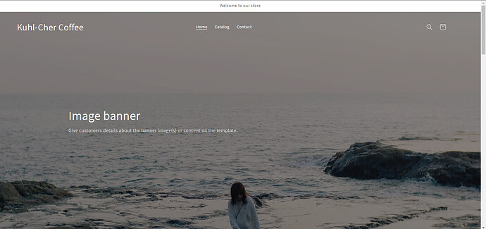
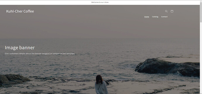
Hi, I would like to move the logo and the menu further down into the image banner as per the example shown from screenshot of Oslo Coffee.
I’m looking at basically replicating that same style with logo on one side and menu on the other, both larger and more pronounced.
Thanks!!
(How I want it to look)
(How mine currently looks)
@dekiv Can you share your store url ?
dekiv
January 3, 2023, 1:50pm
3
@dekiv Put below css into base.css file (Online store->themes->assets->base.css)
span.h2 {
    color: white !important;
    font-size: 30px !important;
}
a.header__heading-link.link.link--text.focus-inset {
    margin-top: 28px !important;
}
span.header__active-menu-item {
    color: white !important;
}
span.header__active-menu-item {
    margin-left: 496px;

}
svg.modal__toggle-open.icon.icon-search {
    color: white !important;
}
svg.icon.icon-cart-empty {
    color: white !important;
}
dekiv
January 4, 2023, 11:44am
5
@Ujjaval Thanks! And if I wanted to move both the logo and menu items further down the banner I would just need to change this one?
a.header__heading-link.link.link–text.focus-inset {
margin-top: 28px !important;
dekiv
January 4, 2023, 11:51am
6
@Ujjaval Also - Looking for logo and the other heading pages to be closer to the left hand side margin, rather than more in the middle like the css code you provided has done. How do I move the logo and headings closer to left margin whilst keeping the menu on the far right?
dekiv
January 4, 2023, 12:15pm
8
@Ujjaval Thank you. Would that apply to my second question above as well?
@dekiv which one ? can you repeat again?
dekiv
January 4, 2023, 12:24pm
10
@Ujjaval it is this question
dekiv
January 4, 2023, 12:26pm
11
@Ujjaval Also - Looking for logo and the other heading pages to be closer to the left hand side margin, rather than more in the middle like the css code you provided has done. How do I move the logo and headings closer to left margin whilst keeping the menu on the far right?
Ujjaval
January 4, 2023, 12:48pm
12
@dekiv add below css into base.css file
@media screen and (min-width: 1024px) {
.page-width {
    padding: 0px !important;
}
a.header__menu-item.list-menu__item.link.link--text.focus-inset {
    color: white;
}
span.h2 {
    margin-left: -142px !important;
}
.header--middle-left .header__inline-menu {
    margin-left: -166px !important;
    margin-top: 25px !important;
}
.header__icons {
    margin-right: -76px !important;
    margin-top: 27px !important;
}
}
dekiv
January 8, 2023, 4:46am
13
@Ujjaval Sorry I meant the “image banner” section and the subtitle underneath to be inline with the “Kuhl-Cher Coffee” logo section, so moved to the far left whilst keeping the menu items to the far right. Basically what these guys did with theirs:
@dekiv
@media screen and (min-width: 1024px) {

.page-width {
    padding: 0px !important;
}
span.h2 {
    margin-left: -142px !important;
}
.header {
    display: block !important;
}
.list-menu--inline {
   margin-left: 37% !important;

}
a.header__menu-item.list-menu__item.link.link--text.focus-inset {
    color: white;
}
.header__icons {
    margin-left: 92% !important;
    margin-top: -86px !important;
}
.banner__box.content-container.content-container--full-width-mobile.color-background-1.gradient {
    margin-left: -188px !important;
}
}
dekiv
January 11, 2023, 11:52am
15
@Ujjaval replace that code with the one you supplied above originally or add to it?
Ujjaval
January 11, 2023, 11:59am
16
@dekiv Add to it. Moderator Edit
dekiv
January 11, 2023, 12:13pm
17
@Ujjaval Thank you so much for all your help!


