Hello,
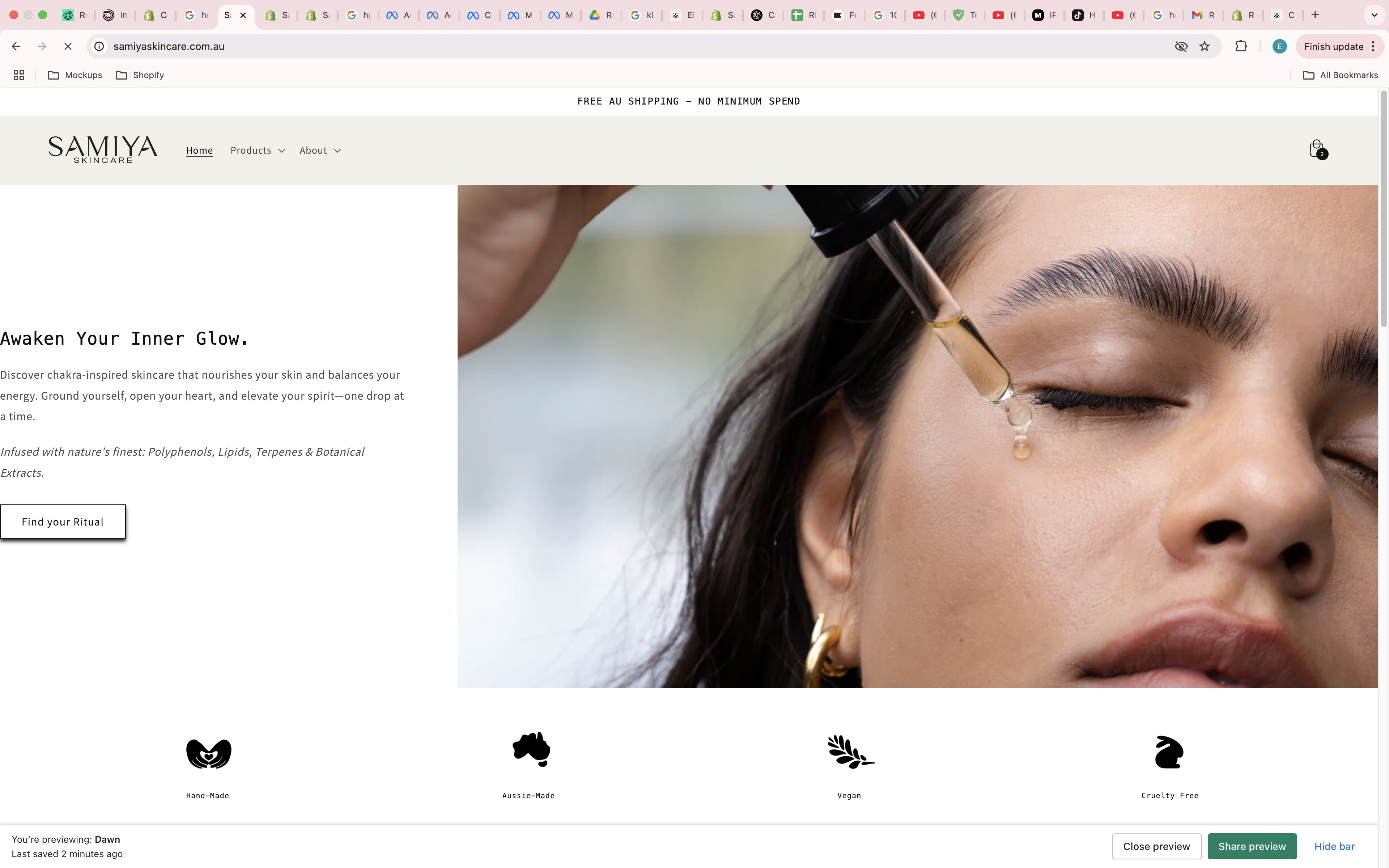
In desktop, my margin has been removed and in mobile, my text becomes uncentred when i remove the @media part.
I want a 6rem margin to the left of my page on desktop and want to keep it how it is in mobile, Can someone please assist me.
URL: www.samiyaskincare.com.au
PW: ellacoker
All your code missing { after ‘750px)’
DaisyVo
3
Hi @ellacoker
@media (min-width: 752px) {
    .full-width .image-with-text__text {
        margin-left: 6rem !important;
    }

    .full-width .image-with-text__heading {
        margin-left: 6rem !important;
    }

    .image-with-text__text-item .button.button--secondary {
        margin-left: 6rem !important;
    }
}
Have you tried replacing the code in the image with my suggested code?
Do they cause any errors after changing
Hi, I see it normal. Please double check on this
1 Like