- Hi im not getting any sales but lots of traffic please if i can get help
Website beautystarthere.net
A store owner reports high traffic but zero sales and seeks help. Multiple experts analyze the site (beautystarthere.net) and identify conversion barriers.
Key Issues Identified:
Recommended Solutions:
Status: Discussion remains open with actionable feedback provided but no follow-up from the original poster.
Website beautystarthere.net
Hi @Rav22 ,
This is Kate from PageFly - Shopify Advanced Page Builder app.
I’m genuinely impressed with your website. It has a stylish flair while remaining clean, clear, and professional. Based on my expertise in CRO, I’d love to offer some suggestions to improve the conversion rate and sales for your store.
Homepage
1. Add a Favicon
You should add a favicon to your store, using your store logo as the icon. Favicons enhance your site’s imagery, improving user experience, branding, and professionalism. They also help visitors quickly find your page when multiple tabs are open.
2. Modify your menu navigation
simplifying your navigation by keeping only the main headings like Homepage, Collections, Best Sellers, About Us, and Contact Us. This will make it easier for customers to browse and find products. If you have headings related to product types, you can include them as subcategories under a main heading like Collections.
3. Have the About Us page
You should create the About Us page and add it to the navigation menu of your homepage.
This page helps customers have an overview of the store and is also one way to impress customers. It often includes some main parts such as
4. Have a testimonial section on your homepage
Including customer testimonials, ratings, or reviews prominently on the home page and product pages can significantly boost trust and credibility. This social proof can be a powerful motivator for new customers to make a purchase.
Product Page
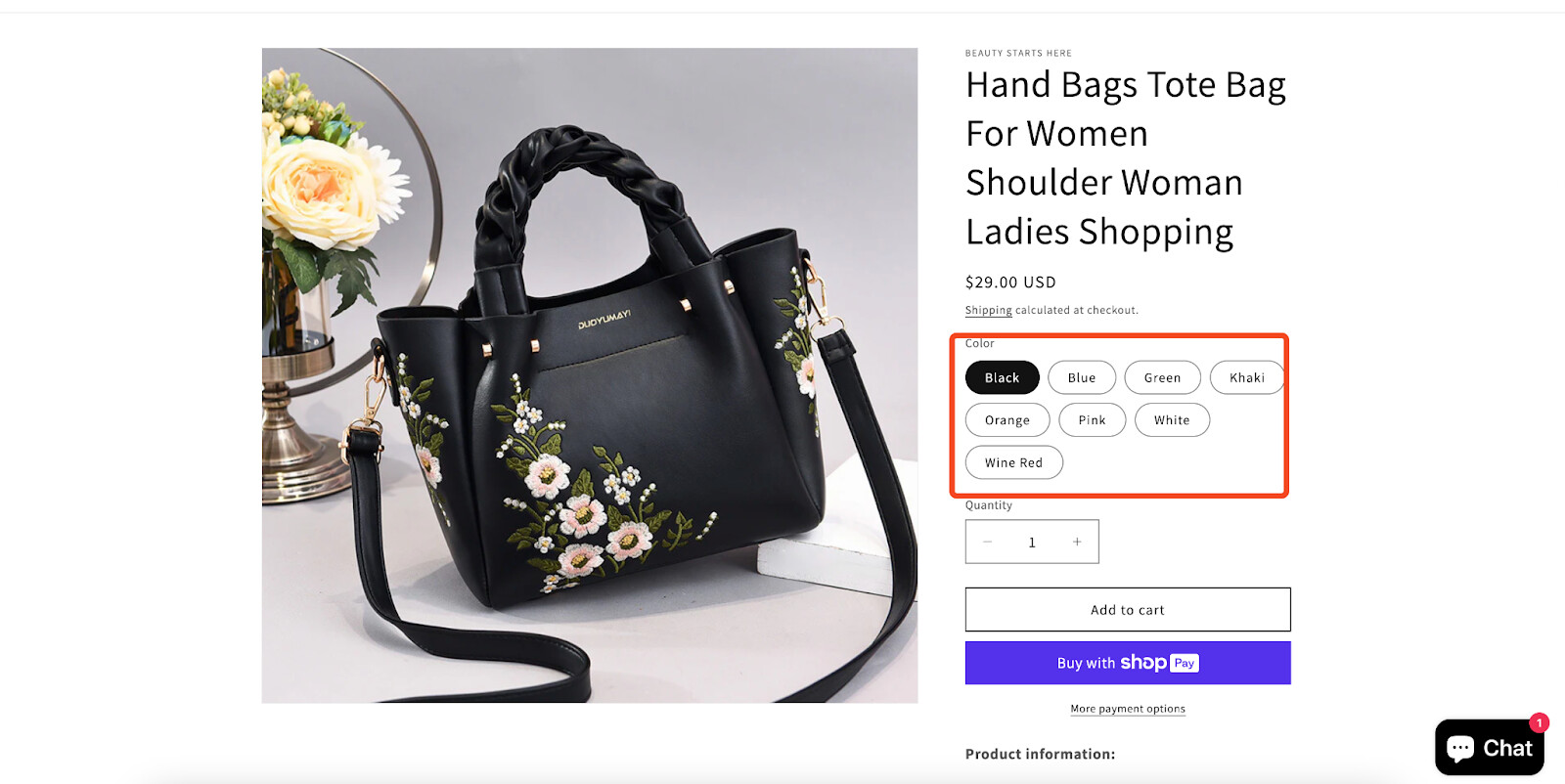
Use Color Swatches
For products available in multiple colors, it’s essential to use color swatches on your product page. Make sure to assign a unique image to each color variation for better visual display.
Color swatches offer a more intuitive and engaging shopping experience, allowing customers to easily view and select their preferred color option, which can significantly improve decision-making and overall user satisfaction.
I hope you find these suggestions helpful in optimizing your website’s conversion rate and sales. If you have any further questions or need additional assistance, please don’t hesitate to reach out. I wish you the best of luck with your online venture.
Best regards,
Kate | PageFly Team
Hey @Rav22 this is Alexis from Akohub! Your website has a really nice aesthetic, and it’s clear you’ve put a lot of work into building a strong vibe around your brand. With a few tweaks, you could enhance the shopping experience even more and possibly boost conversions!
First off, let’s talk product descriptions. Right now, you’ve got the essential info, but adding more detail could help shoppers connect with the products. Think about including descriptions of the fabric’s feel, fit, and weight, plus styling suggestions or any unique details that make each item stand out. This can help online shoppers imagine themselves in the product, which is super important since they can’t see or touch it in person.
Next, I’d recommend adding customer reviews on each product page. Reviews provide that valuable social proof that online shoppers need to feel confident about a purchase. When people see others’ experiences, especially positive ones, it builds trust and makes them more likely to buy. Even if you’re just starting out, encouraging early customers to leave a review can go a long way in building credibility over time.
Your navigation menu could also use a little simplifying. There’s a lot going on right now, which might feel overwhelming for first-time visitors. Consider grouping items into broader categories like “Clothing” and “Accessories,” then using dropdowns for more specific options. Streamlining the navigation helps users find what they’re looking for faster and keeps the browsing experience smooth and enjoyable.
Now, in terms of retention and bringing people back, consider adding Ako Loyalty and Ako Retargeting to the mix. Ako Loyalty lets you reward customers with points for purchases, referrals, or even just signing up, which can help you build a community of repeat buyers. A loyalty program is an awesome way to encourage long-term engagement with your brand. Then there’s Ako Retargeting, which can display ads to visitors who left your site without purchasing, reminding them to come back and finish their purchase. Retargeting is a low-effort but highly effective way to capture those missed opportunities, especially during peak shopping seasons.
With these changes, you’ll create a more engaging, trustworthy, and smooth shopping experience for your visitors. Good luck, and I hope these tips help boost your conversions!
Hi @Rav22
The first piece of advice is to check community posts with the same or similar title but the same issue. There are a lot of good advice that repeats over time. And those would help you out.
Personally, I think you will have issues because of .net domain. It is not so common for online stores and could raise a red flag. Next is the default, free theme. While it is fast it does not give enough features, especially for your kind of business. For me, a lack of contact information is another red flag. Just an email is not enough, are you business? Have some registered number, address, phone ? Without that, I just close the store and search elswhere.
Hey Rav22,
Heddy from Gameball: Loyalty Program & VIP here!
I checked out your website, and here’s my honest feedback:
Hi @Rav22 , I’m Tracy from BON Loyalty, the top-rated Shopify loyalty app.
I had a chance to explore your website, and it’s really great! Your product selection is super diverse, and the site looks very promising. I do have a few suggestions that might help make your website even better:
If you find these suggestions helpful for you, please let me know by giving BON Loyalty a ‘LIKE’ or marking it as a ‘SOLUTION’. ![]()
Best,
Tracy from the BON Loyalty team
Hi @Rav22
It sounds like you’ve put effort into driving traffic to your website, which is great! However, if you’re not converting that traffic into sales, there are a few things to check and improve. Here’s a breakdown to help you troubleshoot and optimize your site:
Here’s a screenshot of a few things you might want to check on your homepage for better conversion:
(Insert an annotated image of the website pointing out areas for improvement, such as CTAs, navigation, or product highlights.)
If you’ve already done all of this and still aren’t seeing results, feel free to share more details about your traffic sources, products, or any specific struggles. Sometimes a fresh perspective can help identify overlooked opportunities.
If you need any other assistance, feel free to reply and I will try my best to help.
Best regards,
Daisy