Problem with the menu on my homepage on mobile

Hello everyone,

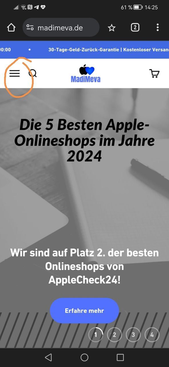
I have a problem with my menu on the homepage.
When I want to click it on mobile, it automatically activates my logo button instead,
which means, that no one is able to get to the hamburger menu.

I have made a screenshot to show the button I am talking about.

It is also weird that if I click “Erfahre mehr” that my Phone protection comes Instead of the website I assigned.

I have changed my h1 code, but I have no clue since how long I have the problem.
I had the problem in the past also, and it got fixed by updating to the newest version of the theme.

Now I have the problem, that it is already updated to the latest version.

It would be amazing if someone could help me.

Greetings
Marc

go to online store, edit code of your theme. search theme.css and this css:

.header__icon-list {
    z-index: 22;
    position: relative;
}
2 Likes
  • Here is the solution for you @Marc104
  • Please follow these steps:

  • Then find the theme.css file.
  • Then add the following code at the end of the file and press ‘Save’ to save it.
.header__main-nav {
 z-index: 999 !important;
}
  • Here is the result you will achieve:

  • Please press ‘Like’ and mark it as ‘Solution’ if you find it helpful. Thank you.
1 Like

Thank you very much.

It has fixed the problem with the menu!

Unfortunately, the problem with the button i have described is still there. Here is a screenshot.

As I said, when I click it on mobile, I get directed to my phone case collection which is on the
2nd site.

On Desktop, everything is correct.

Would appreciate your help here also.

Greetings
Marc

1 Like

I checked and found that the reason for the error is because the link of this button leads to that website. Please review the button path configuration and edit it so it updates again.

1 Like

I have updated and it works.

Thank you very much!

1 Like