I have noticed an issue on with the menu/navigation on my website customcamping.co.uk that wasn’t previously a problem.
The menu is not working correctly on both mobile and desktop:
desktop - can not select the sub-items in the drop down -see screen shot.
Mobile - page title text interferes with the menu and also, when clicking the sub items it opens up the image behind it.
Hopefully someone has an answer for this.
Thanks,
Simon
Hi @SimonButterwort ,
You can solve the issue by following this instruction
Go to store admin > Sale channels > Online store > Themes > Edit code > Assets > base.css, add this code at the bottom, Save file and reload your page and check again.
.header-wrapper { z-index: 3 !important; }
Hello @SimonButterwort ,
You can follow these steps:
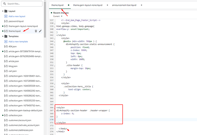
Go to Online Store->Theme->Edit code
Open your theme.liquid file, paste the below code before
I hope the above is useful to you.
Kind & Best regards,
zaczee
March 28, 2023, 8:42am
4
Hi @SimonButterwort ,
Add this CSS code
@media screen and (max-width: 749px) {
  .banner--mobile-bottom:not(.banner--stacked) .banner__content {
    z-index: -1;
}
}


