I would like to reduce the overall height of the rectangles in the multirow section. It allows me to reduce the size of the image but not the overall text and image together. I would prefer custom css to insert into the multirow section box if possible.
1 Like
Hi @SweetViolet ,
Please share website url.
It’s on the homepage - I’ll activate it now so you can see it. It doesn’t have any content yet.
Go to Online Store, then Theme, and select Edit Code.
Search for base.css/theme.css/style.css/main.css/custom.css file Add the provided code at the end of the file.
.multicolumn-card__info {
    padding: 1.5rem !important;
}

.multicolumn .button {
        display: none !important;
 }
Thanks, do you mean the multicolumn? This one?

The size of this depend on the default page-width 120rem. If you like to make it more lesser try this one.
- From your Shopify admin dashboard, click on “Online Store” and then “Themes”.
- Find the theme that you want to edit and click on “Actions” and then “Edit code”.
- In the “Assets” folder, click on “base.css, style.css or theme.css” file, depending on which file your theme uses to store its CSS styles. At the bottom of the file, add the following CSS code:
.multicolumn .grid--3-col-desktop .grid__item {
    width: 25%;
    max-width: 25%;
    margin: auto;
}
- And Save.
- Result:

Please don’t forget to Like and Mark Solution to the post that helped you. Thanks!
1 Like
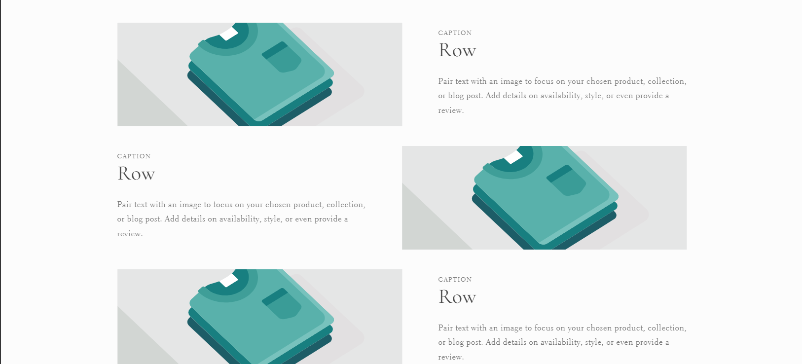
No, I’m sorry I was talking about the multirow which has 3 rows that look like this:

I do appreciate the other code though, I’m sure I will use it.
No worries, Try this one same instruction.
.multirow__inner .image-with-text__grid.grid {
    width: 70%;
    margin: auto;
}
And Save.
Result:

This will aslo change in the mobile screen. You can adjust the % of the width.
Please don’t forget to Like and Mark Solution to the post that helped you. Thanks!
1 Like
@media (min-width: 769px){
.blog__view-all.center.small-hide.medium-hide.scroll-trigger.animate--slide-in.scroll-trigger--offscreen {
    display: none !important;
}

.image-with-text__media-item.image-with-text__media-item--medium.image-with-text__media-item--middle.grid__item {
    width: 30% !important;
}

.image-with-text .grid {
    width: 88% !important;
    margin: auto !important;
}
}
1 Like
Both of those were pretty good in reducing the width, but I am trying to reduce the height, like this:
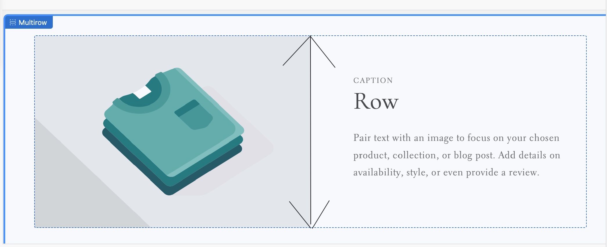
Maybe I just have to figure out a way to reduce the size of the image, and the whole box will reduce in height with it?
Hey!
Just to put something out there that might help you solve this quickly: EasyEdits is a click-and-change editor. (disclaimer) I’m the developer. You can try it free and keep all your changes permanently, even without ever paying. You’d just click any section and adjust the height.
Hope it works out—let me know how it goes!
1 Like
Got it, try this one.
Same Instruction.
@media screen and (min-width: 750px) {
    .multirow__inner .image-with-text__media {
        min-height: 50%;
}
    .image-with-text__media--placeholder.image-with-text__media--adapt,
    .image-with-text__grid.grid, .image-with-text__media-item {
        height: 20rem;
    }

.multirow__inner .image-with-text__content {
        padding-top: 1rem;
        padding-bottom: 1.5rem;
    }

}
And Save.
Result:
Please don’t forget to Like and Mark Solution to the post that helped you. Thanks!
1 Like
This app looks great. One question - what happens when you do an update? Do you need to reload all of your edits?