Hi, I am looking the whole day to customize “Multirow” in Craft Design.
The multirow is too big in my eyes and i would like to customize it. Furthermore is the picture way to big. Can I customize the hight somehow?
Thank you very much
Hi, I am looking the whole day to customize “Multirow” in Craft Design.
The multirow is too big in my eyes and i would like to customize it. Furthermore is the picture way to big. Can I customize the hight somehow?
Thank you very much
Hi @localbrew , it’s hard to see which changes need to be done from the image. Could you share the link to the store?
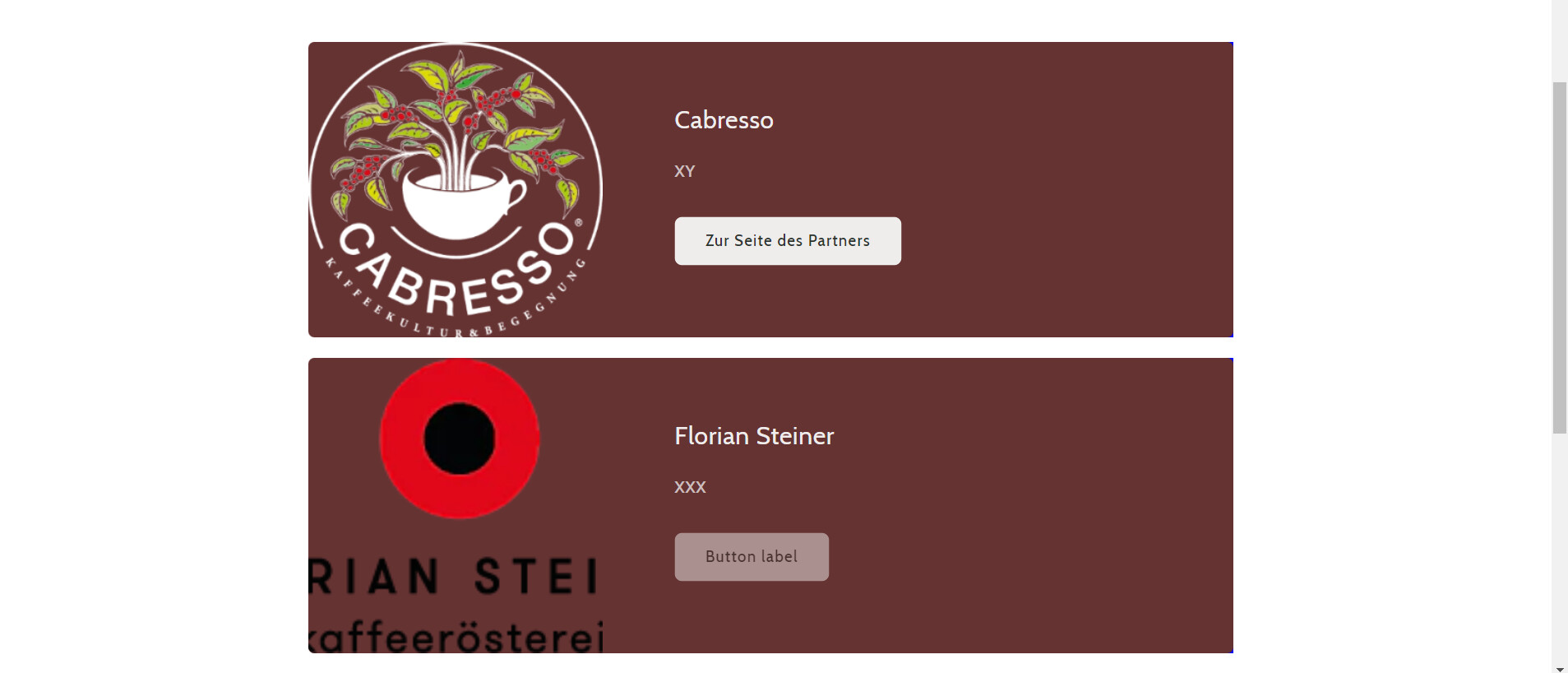
Hey @MichalKopec , thank you for your respons: The Link is https://www.localbrew.de/pages/unsere-partner and password: Local%&2000
Thanks, I will have a look in the evening. If you could send an idea of the ideal size of the images in that section that would be great.
Thank you for your time in advance.
i would like the logo to be smaller, right now it is completely out of proportion. Above it is a “dummy” section and this is what the logos look like. These should fit in there. In addition, the height of the individual sections should be 25% smaller.
Is it also possible to add a link to the website under “To the partner’s page” but that it opens in the background and not directly to the website?
Hey @MichalKopec . Can i provide you with any other informations? 
Hey @localbrew , sorry I’ve just managed to get back on this one. I’ve managed to alter the css in order to fit the images better into the rows:
.media>*:not(.zoom):not(.deferred-media__poster-button), .media model-viewer {
    height: auto!important;
    width: 75%!important;
    margin-left: 12.5%!important;
    margin-top: 12.5%!important;
}
For the button to open links in a new window you need to set target=“_blank” on the a tag:
For the other changes I’d have to have access to the theme, since I can’t do them looking at the css in the browser only.
thank you very much for the help, i have found out how and in which files to insert the customisation. Thank you very much!
Can I send you a theme or can you tell me how to find multirow? Probably in theme.liquid?
You can try this to make the rows a little smaller:
@media screen and (min-width: 750px) {
  .image-with-text__content {
      padding: 2rem 7rem 2rem!important;
  }
}
thank you very much, i think it worked again, because like in the picture below, the bottom section is smaller… but now the sections are not the same… sorry… It’s probably because the pictures have different heights… but if i make the top image smaller, it just gets blurrier and the size is pulled to at least some size… Is there any way I can set it so that the image is not resized when I upload an image if it is set to “small” in the image section?
and secondly that the sections always remain the same size?
Hey @localbrew , I saw you’ve already fixed the vertical issue of those sections. Yes originally the different row heights were depending on the height of the images.