How would I do to expand the search bar in publisher theme ?
Hi @masudamc20 , Can you kindly share your store link with us? We will check it and suggest you a solution if possible.
hi @masudamc20
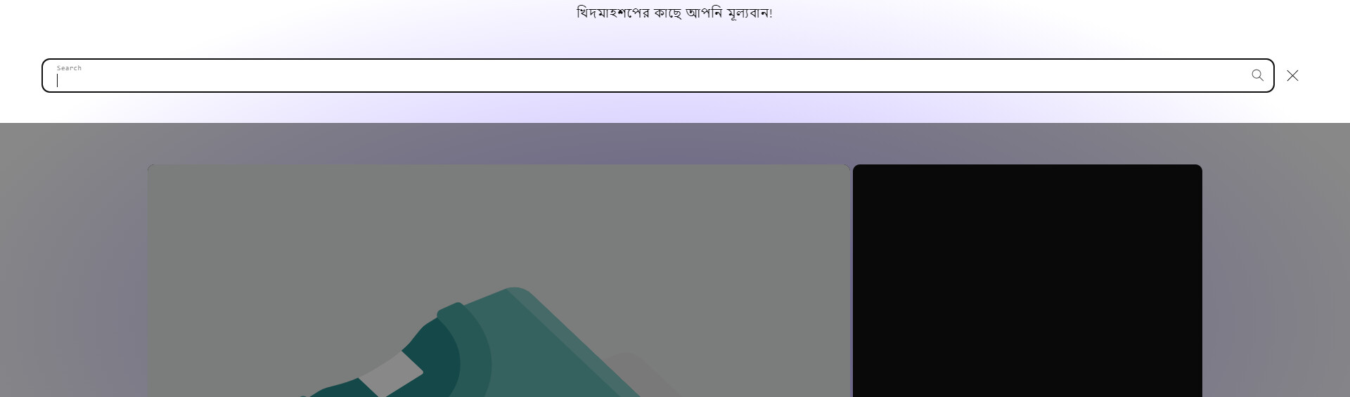
Step 1. Go to Admin → Online store → Theme > Edit code
Step 2. Find the file base.css. Search for the following CSS snippet
@media screen and (min-width: 990px) {
    .search-modal__form {
        max-width: 74.2rem;
    }
}
Please change to it
@media screen and (min-width: 990px) {
    .search-modal__form {

    }
}
Result
If it helps you, please like and mark it as the solution.
Best Regards
Hi @masudamc20 ,
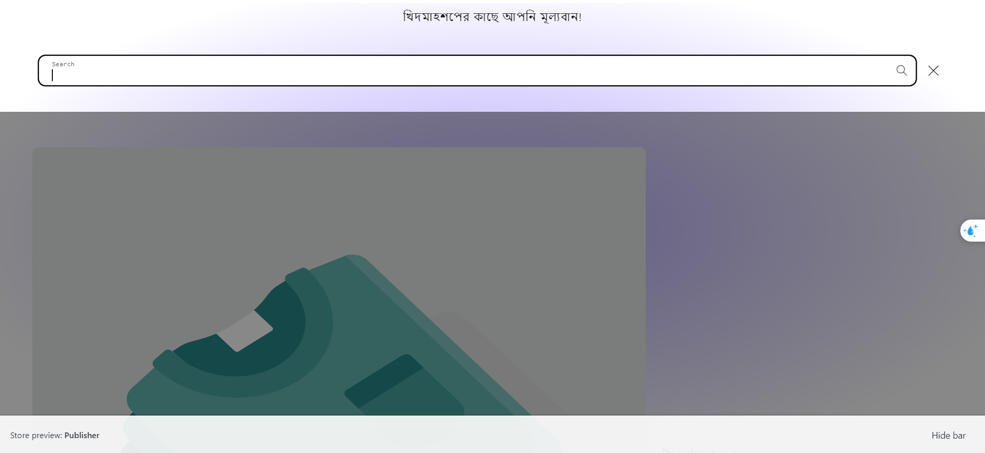
Step 1: Go to Shopify Admin → Online Store ->Theme → Edit code

Step 2: Search file theme.liquid
Step 3: Inside head tags. You need create style tags. After insert my code inside style tags

@media only screen and (min-width: 990px) {
    .search-modal__form {
        max-width: 100% !important;
    }
}
Here is result:
Hope this can help you,
If our suggestions are useful, please let us know by giving it a like or marking it as a solution. Thank you 

oh sorry
Please use this code snippet
@media screen and (min-width: 990px) {
    .search-modal__form {
       max-width: 100% !important;
    }
}
yes. I have done. still the problem exist.
I’ve noticed the search bar has extended. What other issues are remaining?
Are you looking to expand the height of the search bar?
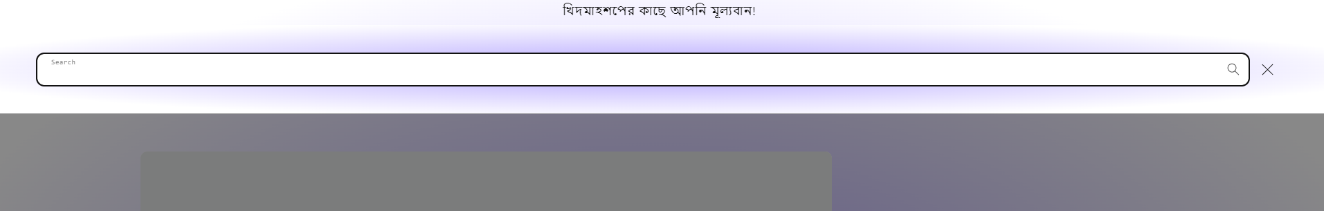
I want the search bar is visible always as the picture attached. thank you for your continuous support with patience.

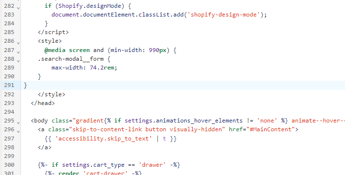
Step 1. Go to Admin → Online store → Theme > Edit code
Step 2. Find the file base.css. Search for the following CSS snippet
@media screen and (min-width: 990px) {
    .header--top-left, .header--middle-left:not(.header--has-menu) {
        grid-template-areas:
        'heading icons'
        'navigation navigation';
        grid-template-columns: 1fr auto;
    }
}
Please change to it
@media screen and (min-width: 990px) {
    .header--top-left, .header--middle-left:not(.header--has-menu) {
        grid-template-areas:
        'heading searchbar icons'
        'navigation navigation navigation';
        grid-template-columns: 1fr 1fr 1fr;
    }
    .header__search {
        display: none !important;
    }
}
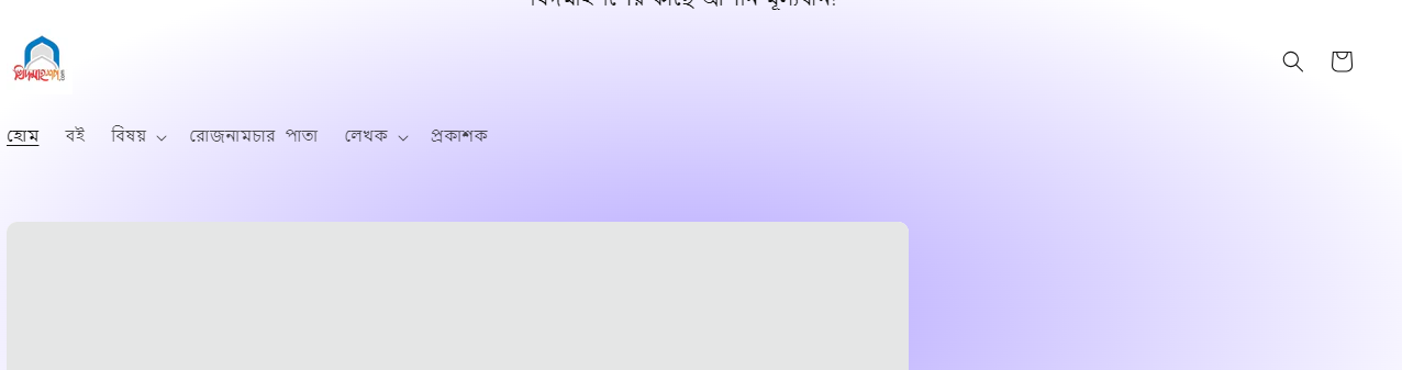
Step 3. Find the file theme.js or global.js. Add the following JS snippet
(() => {
if(window.innerWidth > 750) {
let checkExistInterval = setInterval(function() {
    let heading = document.querySelector(".header__heading");
    let predictiveSearch = document.querySelector("predictive-search");
    if (heading && predictiveSearch) {
        heading.insertAdjacentElement("afterend", predictiveSearch);
        clearInterval(checkExistInterval);
    }
}, 100);

setTimeout(function() {
    clearInterval(checkExistInterval);
}, 10000);
}
})()
Result
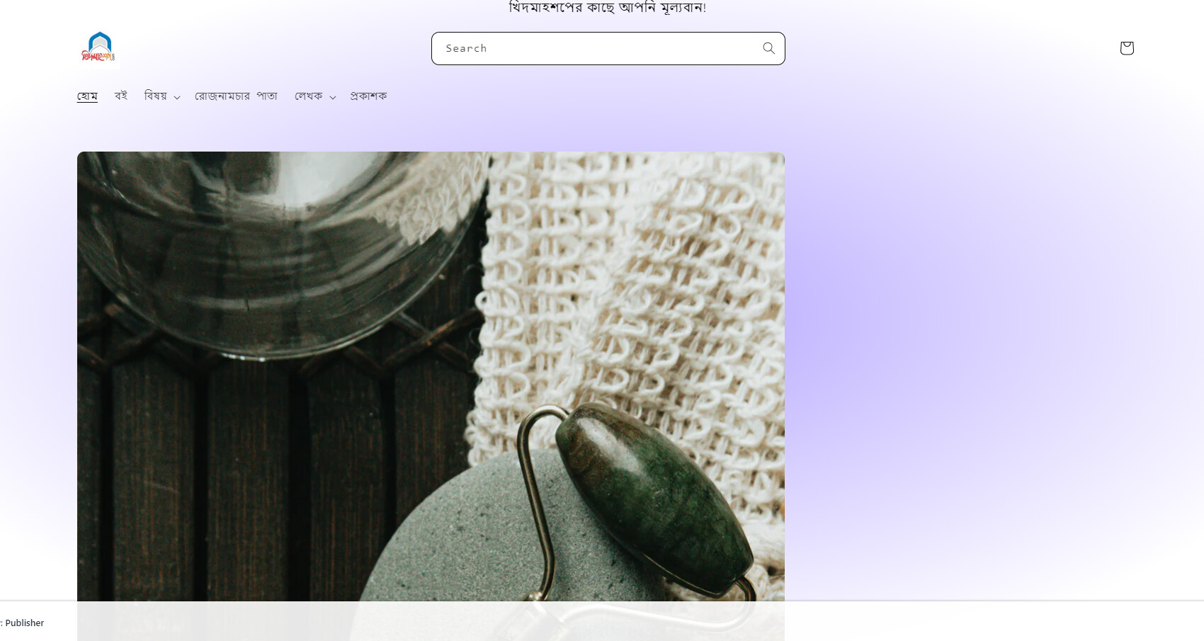
If it helps you, please like and mark it as the solution.
Best Regards
1 Like
this solution is working. thank you again! you are a real expert on shopify.
1 Like
Hi i see this is something i would like to have on my site. Could you please help me for which solution i need to make my search bar long and in the centre
here is my site url angrysuzy.co.uk