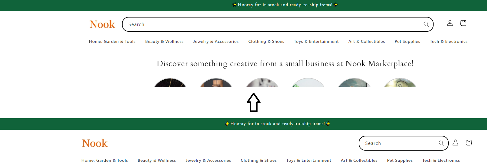
Hi,
how can I extend the search bar?
Dawn Theme 15.0.0
Url: https://ba571d-cc.myshopify.com/
Thank you.
A user seeks to extend the search bar width in their Dawn Theme 15.0.0 Shopify store.
Solutions Provided:
Multiple community members offered CSS code snippets to increase the search bar width:
base.css or theme.liquid using a media query targeting screens 990px and wider.search-modal__form to max-width: 100rem or 100% with !important flagsOutcome:
The original poster confirmed the solution worked successfully. One contributor noted a tablet display issue emerged after implementation and suggested reviewing the responsive behavior. The discussion concluded with the issue resolved and an offer for further assistance if needed.
Hi,
how can I extend the search bar?
Dawn Theme 15.0.0
Url: https://ba571d-cc.myshopify.com/
Thank you.
@store095 , go to base.css and add the following code to the end of it :
@media (min-width:990px){
.search-modal__form {
    max-width: 130rem !important;
    width: 100rem !important;
}

}
Hello @store095
You can add code by following these steps
Go to Online Store → Theme → Edit code.
Open your theme.liquid file
Paste the below code before on theme.liquid
Was my reply helpful? Click Like to let me know!
Was your question answered? Mark it as an Accepted Solution.
Hi @store095 ,
Please go to Actions > Edit code > Assets > base.css file and paste this at the bottom of the file:
@media screen and (min-width: 990px) {
    .header--top-left, .header--middle-left:not(.header--has-menu) {
        grid-template-columns: auto 1fr !important;
    }
    .desktop-search,
    .header__icons {
        width: 100%;
    }
    .search-modal__form {
        max-width: none;
    }
    .search-modal__form {
        max-width: 100%;
    }
}
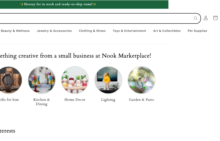
It will help you display well for all devices, including ipad pro
Hi @store095 ,
Now with the changes, the header at your tablet is getting the same error as I described before, so you can check it again and try the solution I sent.
hope it can help you
Amazing. Thank you so much!
Hi @store095 ,
You’re welcome. If you have any questions, you can contact me directly.
Nice to meet you 