Hello,
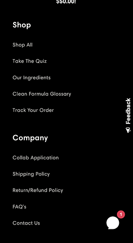
Currently using Sense theme and the mobile footer only displays the footer menus in one vertical column. I would like it to be two columns (side by side). Does anyone know a CSS code I can add to this section?
Here is how it currently looks:
I would like to save space/scroll time and have it to look something like this
:
Another option would be making the menus be drop down like this (not sure if this would be easier or harder):
Website is issamiracle.com .
Thank you so much in advance!
I am tagging a few page contributors that solved similar discussions, however those codes did not work for me.Hoping you guys can help!
@PageFly-Victor @PageFly-Kate @PageFly-Richard @ParthBhut @Michael144 @GemPages @LitExtension
1 Like
Hi @Melinda5
You can try adding the below code:
Go to Online Store → Theme → Edit code https://prnt.sc/XkUYXZPnym_E
Open your base.css in the Assets folder.
Paste the below code at the end of the file
@media screen and (max-width: 749px){
  .footer .grid {
    display: flex !important;
  }
  .footer-block.grid__item{
    width: 45% !important;
    margin: 0 !important;
  }
  .footer-block.grid__item:first-child, .footer-block.grid__item:last-child {
    width: 100% !important;
  }
}
Result:
Best regards,
2 Likes
Litos
March 7, 2023, 7:44am
3
Hi @Melinda5 ,
Please go to footer.liquid file and change all code here:
Code:
{%- if block.settings.heading != blank -%}
                ## {{- block.settings.heading | escape -}}
              {%- endif -%}

              {%- case block.type -%}
                {%- when 'text' -%}

                    {{ block.settings.subtext }}


                {%- when 'link_list' -%}
                  {%- if block.settings.menu != blank and block.settings.heading != blank -%}

                      {%- for link in block.settings.menu.links -%}
                        - {{ link.title }}


                      {%- endfor -%}


                  {%- endif -%}
Hope it helps!
2 Likes
Thank you so much for that!
Thank you so much!!! I really appreciate it. Do you know if it is possible to center the columns also or is there not enough space for that?
Thank you!
Litos
March 8, 2023, 11:49am
6
Hi @Melinda5 ,
Please go to Actions > Edit code > Assets > base.css file and paste this at the bottom of the file:
@media screen and (max-width: 749px) {
.footer-block.footer-block--menu {
text-align: center !important;
}
.footer-block.footer-block--menu .list-menu__item--link {
justify-content: center !important;
}
}
Hope it helps!
Litos
March 9, 2023, 4:25am
7
Hi @Melinda5 ,
If you want to add drop down for mobile you can follow my previous tutorial it will work fine.
Hope it helps!
I tried it, but it didn’t do anything
1 Like
Hello again, would the same code apply to the dawn theme, to get the dropdown footer menu. If so, where would I paste the code?
Thank you again!!
Divin3
February 3, 2024, 1:12pm
10
All it did was make my footer disappear. I thought this was to make footer columns??


