Issue: Black padding appears above product images when zooming on mobile in Shopify’s Dawn theme; user seeks a CSS fix that doesn’t affect product videos.
Proposed fix: Add a mobile-only CSS rule in base.css targeting img.global-media-settings.global-media-settings–no-shadow.active with padding-top: 0 (via @media max-width: 767px). This aims to remove the extra top space during zoom.
Interim concern: User reported the video became larger than product images. They shared existing CSS rules that control media sizing (e.g., padding-top: 133% for deferred media on desktop, padding-top: 100vh for modal on mobile, and video/image sizing tweaks), suggesting possible conflicts.
Guidance: Advisor recommended removing conflicting CSS and re-adding rules incrementally to isolate issues. Media queries (CSS rules for specific screen widths) were noted as potential overlap points.
Outcome: User confirmed the video size issue was due to an unresized source video, not the new CSS. The padding fix works, no further changes needed.
Context: Screenshots were provided; store URL and password shared for verification. Dawn is Shopify’s default theme; CSS media queries adjust styles per device width.
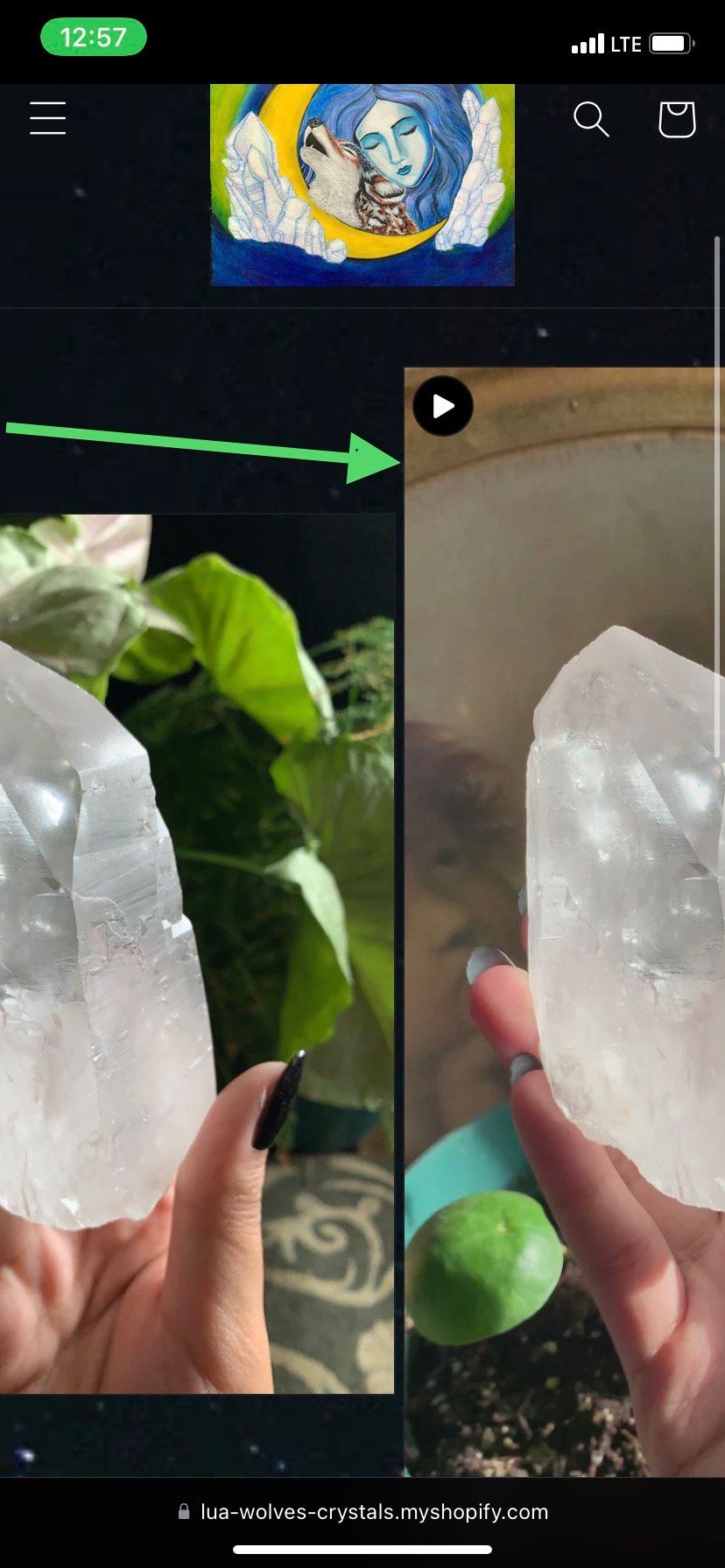
Hi, I need help on how to remove this black padding on top of my product images when you click to zoom in. It’s only apparent when viewing my website from an actual mobile screen. I’ve been trying to search for a solution the past weeks. I’m looking for a code to fix this where it doesn’t affect my other code for my product video. Please help asap. Thanks so much. Here is a pic as reference of the issue:
Hi! Thank you! The code works. But its affecting the size of my video. I wanted the video size to be the same ratio as my product photos. Would you know how to fix this? Thanks!
I also, have these codes that are in my file. One of the codes was used to scale the product video size to the same size as my product photo. Not sure if one of them is interfering or causing the issue. But here’s a copy of it.