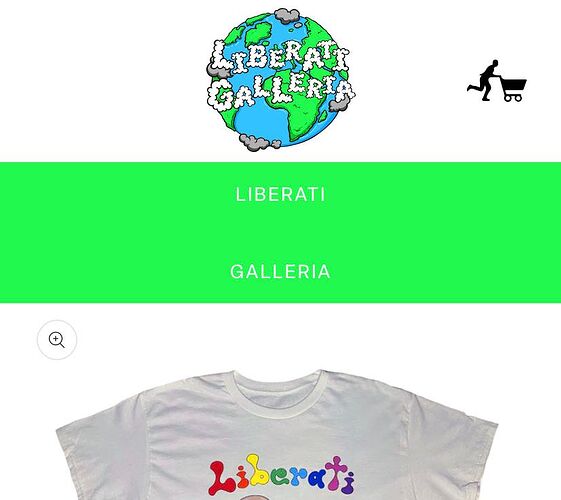
When viewing my store on mobile devices the buttons appear in a column like this:
I am trying to get them to appear side to side- the way they do on desktop.
They do appear side to side on mobile when in landscape mode, see below:
They are only stacked in portrait mode.
I would like them to be side by side like the second picture in both portrait and landscape.
If anyone knows any code I can use to fix this please help! Thanks.
my website is https://liberatigalleria.com/ and I am using the theme “Origin”.
Look for settings related to “buttons,” “mobile view,” or “layout options” in your theme admin panel. Some themes allow adjusting button alignment or switching between single or double column layout for mobile devices.
Hi @Liberati Please add the code in your base.css file.
@media only screen and (max-width: 620px){
.rich-text__buttons--multiple>*{
min-width: 0px !important;
}
}
If you are not sure where is your base.css file please follow the steps:
- Login in shopify admin.
- Click on the Online Store.
- Then click on the button next to Customize in live Theme.
- Click Edit Code.
- Search base.css in the code in left hand side.
- You can add the above code at the bottom of the file.
Result:
If you will unable to implement the same then I’m happy to do this for you, let me know. I can implement the code changes so that this will work well for you.
Hopefully it will help you. If yes then Please don’t forget hit Like and Mark it as solution!
Best Regards
Sahil
Hi @Liberati
You can add code by following these
-
Go to Online Store → Theme → Edit code.
-
Open your section-rich-text.css file
-
Paste the below code
@media screen and(max-width:767px){
.rich-text .rich-text__buttons–multiple>* {
flex-grow: unset !important;
min-width: unset !important;
}
}


