I’m currently encountering a problem where on desktop, the image banner quality is great. However on mobile it becomes blurry.
Desktop:
Mobile:

Here is my site preview link: https://npk609xh9xfzlm9u-75017814299.shopifypreview.com
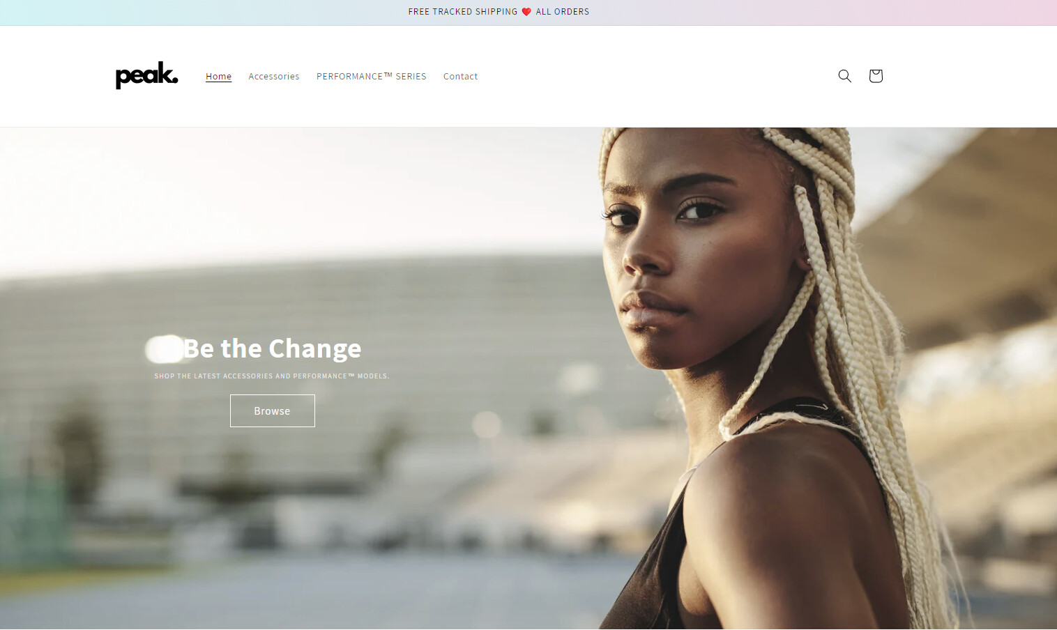
I’m currently encountering a problem where on desktop, the image banner quality is great. However on mobile it becomes blurry.
Desktop:
Mobile:
Here is my site preview link: https://npk609xh9xfzlm9u-75017814299.shopifypreview.com
Hi @pushthepeak
This is Lucas from PageFly - Landing Page Builder App
You can try this code by following these steps:
Step 1: Go to Online Store->Theme->Edit code.
Step 2: Search file base.css
Step 3: Paste the below code at bottom of the file → Save
@media screen and (max-width: 767px){
.banner__media.media img {
object-position: 75.1724% 25.2874% !important;
}}
Hope that my solution works for you.
Best regards,
Lucas| PageFly
Check your theme’s settings: Review the theme customization options or settings to see if there are any settings related to image quality or optimization for mobile devices. Some themes offer separate settings for optimizing images for different screen sizes. Make sure the settings are configured properly for optimal image quality on mobile.
Optimize your images for mobile: Ensure that the images you are using in the banner are optimized for mobile devices. Large file sizes or high-resolution images may take longer to load on mobile, leading to blurry or compressed appearance. Use image editing software or online tools to resize and compress the images appropriately for mobile devices while maintaining a good balance between image quality and file size.
Use high-resolution images: If the images used in the banner are not high-resolution, they may appear blurry on high-density (Retina) displays on mobile devices. Consider using high-resolution images (with appropriate file sizes) to ensure sharpness and clarity on mobile devices.
Check image dimensions and aspect ratios: Make sure the images are properly sized and have the correct aspect ratio for the banner section on both desktop and mobile. If the images are stretched or compressed to fit different screen sizes, it can affect their clarity and quality.
This just changed the focal point of the image, the quality stayed the same.
How could I make the website load a different image depending on whether the user is on a mobile or desktop?
I ran into exactly the same problem on my theme. Did you manage to solve it in any way?