Hi. My background image on my phone looks zoomed in. Everything on the desktop, including mobile view looks fine. But when I went to check on my phone, it’s zoomed in like the picture I attached. Does anyone know how to fix this? Launching my store soon and need help asap. Thank you.
Here’s the background code I used:
.gradient {
background-image: url(https://cdn.shopify.com/s/files/1/0655/6113/3295/files/Untitled_design_2.png?v=1659251819);
background-repeat: no-repeat;
background-size: cover;
background-attachment: fixed;
}
store url: https://lua-wolves-crystals.myshopify.com
password: bahcri
Hi,
You may add
background-position: center;
to make the background image centered.
To make it better look, you may make another background image to fit on mobile as below.
@media screen and (min-width: 740px) {
  .gradient {
    background-image: url(https://cdn.shopify.com/your-mobile-background-image-url);
    background-repeat: no-repeat;
    background-size: cover;
    background-attachment: fixed;
	background-position: center;
  }
}
Please change the image URL to match the mobile background file location.
I would recommend that the background image width to be less than 800px and bigger than 740px to fit on mobile view.
Hope it helps.
Thanks.
Thank you for your help. Unfortunately, it didn’t work for me and still showed the same issue no matter if i resize the image for mobile screen. 
I checked my other pages and the background seemed fine for some of them on my phone. Except, my home page and a couple others. My home page is the most zoomed in for the background image though.
Hi,
Did you add the code below to your base.css file?
.gradient {
  background-position: center !important;
}
I don’t see the code was added to the base.css file yet.
Please add it and let me see the change.
Thanks.
I added both codes. I tested them out one at a time and then inputted both codes but the background image on my phone is still blurry.
I checked it on my phone and it looks fine.
If you want it to be better look, you should make the background image for the mobile view and use the code in my first reply (for mobile). The current background image is landscape for PC and you need to create a portrait image for mobile background for better look.
Hope it helps.
Thanks.
Hi @Popcorn you can try this code.
@media(max-width:786px){
.gradient{
background-image: url(https://www.linkpicture.com/q/Untitled_design_2.png);
background-size: 100% 100%;
}}
I have used a dummy portrait image, plz use your own portrait image URL
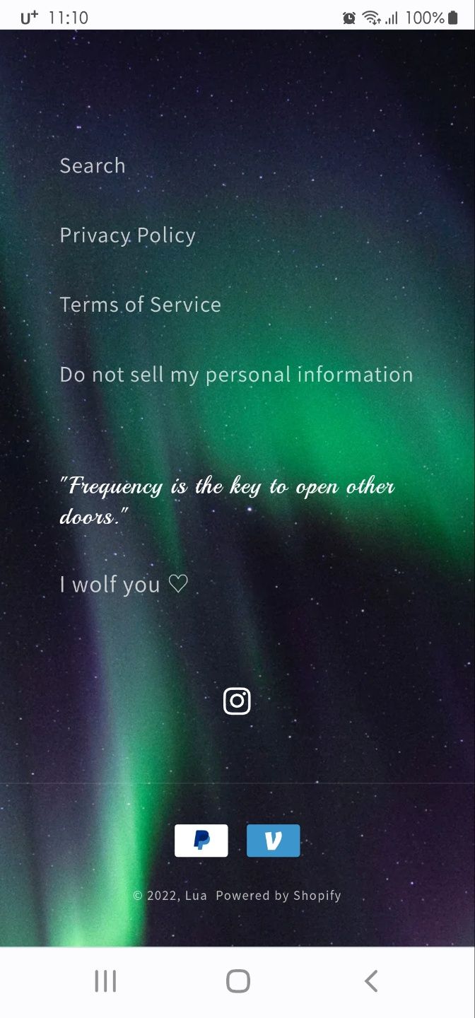
This is what I’m seeing from my side. Even when I tried both landscape and portrait image for my mobile background. Still comes out blurry for me.
Hi, I used your code and my background image came out like this. I’m not sure on how to fix the size. I’m using an iPhone. I checked it on an android and my background image looks perfectly fine there. Just not on my phone.


