Hi @Guyshoham6 ,
This is Richard from PageFly - Shopify Page Builder App. After looking into your store, I have some comments below and hope that you can consider them to improve your site.
HOMEPAGE
1. Set all product images in the same size
The product images in the product list below have different sizes that make the product list look unaligned. You should set product images in square size so that it will look more beautiful and professional.
2. Add more content in your homepage
2.1. Add blog section
The website has a blog section that provides customers with useful information and tips on choosing the jewelry. This can be a valuable resource for the ones who are looking to find the suitable ring, necklaces, etc
2.2. Add a section about brand history
Adding a brand history section on the homepage can establish credibility, create an emotional connection, provide context, and differentiate from competitors. Sharing the brand’s backstory can help visitors understand its legitimacy, reputation, and evolution.
2.3. Add testimonial - customer reviews
When you go live and have sales, you can add Testimonials. Customer reviews are proof of your product quality. This section will help you build customers’ trust. You can show rating stars for each product or you can add customer reviews with both texts and photos to increase the legislation, like this:
2.4. Have a newsletter on your homepage
Having a newsletter on your site, customers can subscribe to their emails to receive product information, any sales campaign, etc from your store. But kindly drag it out of the footer and place it right on your homepage, I bet you would have more clicks. You can refer to the example below:
PRODUCT PAGE
1. Provide images of accessories on the human model
Before purchasing fashion accessories, consumers must be able to visualize how the item will appear on their own body (or face). Users cannot accurately identify crucial product qualities such as fit and length - how large is this necklace, how fitted is the bracelet, earrings, etc.
Therefore, you should show the context of a human model in order to get the truest sense of the product. Without “Human Model” images, it’s left up to the user’s imagination to try to picture how a product might look when worn. You can refer to the example below:
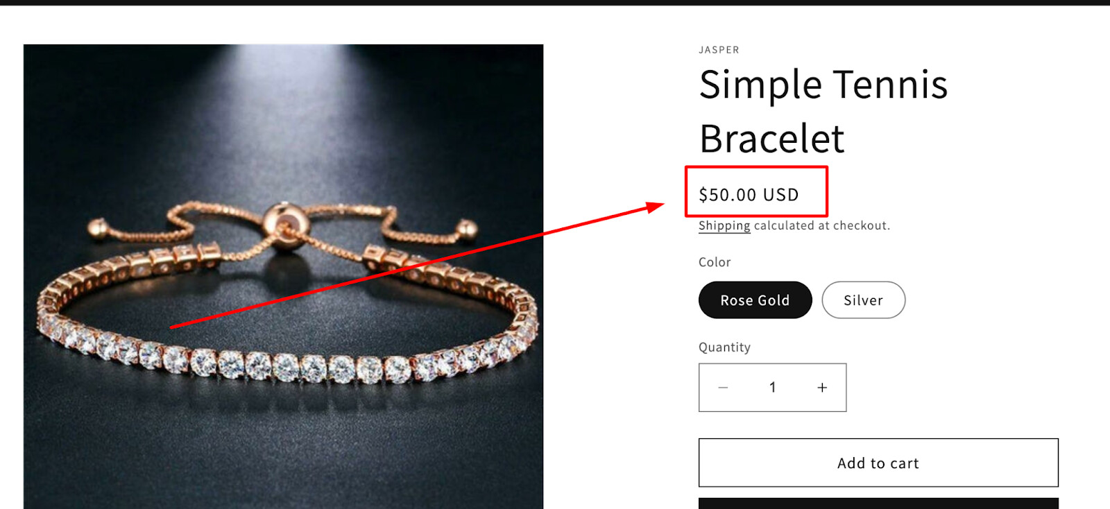
2. Style Product Price to Be Highly Visible
Without a clear price, users cannot evaluate a critical aspect of the product. You should place the product price in the “Buy” section and increase its visibility by using a large font size (similar in size to the product headline), bold text style, or eye-catching color.
3. Include both User rating average and number of ratings
Many users rely on ratings and reviews to select products and displaying them right on each product in the first place can quickly build your credibility. For example:
4. Always include quick Add to cart buttons in product lists
It will save customers the trouble of having to click on a product in order to add it to their cart.
Furthermore, the page speed of your store in mobile is 66 while pagespeed is extremely crucial for both buyer’s experience and Google ranking, so you could consider Shopify themes made to help you boost Google pagespeed score for your store such as Blum, Refresh, Dawn…
These are some suggestions for improving your store.
Good luck and have a nice day!
Warmest regards,
Richard | PageFly