Hi @Cadizcowgirl ,
I’m Kate from PageFly - Shopify Landing Page Builder app.
Congratulations on your new store! I’m so impressed that your products are pretty and diverse. The items should be the most thing bought for this season for being a gift or decorating. Based on my experience, it looks nice and straightforward. However, I have a few small suggestions that might help improve your sales. Good luck!
1. Improve your UI/UX of your homepage for better 1st impression
1.1 Stand out with a favicon for your store
Give your store a unique identity that sticks in customers’ minds with a personalized favicon! This tiny icon displayed on browser tabs can do wonders for brand recognition. Follow this guide to effortlessly add a favicon: https://help.shopify.com/en/manual/online-store/images/add-favicon
1.2 Enhance your hero banner
The top banner is your store’s welcome mat - make it count! Within those crucial first 5 seconds, grab attention and clarify your offerings. Try shifting the heading and “Call to Action” button (CTA) to the center of the first screen for maximum impact. Check out our free template for inspiration!
With these simple tweaks, you can elevate your store’s visual appeal and give customers a smooth, welcoming experience. Moreover, you should keep your banner visuals clean and simple for optimal impact, especially the text on slide 3 is quite hard to scan and read.
1.3 Adjust your header
Sticky header helps customers easily access menu navigation although they scroll down or up on your page and also quickly reach the Search field to find products with a sticky header.
I found that your header is sticky already but it take much spaces, your should consider reducing it and adjust better spacing on mobile:
Besides, you can add all collection page as categories on your header. All your collections can be neatly categorized in the header, making it a breeze to explore every corner of our store and customers easily recognize your offers.
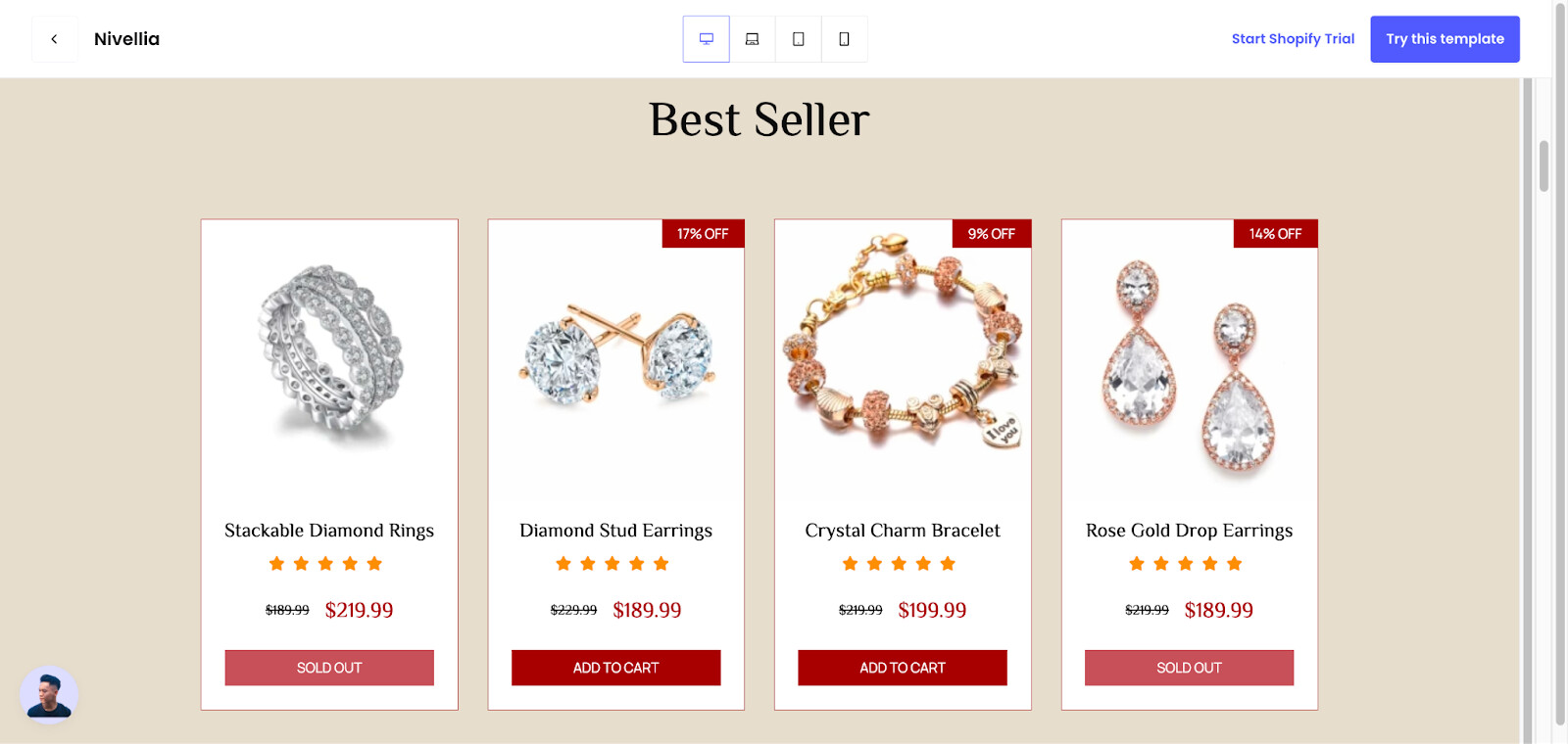
2. Make the tex is easy to scan
It’ll be better if you adjust the text which overlaid the pictures below. I think it’s hard to scan and read. You should use another color or make your background picture a bit transparent. And the red borders are the area you should to put the text in. According to UX rule, users can not read large-width text, it should be focused on a suitable width to scan easily.
3. Have testimonial, brand story on your website
Including a section about your brand story or customer review can help customers learn more about your business and make your store appear more professional and increase your reliability.
You should add the section on your homepage, star review on your product and collection page to increase the reliability of your store. Here are some examples for you:
.
Hope these suggestions help! If you have any further questions, please feel free to let me know.
Hoping you shimmy and shake your way into 2024!
Best regards,
Kate | PageFly team