Hi there!
My store has been now properly finished since last April but I am getting no traffic and therefore no sales. Any feedback would be very much appreciated. Thanks!
Hi there!
My store has been now properly finished since last April but I am getting no traffic and therefore no sales. Any feedback would be very much appreciated. Thanks!
Hello @MayteCoke ,
Greetings from flareAI app helping Shopify merchants get $7Million+ in sales from Google Search, on autopilot! I am Gina, and I am here to help.
I’ve taken a look at your store and found there are quite a few things which if added can increase sales.

To increase traffic and sales in your Shopify store, make sure your website is easy to use and visually appealing. Use SEO techniques to rank higher in search results and attract more visitors. Create helpful content and share it on social media to drive traffic. Offer discounts and incentives to encourage purchases. Collect customer reviews and testimonials to build trust. Keep track of analytics and adjust your strategies accordingly to improve sales.
Let me know if you have any questions.
Gina
Hey,
What Gina has replied above will solve most of the problems, but from what I’m seeing on your website, the homepage needs improvements.
As humans, our attention spans are decreasing day by day. Brands got only 15s to answer these 3 questions from the website: what they do, how will it make the customer’s life better, and how to get it.
Saddening to say I got confused after I landed on your homepage. No hard feelings.
People don’t read texts; they scan.
And when I saw “Shop dogs” & “Shop cats” on your website, I thought you sell pets besides organic clothing.
eCommerce experience is based on endless scrolling and the way to fix this is by having better navigation and CTAs.
Here are a couple of minor fixes for you:
Use a different header image/messaging on the hero section. Something which would take you one big leap closer to giving those 3 answers.
Have better CTA messages. If possible, use better imageries in your cards on the homepage.
Add elements like “Fast shipping,” “Easy Returns,” etc., on your store depending on its’ policies.
Other than that, the product page looks decent and the overall design is okay.
Try to get traffic on the website and analyze web behaviours using tools like Smartlook or Hotjar and you’re good to go.
Best,
Aar Rafi.
Hi @MayteCoke ,
This is Kate from PageFly - Shopify Landing Page Builder App:
I understand that experiencing low sales can be frustrating. I want to assure you that we are here to help you through this issue. I’d love to give you my suggestions as hereby:
HOME PAGE
1. Add a call-to-action button to the hero banner.
You could consider creating a slideshow to exhibit some of your featured collections or include a call-to-action button that directs people to your collection website.
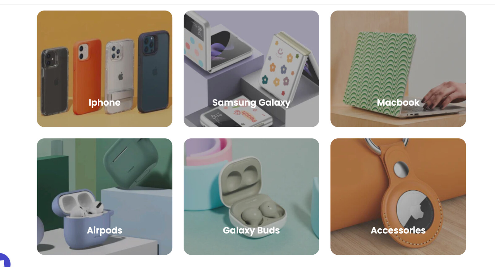
2. Consider using to Collection List
As I see, you are listing your collection vertically. This layout will be suitable if you have fewer than 5 collections. And, it would be not user-friendly, especially on mobile devices if you have more than 10 collections.
In this case, I suggest you could display your collection in grid layout or slideshow like the attached images below.
3. Have secondary hover images:
There are few strategies you can use for your secondary hover images:
Secondary hover images will help customers see different views of the products so that they can easily gain trust and make Buying decisions.
4. Make your CTA buttons more attractive
All the Call to action buttons need to add a hover state to make the user feel these buttons are active and clickable.
For example, when the mouse hovers over the button will change to color, zoom out,… etc
PRODUCT PAGE
1. Include both the User rating average and Number of ratings
When it comes to online shopping, customer reviews are crucial. PageFly makes adding testimonials and product reviews to your page an ease.
2. Set a border for this field
This field currently lacks a border, making it challenging to distinguish it as a place where customers can enter their information. To ensure that your clients don’t miss this field, I advise you to add a border around it.
3. Provide images of your products on a human model
Before purchasing fashion items, consumers must be able to visualize how the item will appear on their own body.
Users cannot accurately identify crucial product qualities such as fit and length - how big or fitted is this ring — without a human model for reference. Similarly, finer aspects of proportion and quality can be difficult to judge without the context offered by a model.
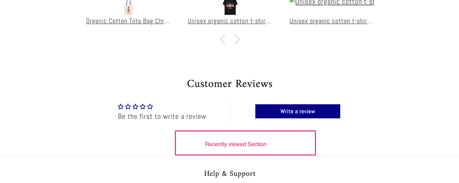
4. Add a recently-viewed section
You might consider giving all users (including those who aren’t signed in) access to a history-based recently viewed things list, and allowing them to change it. For a variety of reasons, users may desire to revisit previously seen content.
For example, throughout both mobile and desktop testing, people frequently wanted to return to a product they’d seen before simply to reevaluate it after having looked at and rejected other options. Users will become bored and dissatisfied if it is too difficult to refind previously viewed things, and they may decide not to buy anything at all.
Furthermore, if you haven’t yet prepared for the Back-To-School season, don’t worry! There’s still plenty of time to make the most of this opportunity. Here are some suggestions to help you get started:
Please let me know if you have any questions.
Cheers!
Kate| PageFly team
Hi Kate!
Thank you so much for this detailed, extremely helpful information. I am going to go through each point and make these improvements. I hardly know anything about setting up a store so it’s going to take me a while to find out how to do everything you suggest but I will do it! Thanks a million ![]()
You’re welcome @MayteCoke ![]() . I’m so glad to hear that my suggestions help.
. I’m so glad to hear that my suggestions help.