Hi! Before of all, i made some changes on the product cards adding them a padding, that ended the images in the mobile version looking too small.
I want to keep that internal padding on pc without making the images on mobile too small, anyone knows how to fix it?
Thannks!
Web: https://centralmrkt.myshopify.com
Code: 90210
Hi @davidvilaa ,
This is David at SalesHunterThemes.
You have added padding space but it is not responsive on mobile devices. You can try the code I gave you already supported on mobile.
You can try to follow these steps:
Go to Online Store → Themes → Actions → Edit code.
Go Assets folder → base.css file.
Add this following code at the bottom of page.
@media (max-width: 767px) {
  .card-wrapper {
    padding: 50px 20px 50px !important;
  }
  .card .card__information {
    margin-top: 50px !important;
  }
  .collection .card__media .media img {
    padding: 5px !important;
  }
}
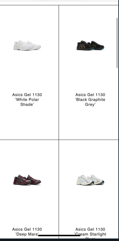
Here is the result:
If I managed to help you then, don’t forget to Like it and Mark it as Solution!
David | SalesHunterThemes team
Hi @davidvilaa
Please try to add this CSS code at the bottom of your base.css file to check if images bigger
@media screen and (max-width: 749px) {
.collection .card__media .media img { padding: 0px !important; }
}