Hi, I recently became an e-commerce and I made a store and I wanted you guys to check it out to make sure it looks good and to see if I can do anything else because I had over 500 sessions today and no sales and no ad to carta so I was wondering on what is going on and I do have another question about the robot TXT should it be disallow or does it have to be allowed, and if i have to make it allowed, i have no clue how to do that, i’m so confused about that
store: https://hedemand.shop/
2 Likes
I am piloting a tool to do detailed Website Content Audits for landing Pages (https://www.saleso.ai/product/website-content-feedback-tool ). As a part of that, generated a detailed report for your page here - https://drive.google.com/file/d/1hCNNKKYRrOLwypP3funDOBn1LTbrZIBo/view?usp=sharing. If that is cumbersome, you can also find a summary here - https://drive.google.com/file/d/14SBFi_cRcVFCIUULuyZsY6b7MYn-SYWi/view?usp=sharing. Hope this is useful to you. If possible, do give me feedback on it.
Having said that, it’ll be good to understand the real diagnosis of your current pain point. Did you have 500 sessions in one day and no sales - or are you consistently having 500 sessions a day and no sales. If it’s the first case, I would probably wait a few more days. E-commerce conversion rates in early days of the store can be quite low (the algorithms you use for ads are still learning, there is history still yet to be built etc). Additionally, please look through your analytics to see where people are dropping off - are they dropping off at the first loading itself (the video/gif can sometimes be a bit cluttered confusing - Maybe try out a high quality image and see if that helps).
Thanks
Gandharv
Hi @HEDemand
Thanks for reaching out to the community. This is MooseDesk - Customer Support Helpdesk/FAQ App.
First of all, congratulations on your store! As a UX enthusiast, I believe it effectively communicates your business scope, services, and message. However, I have some feedback to help make it even better. Please kindly review the following:
1. Low quality pictures on homepage
- The hero section and the section beneath it contain low-quality pictures, which can come across as unprofessional.
- Try replacing these with higher-quality images to create a better impression.
2. Make video autoplay
- Your video has valuable information and great visuals, but it isn’t set to autoplay, which leaves a blurred image in the visible area.
- Setting the video to autoplay can enhance the visual appeal and engagement.
3. Support widget
- The color contrast of your support widget label is not optimal. Consider making the text color brighter for better visibility.
- I also noticed that you are using Shopify Inbox for your support widget. While Shopify Inbox is useful, it may not offer the robust features needed to manage and respond to tickets efficiently. MooseDesk can help bridge that gap.
MooseDesk also can help you create FAQ and Contact us page for free with pretty templates
If this is helpful for you, please let me know by giving me a ‘LIKE’. If your question is answered please mark this as 'SOLUTION’.
Thank you for reading. Wish you nice day ahead
Hi @HEDemand I’m Garcia from PageFly - Shopify Advanced Page Builder App. Generally, I love your store’s design, it looks classic but professional. From my CRO expertise, I’d love to give you my suggestions as hereby:
1. Homepage
- Update the announcement bar
There are 2 things you can improve in this section
- Rewrite “WorldWide” into “Worldwide”
- Add a blank space between the text and the icon and in both ends

The banner, gif or video in this section holds immense importance in hero material. It’s the very first element that greets visitors upon entering your website. Let’s ensure that consumers instantly grasp what you offer within a mere five seconds.
Unfortunately, the current gif is not of high quality. Please recheck it and other images, gifs, videos as well
- Redesign the benefit section
This section gives your customers a reason to purchase from you instead of the competition.This helps reduce the bounce rate and increase the likelihood of purchase.
But the current benefit section does not seem to be prominent and clear, you can check it out:
If the icon and the text are separated and the section has a different background color other than white, it’s definitely catch the eyes. Here is a demo for you:
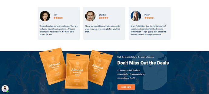
- Display testimonial - customer reviews: This section will help you build customers’ trust. You can show rating stars for each product or you can add customer reviews as text and photos. Here is a sample for you:
2. Product page
Product color swatches enhance conversion rate by reducing the number of clicks for customers to find the product they want. The shorter and easier a customer’s path to the desired product is, the more likely they will make a purchase.
As you can see in my screenshot, the sale is not quite outstanding.
You can refer to the image below:
- Use color to differentiate between the original and the discounted prices
- Add countdown timer to create FOMO effect
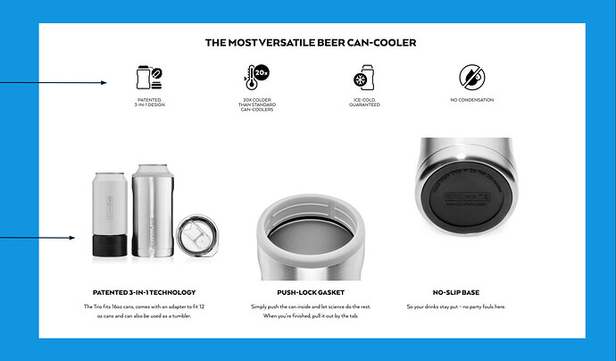
- Display value propositions
Display the key product benefits and deep dive on product details to answer customer’s logical questions. For instance:
And that’s my feedback! Hope it helps you boost the conversion rate.
Cheers!
Garcia | PageFly Team
I really feel like you need some social proof, preferably multiple kinds. If you google social proof conversion factors you’ll find a lot of ideas. Help your audience feel like they’re going to be part of the cool crowd by buying your product.
1 Like
Hi,
I hope you are doing good and welcome to the Shopify Community!
I am San from MS Web Designer
Thank you for sharing your store URL. This allowed me to go through your site.
You have a beautiful website. I believe a few adjustments may be required to make it more professional and appealing to customers.
Here are some recommendations:
Header :
- Wishlist missing
2 Search bar missing
You can follow this
Homepage: (First Impression is the last impression)
The homepage is the first landing page your customers will see after opening the website. Yours is done beautifully. Home page banner is of poor quality.
-
- Homepage can be more Organised and authentic to bring more customers.
- Featured Products / all Title should be Optimised and Seo Friendly
- Add a featured collection on your home page.
4.Add sticky add to cart button on home page collection features.
5. Add a Lead magnet section on Home Page
7.If Possible add instagram feed on the home page.
- Add customer reviews in more organised form.
Collection and Product Page:
-
Add Product Review on Collection Pages
-
Add Sticky add to Cart and Buy now Button for quick checkout
-
Add Trust Badges bellow add to cart or Buy now Button
-
Add Products Bages like New, 10% Off, You Save 20$ or Free Shipping
SPEED Optimization:
1.Your site might be in need of Optimization too. As per Google Insights, your site score is 65 which means that attention is required here. A well-optimised site rates 80+ for mobile version, this affects your SEO ranking and decides how many customers/visitors view or find your website as 80% visitors use mobile to place the order. This is especially important if you don’t want to invest in advertisements.
Speed optimization is required to increase sales and traffic. Also, if your speed is not good, your website ranking will definitely fall.
I hope this helped!
Please feel free to contact us for any further help that you might require.
Best regards,
San.


