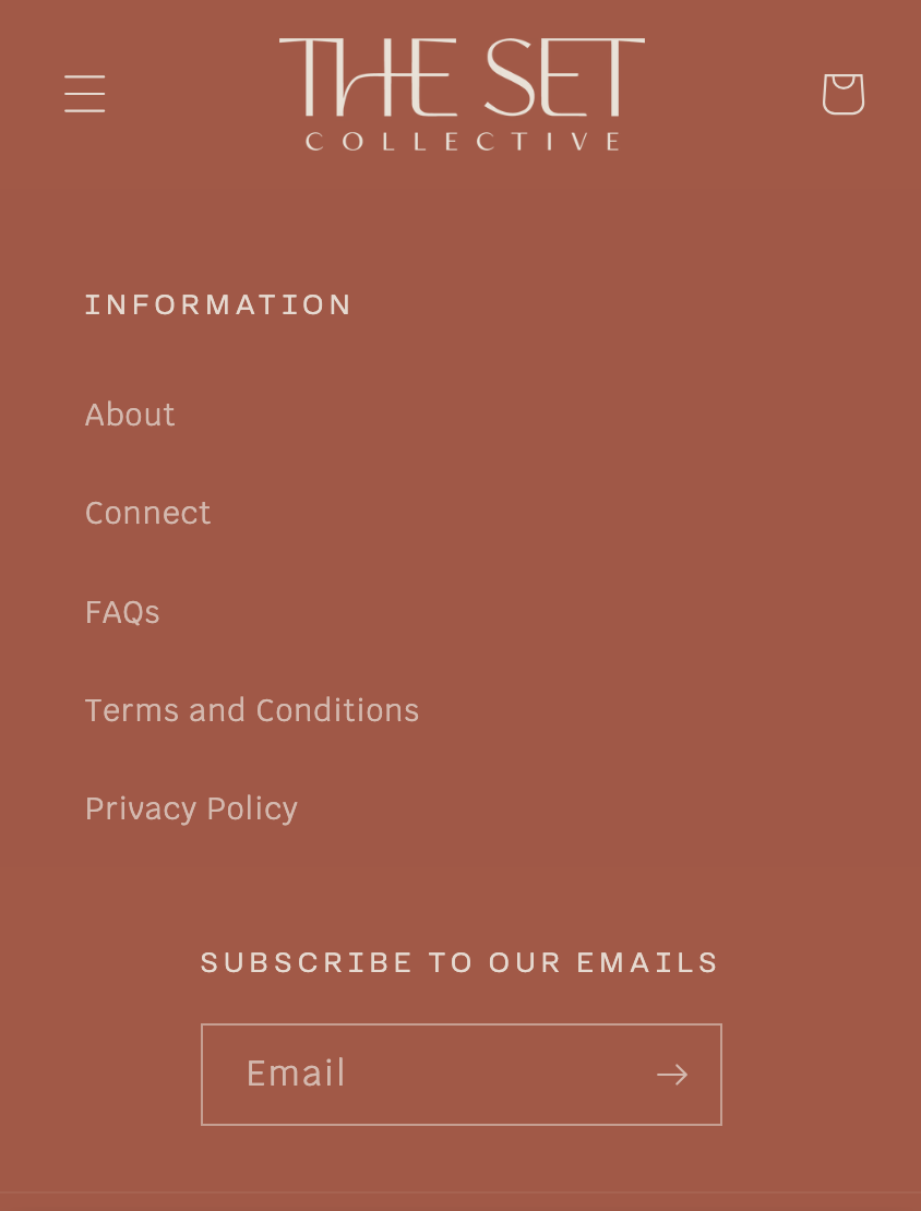
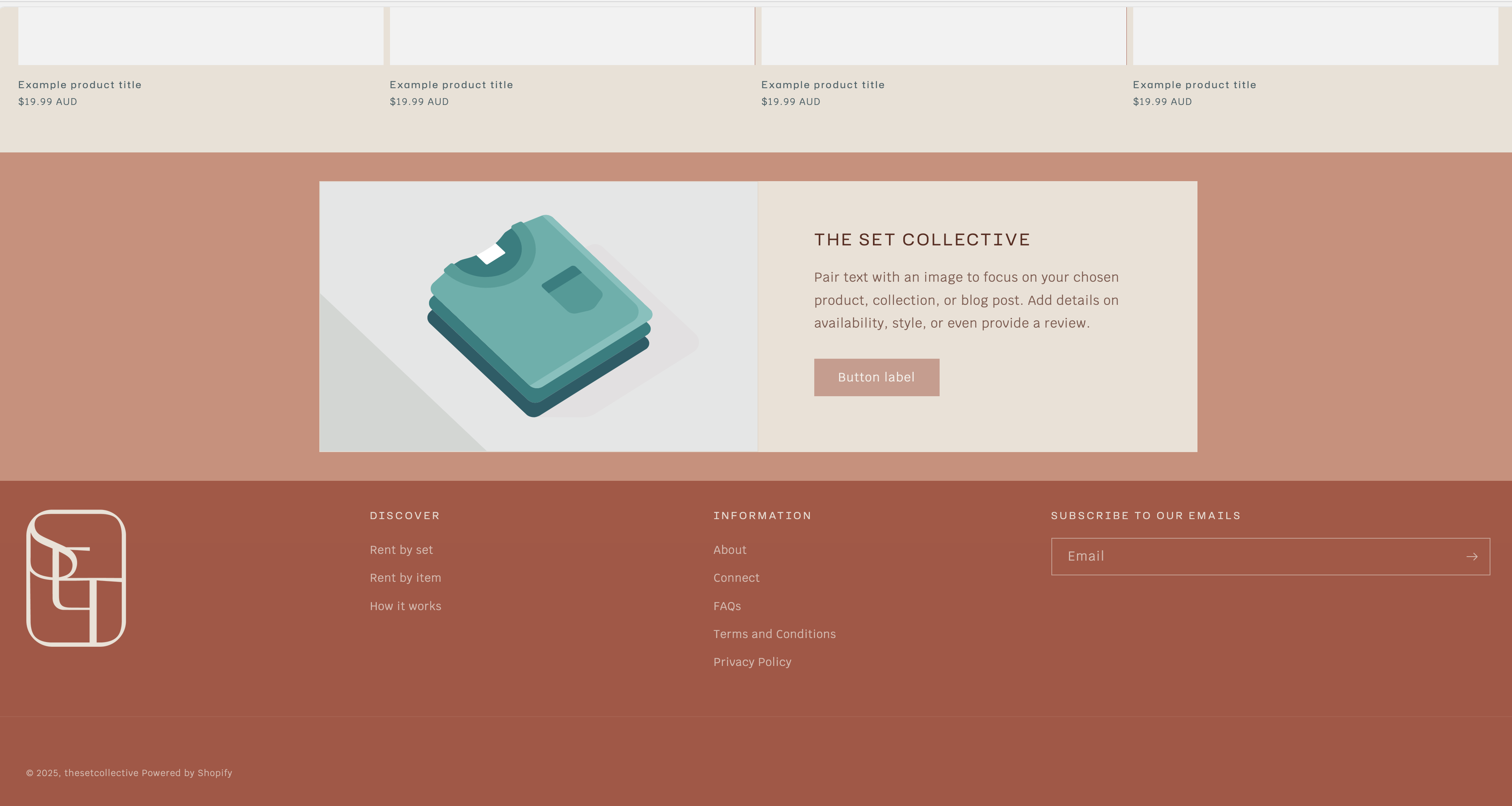
Would someone please be able to help me fix my mobile footer? I have gotten everything how I want it in desktop, but I want to stretch my newsletter box out to full width on mobile too. Any help much appreciated, see screenshots.
Nice job getting your desktop layout looking great, that’s often the harder part. For the mobile version, it sounds like the newsletter box is being limited by its parent container (likely some padding or a max-width rule in the footer section).
Here’s something you can try:
Go to Online Store → Themes → Edit Code
Open your theme.css or base.css file (sometimes footer.liquid depending on your theme setup)
If your newsletter form uses a different class (like .newsletter or .footer__newsletter-form), just replace .footer-newsletter with that.
That should make your newsletter box stretch nicely across the full mobile width.
If you’d like, I can take a quick look at your theme or code section and help adjust it directly, these layout fixes usually take just a few minutes when you know where to look.
Happy to help you get it looking exactly right.
Steven | Shopify Developer & Theme Customization Expert
@ellacoker Hi there!
You can make your newsletter box stretch full-width on mobile with a small CSS adjustment.
Try adding this code to your Online Store → Themes → Edit code → Assets → base.css (or theme.css) file: @media screen and (max-width: 749px) {
.footer__newsletter {
width: 100% !important;
max-width: 100% !important;
margin: 0 auto !important;
padding: 0 15px;}}
If your theme uses a different class name for the newsletter section, right-click on it in your browser → “Inspect” → and copy the exact class (e.g., .newsletter-form or .footer-block--newsletter) into the code above.
After saving, refresh your mobile preview the newsletter should now span the full width.
If it still doesn’t look quite right, feel free to share your theme name and a screenshot or preview link (no login details) so the community can tailor the CSS more precisely.
