Hi @DuckBuster,
Thanks for reaching out to the community. This is MooseDesk - Customer Support Helpdesk/FAQ App.
Congrats on your new store! Your store looks stunning. I can tell you have put a lot of effort into building this. However, I have some comments to make the good get even better. Here are some of my recommendations for better customer experience, please kindly check.
1. Navigation Menu
Moving your navigation menu to a prominent position in the header can ensure its visibility and accessibility across all pages of your website. This allows users to navigate seamlessly between different sections and categories of your store, improving usability and enhancing the overall browsing experience.
You can refer to this example. This horizontal navigation bar would better suit your website than the current hamburger menu:
2. Logo
The logo currently appears quite oversized, which might impact the overall visual balance of your website. We suggest considering options such as resizing the logo or exploring alternative versions to ensure that it looks more proportionate and harmonious with the rest of your branding elements.
3. Homepage
3.1. Hero Banner
Your hero banner serves as a crucial focal point for capturing users’ attention and conveying key messages about your brand and products. However, we feel that there’s room for improvement in its current iteration.
By incorporating a captivating, high-resolution image along with a concise yet compelling description, you can effectively communicate to users why they should choose your products. This approach will not only enhance visual appeal but also encourage users to stay on your website longer and explore further.
Here is an example for you:
3.2. About Us Section
An “About Us” section serves as a crucial opportunity to introduce your store’s backstory, mission, and values to potential customers. By providing insights into your brand’s identity and ethos, you can establish a deeper connection with users and foster trust and credibility.
3.3. Product Benefits Section
Group the “Quick Cleaning,” “Powerful Suction,” and “Modern Design” sections into one unified unit. This will highlight your product benefits clearly and avoid distracting users. Remember to put a CTA button to redirect users to your product page.
Here is an example for you:
3.4. Reviews/Testimonials
Adding a section for customer reviews can make your store look more trustworthy. When people see positive feedback from others, it helps them feel confident about buying. Showing these reviews prominently can also make your brand stand out and look better compared to other brands.
You can follow this example:
3.5. Remove Product Section
Consider removing this redundant section that redirects users to the product page, as it has already been featured in the sections above on the homepage. These duplicated sections may distract users and reduce engagement.
4. Product Page
4.1. Product Images
Using a slider for product images enhances browsing. Users can easily view multiple images without scrolling, improving engagement and increasing the chance of purchase.
4.2. Product Description
Detailed product descriptions play a crucial role in providing users with essential information to make informed purchase decisions. While your current descriptions may offer a general overview of your products, enriching them with comprehensive specifications and features can significantly enhance their usefulness and relevance to users.
You can follow this article to learn more.
5. Footer
Your website’s footer is a valuable space to enhance user trust and experience by providing essential store information. Include details like location, email, phone number (if available), and operating hours for easy contact. Additionally, links to shipping and return policies can improve transparency and reassure users.
Here is an example for you:
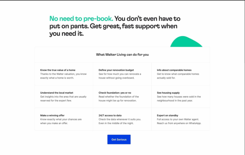
6. Customer Support
You should implement a customer support system to provide users with fastest ways to reach out for assistance. Consider integrating a dedicated help center to provide users with immediate access to answers and solutions to their queries and concerns.
7. FAQ page and Contact us form
Establishing a dedicated FAQ page can serve as a valuable resource for addressing common customer inquiries and concerns. By providing detailed answers to frequently asked questions, you can alleviate uncertainties and provide users with the information they need to feel confident about purchasing from your store.
Additionally, integrating a Contact Us form directly on your website can facilitate seamless communication between users and your store, ensuring that inquiries are promptly addressed and user queries are efficiently resolved.
To address your customer support, FAQ and Contact us page, I recommend using MooseDesk, an app for creating unique FAQ pages for your customers. Besides helping you creating your Help Center, we also provide a helpdesk/ticketing system for your customer support.
Since our app is now available for free, all current users will be considered as early-bird users and get to enjoy all our current features for free forever!
As an expert/enthusiast in UX, I recommend implementing these changes to improve customer experience when scrolling through your store.
If this is helpful for you, please let me know by giving me a ‘LIKE’. If your question is answered, please mark this as 'SOLUTION’.
Thank you,
MooseDesk - Customer Support Helpdesk/FAQ app