- Hi I have launched my store about 2 weeks ago and trying to build the audience and doing marketing at present. I can see some traffic but so far no sales. Can you please provide a overall feedback on my store and the things that I can do to turn visitors into customers?
1 Like
Hi,
Happytailssupply.shop
Hi @MZN
Thanks for reaching out to the community. This is MooseDesk - An ideal Helpdesk Solution that aligns perfectly with your Start-up.
Firstly, congratulations on your new store! Your store looks stunning and I can tell you have put a lot of effort into building it
However, it’s not uncommon for new stores to experience a slow start. To improve your store and make it more convincing to potential customers, I have some recommendations for you . Please kindly check them out:
1. Homepage
-
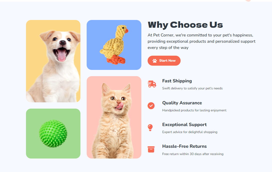
Hero Banner: I love your current hero image; it looks quite attractive. However, consider changing your image into a video or slider. This can effectively allow you to showcase your product and brand story in a dynamic and compelling way, creating a memorable impression with your visitors.
-
About Our Featured Collection: Your current pricing in this section needs to be customized to ensure consistency and alignment. A well-organized layout is especially important to help your site look more professional.

- Add Customer Reviews Section: Displaying customer reviews prominently on your homepage can effectively build credibility for your products, therefore, it can lead to a higher conversion rate. Here is a good reference you should follow:

- Add Instagram Feed: You might consider adding an Instagram feed to showcase your highlighted products and compelling stories, encouraging visitors to interact with your website by exploring dynamic and visually appealing content. I think it can be an effective way to drive traffic to your social account.

Add Trust Badges for Your Homepage: Many online shoppers expect to see trust badges on e-commerce websites. I highly recommend including trust badges to build credibility for your site and to gain the trust of potential customers. Take a look at this example below:
2. Product Page
- Custom Product Images: I noticed that your current product page displays multiple copies of the same image, which can overwhelm customers. Consider using thumbnail navigation to allow customers to switch between different views or angles of the product. This keeps the page clutter-free while still providing access to additional images.

- Add Cart Icon to Cart Button: I see your add-to-cart button does not include the cart icon. I recommend you should create a cart icon to encourage impulse purchases and streamline the user experience. It also enhances customer satisfaction by clearly indicating which products have been successfully added to the cart.

3. Support
Last but not least, customer support is crucial in ensuring a positive shopping experience.
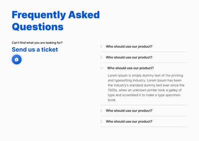
To address this, I suggest exploring MooseDesk, a free support, FAQ, and helpdesk app. MooseDesk provides auto-reply features during non-business hours, a proactive help center, and a user-friendly widget layout, offering an effective solution to enhance customer support on your platform.
- You can add a widget that contain FAQ like this with MooseDesk:

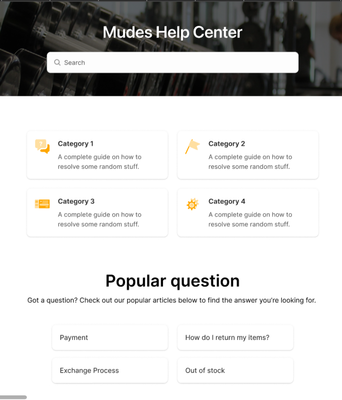
- Or create a FAQ / Help Center page that contain all instant answers for your customers like this:
As an expert/enthusiast in UX, I recommend implementing these changes to improve customer experience when scrolling through your store.
If this is helpful for you, please let me know by giving me a ‘LIKE’. If your question is answered, please mark this as 'SOLUTION’.
Thank you,
MooseDesk - All-in-one Shopify Helpdesk App
1 Like
Hi @Launchpadweb,
Thank you for your feedback. I really appreciate it as you have highlighted some of the important issues with my website and the suggestions for improving the user experiences.
I have implemented some of this changes and working on improving more. Thank you..
Hi @MooseDesk ,
Thank you for your detailed feedback and highlighting some of the important factors to improve on. It is great to see that you have looked at the website thoroughly and come up with a very useful insight about the areas that I can improve to overcome some of the challenges in attracting customers to my site.
Thank you for your recommendations and I will look into implementing all the changes mentioned. Thank you!!
Greeting @MZN
Garcia’s here from PageFly, a minor Page Builder platform. After co-operating with a thousand store in E-commerce and multitudinous UX UI courses as well as seminars, hopefully, my opposite can support your way
Branding
-
You can build a concise logo, which will help your page look more attractive and easily save your image. A concise logo is not only visually appealing but also versatile, working well across different platforms and marketing materials.
-
If you don’t want to invest a lot of time, there are plenty of affordable pre-made logos available on platforms like Envato or Freepik. These websites offer a wide variety of styles and options to choose from, allowing you to find a logo that perfectly fits your brand identity.
-
Choose one primary font for the headline and a secondary font for the paragraph
-
A clear distinction between headlines and body text improves readability, keeping users engaged.
-
This will help create a clear visual hierarchy on your page
-
Choose the color palette/color scheme, this will be used for all elements, like buttons, text, and backgrounds. This will help create a visually appealing and engaging user experience. A well-defined color scheme can guide the user’s eye, highlight important information, and create a pleasant aesthetic
-
Choose other format of call to action button. A call to action (CTA) button with only a border and no background color is generally not ideal for conversion rate optimization (CRO). Buttons primarily rely on color and contrast to attract attention and guide user actions. Without a background color, the button can blend into the background, making it less noticeable and potentially causing users to miss it entirely.
-
Use a Solid Background Color: Choose a contrasting color that stands out against the background of your page. This will make the button more visually appealing and easier to see.
Homepage
1. Announcement bar
A sticky announcement bar remains at the top of the page, regardless of how far a user scrolls. This ensures maximum visibility for your important message, unlike a static banner that might be missed if users scroll past it quickly.
2. Header
Attention spans are short online, especially on the first page load. Users typically decide within 3 seconds if they’ll stay or go. A long header can be detrimental because:
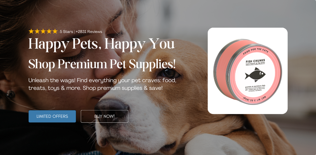
- The hero banner is where your key message and product offering reside. A lengthy header pushes this crucial information below the fold, potentially causing users to miss it entirely
- Long headers eat up valuable screen real estate on mobile devices. Users have to scroll to see the content below, leading to a frustrating experience.
3. Hero Banner
Change the Heading
- “Come and Visit” is a generic phrase that doesn’t tell users what makes your store unique or why they should visit.
- While simple, it doesn’t capture attention or effectively communicate your value proposition within those crucial first few seconds.
4. Collection List/ Our Products
This can be displayed with the tab format
- By simplifying product discovery and minimizing navigation clicks, you can potentially increase the chances of users purchasing something they find browsing the collections.
- All your products are readily accessible within a single view, promoting a wider range of items to potential customers.

5. Our Featured collection
a. This headline of section can be changed into: “Best Seller Items”
b. Choose consistent format to display main media for these product:
- Change utilizing PNG images with cut-out backgrounds (showing only the product) for your product list items, and then switch to benefit-oriented images on hover
- In a product list, users typically scan quickly. Clean images with transparent backgrounds ensure they can readily identify and differentiate products without getting overwhelmed by clutter.
- Hovering images allow you to showcase product features or benefits without cluttering the initial product list view. This keeps the page clean while still offering valuable information.
6. Promotion Banner
a. Add the urgency elements.
b. Friendly reminder, the National Pet Day will be happened in the next few days, you can reference more to create special promotion for this day, and decorate the page with more attractive elements

7. Add more section: Benefits bar
I have some example for yours, take a quick look at them. By outlining things like free returns or warranties, you can alleviate user concerns and make them feel more comfortable and demonstrates transparency and builds trust with potential buyers

8. Add more section: Testimonial

Product Page
Change the font size of Product Name
- The current interface of this page is not good at all. The too big font size of Product name hide all the other critical information, and users must interact much to find what they want.
- Every critical information must be displayed above the fold
- Look at 2 above the fold, I’ve taken note some ideas you can refer

Hopefully, it will support your way, just reply this thread if you need more consultancy
Hi @MZN
I’m thrilled that my suggestions were helpful for you!
Wishing you the best of luck with your store. If you need any further assistance, please feel free to let me know in the comments below. Have a wonderful day ahead!
Thank you,
MooseDesk - Customer Support Helpdesk/FAQ app