Is there anyway my new shop can have a once over to check if the look is like get sales- thanks in advance.
1 Like
Hi @Kaangraang ,
Thanks for reaching out to the community. This is MooseDesk - All-in-one Shopify Ticketing System App.
Congratulations on the opening of your store! It’s truly impressive, and I can see the dedication you’ve poured into your store.
While it’s already great, I do have some suggestions to help make it even better. Here are a few of my recommendations for better customer experience, if you don’t mind taking a look.
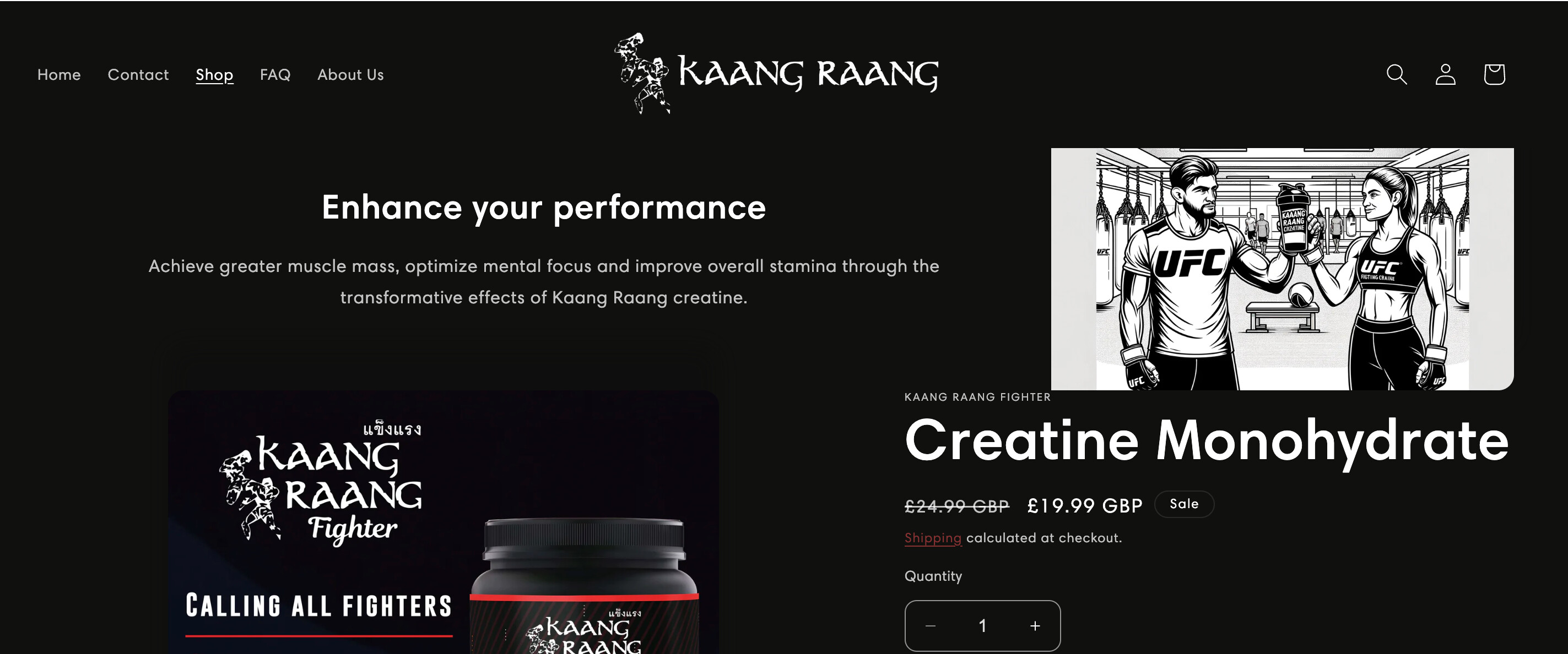
1. Home Page

- Your hero section has blurry background image and the CTA button is quite out of visible hero-area. I suggest changing the background to a more high quality picture and put the CTA button in the visible area. It would make your store look more professional

- All the link buttons have a reddish color, which appears challenging to distinguish on a black background due to low contrast. It would be easier for customers to see and read them in white

-
I like that you have section to talk about the product’s unique selling point. You can make the home page even more convincing by adding a new About Us section right under this section and talk about how trustworthy your brand is. Tell your brand story, add some trust badges, … would make the the conversion rate increases!
-
You haven’t had a footer for your store. You might want to add that to help customers navigate easily within the store
2. Product Page
-
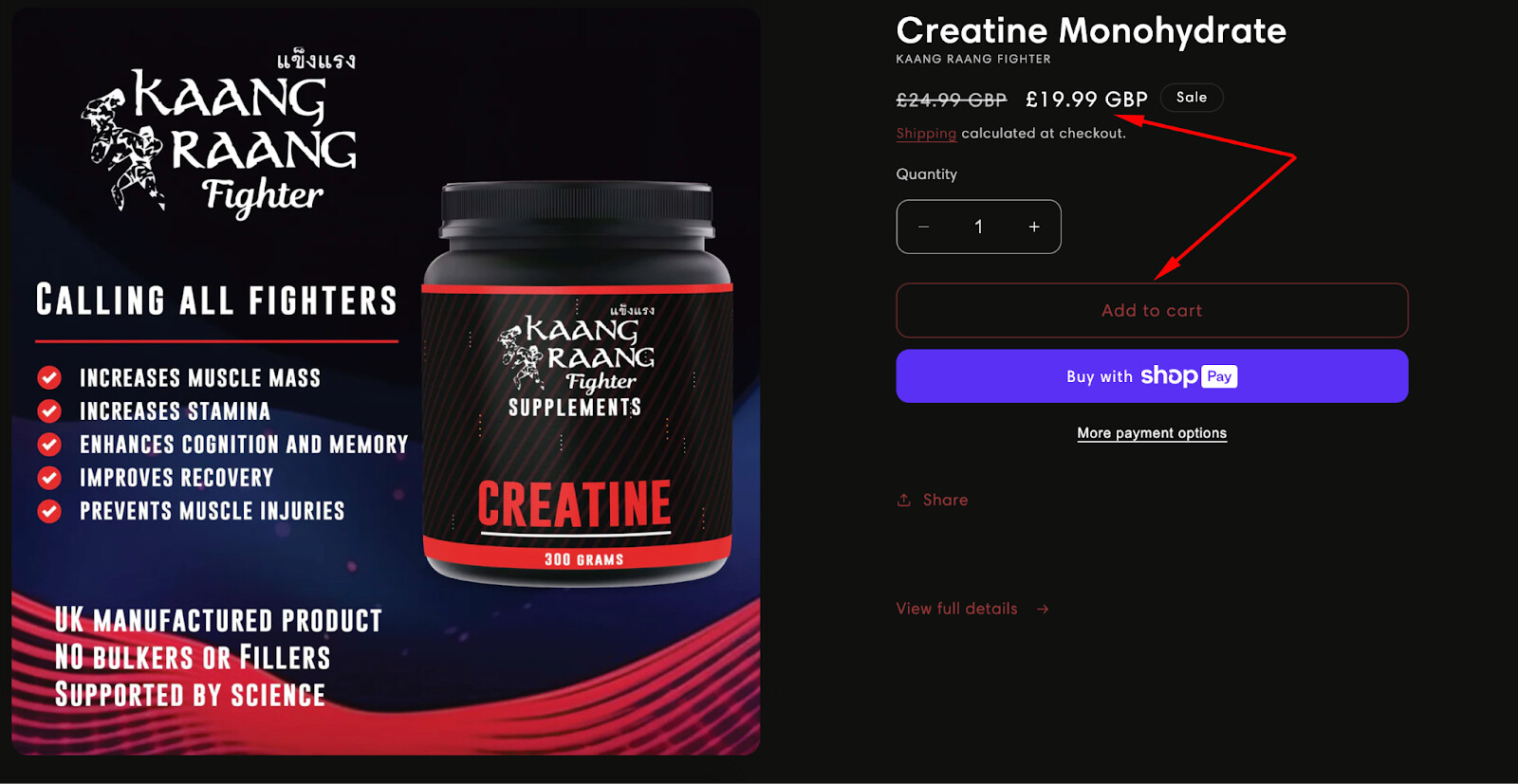
You should place the Product Detail section above the selling point section. It follows the flow: Introducing the Product → Explain the product’s selling point
-
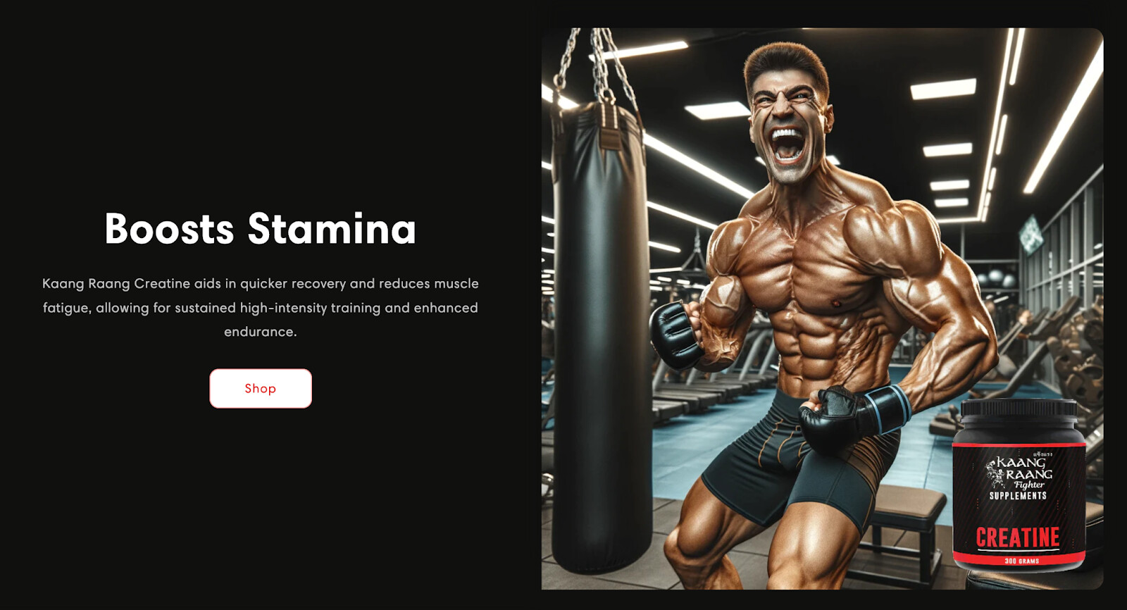
You might want to add more to the product selling point section explaining how many benefit it would bring. Maybe some photos of muscular guys to demonstrate the future outcome should work too
-
If you have review, prepare a review section underneath. Social proof really helps to customer to make buying decision.
-
If you have TikTok or Instagram, make sure to include it into the page so customer can have closer look at the product.
- Support.
Your store currently does not have a support widget. It’s very important to create a place where customers can easily feedback their experience or ask about products.
You can either create a support widget or create a help center / Contact page so customers can proactively seek answers to their questions.
You can try MooseDesk app - an app dedicated for support with ticket management system, support widget, FAQ Help Center page. This is a FREE app so you dont have to worry about the cost ![]()
So that’s my review on your store If this is helpful for you, please let me know by giving me a ‘LIKE’. If your question is answered please mark this as 'SOLUTION.
This would mean so much to me. Thank you and hope you get a lovely day ahead ![]()
1 Like
Hi @Kaangraang
I’m Garcia, a CRO expert from PageFly - Advanced Page Builder app.
What a great store you’ve built there! It can still be enhanced further so here I’ll drop some suggestions that might just be of help and hopefully can cater to your needs:
1. General
- Update your website title and favicon: This is one of the first things that your visitors see at first sight as they enter your store. Here, I suggest you change your favicon into a visible version of your brand logo as it currently looks a bit hard to see clearly. Additionally, make sure you include your brand name somewhere in the website title, too, like this example: “Kaang Raang | Creatine Designed For Fighters”.

- Regarding the usage of AI: It’s great that you implemented AI into the construction of your storefront (or at least from what I can see). But these AI-generated images might be off-putting and even confusing for some people when they surf through your pages; they might want to know the use and applicability of your product IRL more than via an AI-generated setting, for example.
If you have access to shooting sessions of your product then I highly recommend you organize some photo shooting sessions so that you get authentic images to be used on your storefront! ![]()
2. For the Homepage
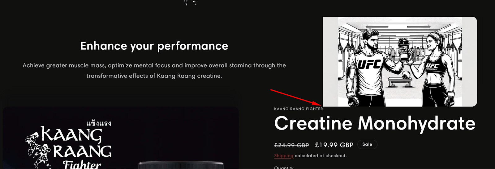
- Regarding images in your hero banner section: Your images currently look blurry and are not fit for a hero banner. A hero banner should be an image where your premier product is clearly visible as well as shot in a crisp and professional background (be it a real life setting or an arbitrary background). Consider updating your hero banner images to be like how I mentioned just previously.

If you feel clueless, here’s an example that I hope can help you visualize better:

-
Regarding texts in your hero banner section: Like the example above, a hero banner should also include a concise and captivating heading so that visitors know what to expect next on your store. At the moment, your hero banner images don’t have that. Consider including the texts, too!
-
Update your Featured Product section: Right below the hero banner section, your Featured Product section looks nice but it can still be improved. I suggest that you: make your discounted price stand out by making it bold and giving it a different color like red; give your ATC button a different color like gold so that it doesn’t blend in the background.
-
Add more sections: Homepage is where your visitors start their shopping journey. So, make sure that you include information-rich sections about your brand and products so that visitors will be more intrigued and eventually urged to make purchases. I suggest you add these sections: About Us, Product Comparison, Product’s Benefits, Testimonials, Newsletter.
-
Include crucial info for your footer section: Though insignificant in terms of visuals, these info play a crucial part both legally and in reassuring that your visitors are purchasing at the right place. Consider adding these pages onto your footer: Shipping policy, Privacy policy, Refund policy, and the likes.
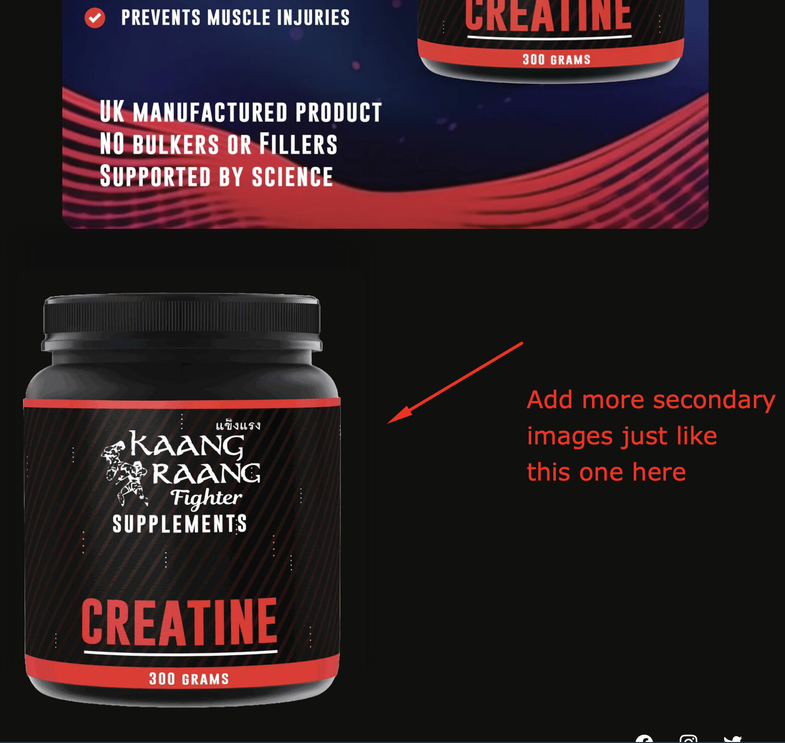
3. For the Product page
- Adjust a certain Text with Image section: This section is kind of overlapping the Product details section right below it, making it look messy. Please consider moving this section below the Product details section so that it looks nicer structurally.
- Make your discounted price stand out: Like I said earlier for a similar section on your Homepage, consider making your price stand out by making it bold and be in a different color so that your visitors notice the price difference.

- Include secondary images: It’s best that you also include secondary images that showcase your products in different angles as well as in different usage scenarios. Consider giving your products these types of images: nutritional info on the product label, a real person using your product, you name it.
- Add more info in the description: Your description is looking quite short. Consider giving essential information like nutritional value, facts, benefits of using your product, etc.

- Add a customers’ reviews section: Adding a customers’ reviews section will help your product gain more trustability, so that you have better chances of getting later visitors to buy your product.
Hopefully, my suggestions have been of help to you. For any further questions, feel free to reply to me here. ![]()
Wishing you the best of luck with your store-building journey!
Cheers,
Garcia | PageFly Team
1 Like