Hi Keith @PacificBlue ,
I’m Kate from PageFly - Shopify Landing Page Builder app.
Congratulations on your new store! Your website has a clean and organized layout, which is great as a foundation. You might put many efforts on this. Based on my experience about CRO and UI/UX case studies, I have a few small suggestions that might help improve your sales:
1. Improve your sticky header background
We both agree that the sticky header helps customers easily access menu navigation although they scroll down or up on your page. I found that your header is sticky already but it’s background is transparent and I found it’s hard to read when we scroll down both on desktop or mobile:
(mobile version)
You should find the way to add background color when a merchant goes down.
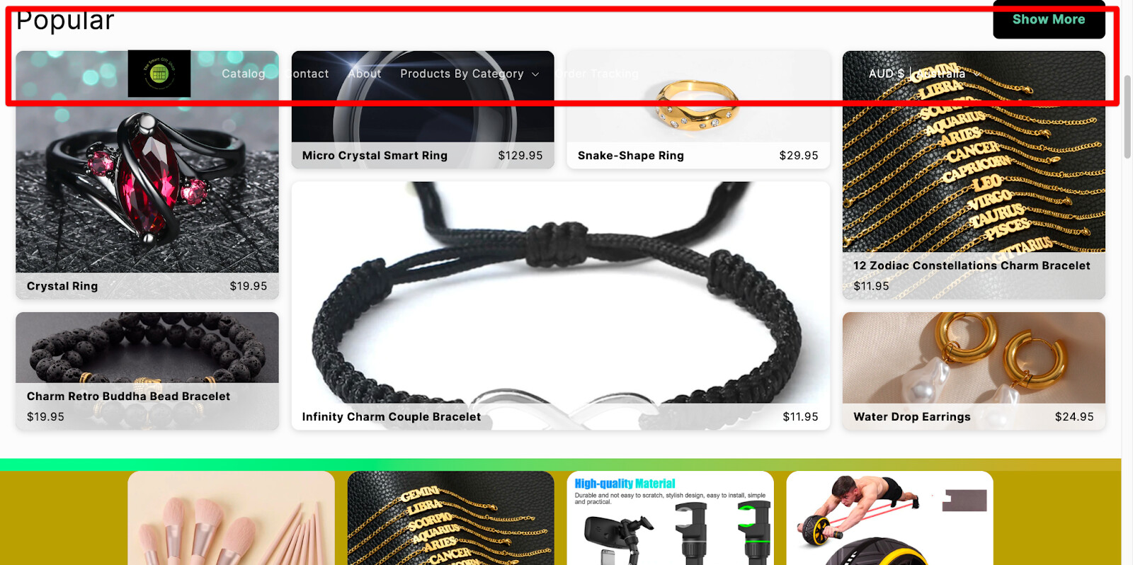
2. Add content for your announcement bar
The announcement bar will announce the information about shipping and discount or any promotion campaign of a store. You should set more highlighted background color, the text is hard to read right now. Here is an example from our free template:
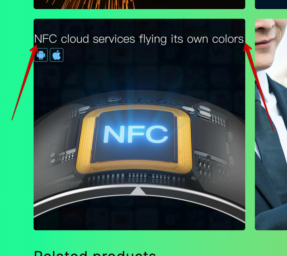
3. Improve your hero banner
Your website’s hero banner is like a handshake at your digital door. It sets the tone, makes the first impression, and determines if visitors stay or click away. So, how do you ensure those precious first 5 seconds pack a punch?
- Display your attractive products on your banners and menu
- Grab attention and clarify your offering instantly: A boldest headline and tempting “click now” button to the banner’s center stage
Take a peek at our free template! See how the clear message and prominent CTA take center stage, inviting visitors to explore further.
4. Adjust your product and collection page(s)
Your product page and collection page should be more focus on their function. I found your hero banner on all pages. It should be a Product detail on your product page when a merchant want to explore it more.
5. Have testimonial, brand story on your website
Including a section about your brand story or customer review can help customers learn more about your business and make your store appear more professional and increase your reliability.
You should add star review on your product and collection page to increase the reliability of your store.
6. Add more spacing to have better UX
It’ll be better if you adjust the spacing here where the text are too close to the edge of the section/column. I think it’s hard to scan and read. According to UX rule, users can not read large-width text, it should be focused on a suitable width to scan easily.
Hope these suggestions help! If you have any further questions, please feel free to let me know.
Hoping you shimmy and shake your way into 2024!
Best regards,
Kate | PageFly team