The new ‘Dark’ view is terrific. I was a massive critic of when it was changed last year. Hats off to whoever came up with this…it looks great.

5 Likes
I don’t like it either. It takes time to load and it looks messy.
3 Likes
So what changes were made?
So I just got the updated live view.
Much better than the update last year. MUCH MUCH better.
But I am scratching my head. Why…WHY are you guys doing this right before the biggest sale weekend of the year (BFCM)!!! You guys should have launched this weeks ago to let everyone get their feet wet with it. Not just cram it down our throats right before BFCM. Last year was a TOTAL dumpster fire. I figured you guys would have learned from that.
5 Likes
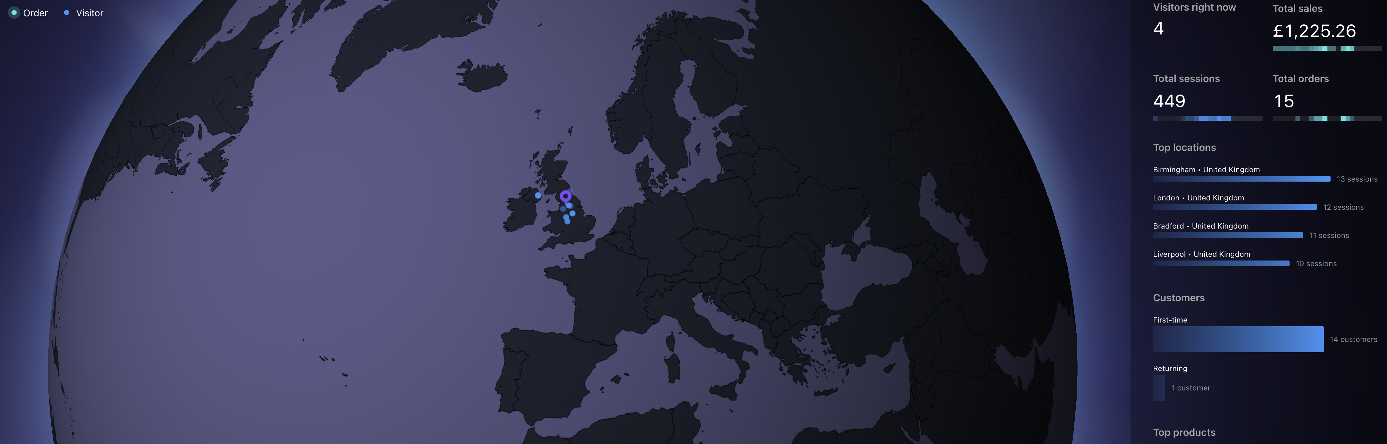
Here is some feedback…make the stats panel on the right so you don’t have to scroll it. I don’t have a 300 inch monitor. Even on the full screen mode with my resolution set to 1920x1080, I have to scroll to see all the stats. Maybe make it responsive to whatever resolution is being displayed? Just a thought.
4 Likes
This update makes me unhappy. ![]()
I still cannot view my own country on zoom and am forced to see half the Europe (and my international sales are like 5% of revenue), so that makes the map completely irrelevant.
And most importantly.. why did you make it BLACK (on Android at least)?! It’s so aggressive and completely doesn’t match the rest of UI. I hate it ![]()
8 Likes
Omg why, my screen is all black, why do you keep making these changes. We just get used to one setting and then you decide to change it
6 Likes
Glad you like it. I personally can’t stand this new live view. The map wastes so much space (and the globe just looks dopey). Plus, I feel like the dark view doesn’t work at all with the rest of the backend experience. Really wish they wouldn’t make a change every Black Friday with something that makes getting work done more difficult right now. I love experimentation, but I’m frustrated that switching back to the original view doesn’t seem like an option.
8 Likes
@brewshop I’m glad I’m not the only one! I also hate that they have removed the live page views section! Can’t believe they done that, absolutely fuming!
13 Likes
I hate it!! It’s absolutely awful. Why oh why did they take away the live page views section too?? The live view for me is pretty much useless now, I loved seeing the bars rise up when someone was on my store and then seeing it change to an active cart was exciting! Now they’ve ruined that as you can only see it when it goes straight to an active cart! No idea why they would take that off! Please change it back or at least give us the option to have either one!
8 Likes
Yeah, and you’d think what they did one year ago, also just before BF, was
bad enough, eh?
They just cannot help themselves but mess things up more and more…
Blindly tweaking settings instead of, oh I don’t know, researching and
consulting with their clients.
How they think this UI is an improvement over the past one (which was
already worse than the one before) is totally beyond me…
If that is not a definition of going downhill, I don’t know what is. ![]()
4 Likes
I have low vision and cant see a thing!!!
WHY is my map Black on dark grey!!!
This is terrible!!
Terrible
terrible
terrible
What are you thinking!!!
8 Likes
Why is it black on Dark Grey???
What are you thinking???
This is disgraceful and discriminates against those who are vision impaired.
Not Happy!
4 Likes

Totally agree. I can’t even keep track anymore. It’s absolutely useless this new version. They should have the decency to at least notify us of the change. I remembered complaining about the last change and they never did anything about it all. Looks like Shopify just do as they please ![]()
7 Likes
More constructive feedback…
Get rid of this “Top Products” section - its useless. I can run a report to see that if I am really interested. Bring back the page view tracking.
As some are not happy with the new color layout, I like it much better than the blinding white screen.
4 Likes
I also can’t believe the live views are gone. I also don’t like that I now have to scroll down to see the active cart/checkout status. It all fit on my screen before the update. Now the most useful data is separated by info I don’t really use. “Most popular product” is not something I need to see in real time, all the time.
Finally, if you like dark mode that’s great, but I prefer the old mode. Usually dark mode is an option, not the only option.
12 Likes
@chathamgardens @Totally agree! It used to all fit on my screen too, now it doesn’t. So frustrating! I can’t believe or understand why they would remove the live views?! Like you say we don’t need the top product, I wouldn’t even want to see the customers section either! I really hope they change it back and fast!! But somehow I can’t see them doing that or listening to us ![]()
![]()
![]()
6 Likes
I honestly don’t understand how a billion dollar company are making such a hash of this.
Someone in a decision making capacity is obviously super committed to this map and globe view despite it offering next to no useful information and forcing the actual useful information into tiny panels or off screen on the app.
It’s a bit more colourful than the last version but I honestly don’t get why you’d make a tool like this and hide the actual data people use it for.
11 Likes