bob891
September 26, 2023, 6:00am
1
Hi all,
I added a Hamburger menu to desktop with the following code. My only issue is the the icon is too small. I would like to make it bigger and thicker (on desktop.) Here is the code I added base.css
@media (min-width: 990px) {
	.header {
		display: flex;
		justify-content: space-between;
	}

	.header .header__inline-menu {
		display: none;
	}

	.header>*:nth-child(2) img {
		max-width: 120px;
		margin: 0 auto;
		display: block;
	}

	.header__heading-link {
		display: table;
		margin: 0 auto;
	}

	.header>*:nth-child(4) {
		order: 3;
	}

	header-drawer {
		display: block !important;
	}

	/* Items' order */
	.header>*:nth-child(1) {
		order: 1;
	}

	.header> *:nth-child(2) {
		order: 3;
	}

	/* Logo */
	.header>.header__heading {
		order: 2;
		position: absolute;
		left: 50%;
		transform: translateX(-50%);
	}

	.header>*:nth-child(5) {
		order: 5;
	}

	.header__icons .header__search {
		display: block !important;
	}
}
1 Like
Hello @bob891
Please Send me your store URL.
Hello there,
In your Shopify Admin go to online store > themes > actions > edit code
Find Asset > base.css and paste this at the bottom of the file:
/* Increase the width and height of the hamburger icon */
svg.icon.icon-hamburger {
width: 3rem; /* Adjust the width as needed */
height: 3rem; /* Adjust the height as needed */
}
bob891
September 26, 2023, 6:36am
4
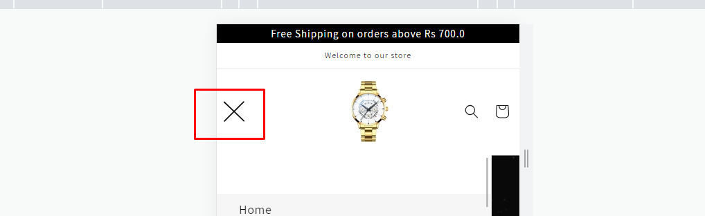
Looks great. How can I apply the same look to the “x” the close the hamburger menu?
1 Like
Hello there,
In your Shopify Admin go to online store > themes > actions > edit code
Find Asset > base.css and paste this at the bottom of the file:
svg.icon.icon-close {
  width: 3rem; /* Adjust the width as needed */
  height: 3rem; /* Adjust the height as needed */
}
bob891
September 26, 2023, 7:06am
6
Can I limit these changes to the desktop version?
1 Like
Hello @bob891 ,
In your Shopify Admin go to online store > themes > actions > edit code
Find Asset > base.css and paste this at the bottom of the file:
@media screen and (min-width: 769px){
svg.icon.icon-hamburger {
width: 3rem; /* Adjust the width as needed */
height: 3rem; /* Adjust the height as needed */
}
svg.icon.icon-close {
width: 3rem; /* Adjust the width as needed */
height: 3rem; /* Adjust the height as needed */
}
}
bob891
September 26, 2023, 6:29pm
8
Hi,
This seems to be affecting their desktop version as well. I had the icons as bigger and after pasting this code in, they become smaller on desktop.
bob891
September 26, 2023, 6:32pm
9
My menu is invisible up on mobile, but if I tap the upper right hand corner, it activates.