Low conversation rate

Hi All

I recently launched my shopify store - CASER LONDON, about 2 months ago. The traffic has been growing steadily which is about 100 sessions per day, I think it’s pretty decent considering it’s a new store.

However, my conversation rate is quite low, I know partially is because my product price is on a higher end. That said, I was wondering if there is anything else I could do to improve conversation rate? Any feedback or comments are appreciated!

Thanks

Jun

Hey,

I have a question and a suggestion:

Question: The traffic you get - do people stay on the site, do they go to the product pages?

Suggestion: Offer products for purchase (Add to cart) directly from the home page.

they do go to product pages, thanks for the suggestion, anything else do you think I could do?

Hi @junwang08

Thanks for reaching out to the Shopify Community! I’m Donna from MooseDesk , your go-to Live Chat, WhatsApp and FAQ App

(Happy to see you’re customer of Moose)

I happened to come across your post and wanted to share some thoughts on your store UX as a UX enthusiast. Hopefully my recommendations can provide some better customer experience advices, please kindly check :heart_eyes:

  1. Homepage revamp

Some ideas to improve your homepage:

  • The hero section lacks a clear call-to-action – consider adding a prominent “Shop Now” button with hover effects
  • Navigation categories could benefit from dropdown previews showing subcategories or featured products
  • Add social proof elements (e.g., “As seen in Vogue” or customer testimonials) to build immediate trust
  • Implement a personalized “Recently Viewed” section for returning visitors to improve continuity
  • The newsletter signup at the bottom needs more compelling value proposition (e.g., “Get 10% off your first order”)

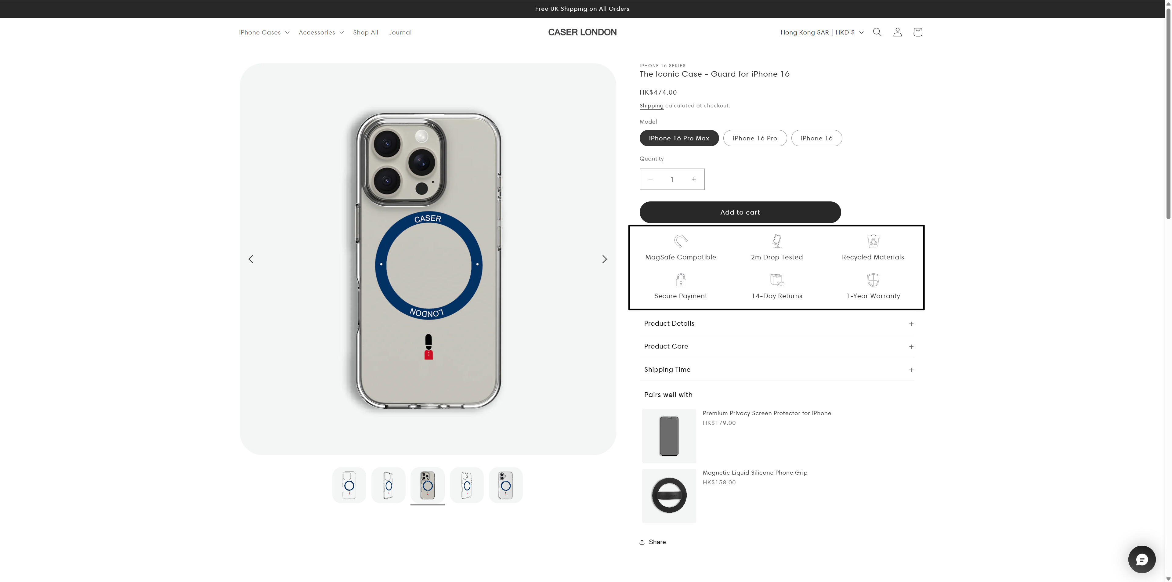
2. Highlight ATC button

To optimize your call-to-action (CTA) buttons for maximum effectiveness, it’s crucial to use bright and striking colors that contrast well with your text. White and black are reliable choices for text visibility. Popular CTA button colors include blue, yellow, orange, and black, but the key is to select hues that align with your brand.

Here is an example of the CTA button that does not look good as it lacks the background color to be more visually appealing.

3. Optimize a live chat support

It’s wonderful that you’re using MooseDesk, dear customer. We hope that MooseDesk will be your trusted companion in enhancing your customer support progress.

By the way, I noticed that the “Chat with us” field seems to be left blank, which could cause some confusion for your customers.

To fix this issue, please follow these steps:

  • Go to the Chat Widget
  • Select the Translation tab
  • Scroll down to Pre-chat Information
  • Then, enter the pretext you want to display in the fields.

If you encounter any issues or need further assistance, don’t hesitate to reach out to MooseDesk support!

—————

As an enthusiast in UX, I recommend implementing these changes to improve customer experience when scrolling through your store.

If this is helpful for you, please let me know by giving me a ‘LIKE’. If your question is answered please mark this as 'SOLUTION’.

Thank you for reading. Wish you a nice day ahead! :face_blowing_a_kiss:

Thanks a lot Donna, I have made some changes based on your suggestion

Hello there @junwang08 Here are a few recommendations I have on how you can make some sales and improve that conversion rate

  1. You should add a section for FAQs on the homepage

  2. A good initiative would be to put in some enticing bundle and discount packages with a time limit maybe a period of one or two months and see how it performs.

  3. You can also add some reviews either from sales you’ve made offline or even from people who you’ve just had test the cases out. This could help convince some customers as long as they are presented in an authentic manner.

I wish you and your store the best of luck!

Hi @junwang08

I think with 100 sessions a day in just two months is awesome for a new store, so you’re definitely off to a great start

The design is sleek and minimalist, which fits your premium iPhone case vibe perfectly, but I’d suggest adding a standout hero banner on the homepage to instantly show off your best sellers or eco-friendly angle, something to hook visitors fast.

Your product copy is clean, but it could use more punch, highlight benefits like “drop-proof style” or “sustainable luxury” to justify the higher price and spark interest. Since your prices are premium, trust signals like customer reviews or a “why choose us” section could ease hesitation and boost conversions. Traffic’s growing, so maybe test a limited-time discount or free shipping offer to nudge those browsers into buyers.

And hey, I do audit store free! Let’s find out the hidden issues blocking your conversion and unlocking hidden opportunities for you store

Hi @junwang08

After checking your website content, please add some borders for the badges on the product page, which will be more attractive and outstanding, a kind reminder here.

Hi @junwang08 ,
Congratulations on the steady traffic growth. A daily hundred sessions is a solid start. Since your products sit at a higher price point, building extra trust and guiding visitors through a clear value journey can lift conversions without discounting too heavily.

Elevate perceived value and trust by:

  • Hero product storytelling: Use lifestyle imagery and detailed copy that focuses on craftsmanship, materials, and the feeling of owning a premium piece. Highlight any heritage or sustainability angles that resonate with luxury buyers.
  • Social proof: Display reviews, user generated photos, or press mentions near the call to action. For new stores, consider a small post purchase incentive to encourage photo reviews quickly.
  • Risk reversals: Offer free shipping above a clear threshold, easy returns, and prominent warranty details. Luxury shoppers often hesitate if policies are hard to find.

Streamline the path to purchase

  • Speed and mobile checks: Run the site through PageSpeed Insights and address any large image files or unused scripts. Even half a second shaved off load time can improve conversion on higher ticket items.
  • Payment flexibility: Enable Shop Pay Installments or another split payment option. Spreading cost across four payments reduces sticker shock without lowering your headline price.
  • Focused navigation: Push best sellers or signature collections to the top. Too many similar choices can create analysis fatigue and reduce add to cart actions.

Capture intent and follow up

  • Email or SMS invite: Offer a style guide, size chart, or private access to new drops in exchange for an email address. A thoughtful lead magnet feels more aligned with a premium brand than a simple discount popup.
  • Abandoned cart and welcome flows: Send a friendly reminder within two hours of abandonment, then a second message the next day with social proof or a limited time perk.
  • Remarketing: Run narrow retargeting ads featuring the exact item the visitor viewed. Luxury buyers often need multiple touchpoints before committing.

Looking for a straightforward way to set up these emails and popups
Retentionly – AI Email Marketing lets you build welcome, abandoned cart, and post purchase sequences in minutes with AI integration that suggests winning content and timing. You only pay for the emails you send, and the team will set up your automations for free, giving you more time to refine copy and imagery while the follow ups run on autopilot.

Hope that helps. For any questions, you can contact us via our live chat, we are always happy to assist.

Cheers,
Retentionly Team
If this answer solved your concern, a like or marking it as solved would help others too.