vishfi
November 14, 2025, 7:38pm
1
Hi!
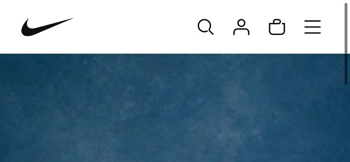
I am looking to move my logo all the way to the left of my mobile site and everything else to the right like the photo attached. I am using Horizon
All codes that I have entered in base.css or theme.liquid that I have found online, only work for the desktop and not my mobile site.
Please help! Thanks!!
Theft of a registered trademark is illegal. Probably wise to create your own, unless you like being sued, fined, and your stuff confiscated….
1 Like
vishfi
November 14, 2025, 7:54pm
3
Sorry, you didn’t understand. My website is www.vishfi.com.br and the Nike image is just an example.
1 Like
OK. Does your code have this first?
@media screen and (max-width: 750px)
Example:
@media (max-width: 767px){
.header-item--left{

max-width: 20px !important;

margin-right: 10px !important;
}
}
vishfi
November 14, 2025, 8:11pm
5
I haven’t made any changes yet; I need step-by-step instructions. Should I add the code you sent to base.css?
vishfi
November 14, 2025, 8:22pm
6
Below is an image of how I wanted to leave it.
suyash1
November 15, 2025, 3:41am
7
@vishfi can you please share your password to view page? if you do not want to public it then you can DM it
1 Like
vishfi
November 15, 2025, 3:50am
8
Hi, how are you? Of course, here’s the password: vshfacessa
suyash1
November 15, 2025, 4:14am
9
@vishfi add this css to the very end of your styles.css file and check, should look like screenshot below
@media screen and (max-width: 749px) {
.header__drawer{grid-area: rightA !important;}
.header__columns .search-action{grid-area: rightA !important; margin-left: 45px !important;}
.header__columns .header-logo { grid-area: leftA !important; }
.header__columns{grid-template-areas: "leftA rightB" !important;    --header-template-columns: 2 !important;}
}
1 Like
vishfi
November 15, 2025, 4:18am
10
I added the base.css file because the style.css file isn’t in the theme. It changed, but now there’s a bug. Take a look at the website.
1 Like
suyash1
November 15, 2025, 4:29am
12
@vishfi please remove entire last css and try this
@media screen and (max-width: 749px) {
.header__drawer{grid-area: rightB !important;}
.header__columns .search-action{grid-area: rightB !important; margin-left: 45px !important;}
.header__columns .header-logo { grid-area: leftA !important; }
#header-component .header__columns{grid-template-areas: "leftA rightB" !important;    --header-template-columns: 2 !important;}
}
1 Like
vishfi
November 15, 2025, 4:36am
13
It seems to work, but I noticed the logo isn’t completely in the corner and the icons are quite far apart. I’d like it to look exactly like in the image. Is that possible? Sorry for asking too much.
suyash1
November 15, 2025, 4:41am
14
@vishfi right now it is adjustment as your theme code structure is not easy to have this like exactly you want, basically all the content is divided into 3 parts and hence it has few limitations. You will have to reform the entire header for mobile view
for logo to be left please remove below line
.header__columns .header-logo { grid-area: leftA !important; }
and replace it with this
.header__columns .header-logo {grid-area: leftA !important; justify-content: left; padding-left: 10px;}
1 Like
tim_1
November 15, 2025, 4:41am
15
Instead of that code, try to paste this into “Custom CSS” of the header section:
@media screen and (max-width: 749px) {
  .header__columns {
    --header-template-columns: 1fr var(--header-mobile-bookend) var(--header-mobile-bookend) var(--header-mobile-bookend) var(--header-mobile-bookend);
    grid-template-areas: "center leftA leftB rightA rightB";
  }

  .header__columns .header-logo {
    justify-content: flex-start;
    padding: 1rem;
  }
}
1 Like
vishfi
November 15, 2025, 4:45am
16
@suyash1 I added the code from @tim_1 and it seems to work better, but the icons on the right are still spaced out. Does the suggestion you mentioned above apply to the code he provided? You can see the changes; I’ve already saved it.
suyash1
November 15, 2025, 4:48am
17
@vishfi yes, the issue is content is divided into various sections and not added in same sections to have uniform spacings. It is theme coding
you will need to add spaces individually for each icon to make it uniform
1 Like
tim_1
November 15, 2025, 4:50am
18
This is default theme spacing.
1 Like
vishfi
November 15, 2025, 4:50am
19
Okay, so where can I find that line to replace it? Is it in base.css?
suyash1
November 15, 2025, 4:51am
20
@vishfi yes, spacing for each icon can be adjusted by adding custom css to base.css
1 Like