Need some honest feedback on my store design šŸ™

Hey everyone,
I’ve been working on my Shopify store Rolaxi. It’s about futuristic/luxury tech gadgets (like diffusers, lamps, smart home stuff). I’ve tried to keep the design clean and user-friendly, but I’m not sure if I’m missing anything important.

I’d really appreciate if you could take a quick look and share your thoughts on:

-The overall design/branding (does it look trustworthy and premium?)

-Homepage flow (does it guide you well?)

-Product page setup (info, images, conversion feel)

Here’s my store: https://rolaxi.shop/

Any advice would mean a lot. Thanks in advance for your time :raising_hands:

1 Like

I just did a simple Google Lens search on one of your products, and there seems to be a huge price difference that I doubt any serious buyer would overlook. Your site has it marked down from $65.00 to 43.95 but you are potentially buying it for as little as $5. You said your site is about luxury items, but a $5 diffuser is hardly luxury. This could potentially cause you to lose credibility. Again, very little browsing, but you should be aware that things like this are very easily searchable by end users.

1 Like

Thanks for time sir,
But as i said that i am ā€œworkingā€œ on here. i want to know about the web page design that is it good for better convertion? I didn’t edited the product price section, these 40$+ is auto generated. It is definately no that muchšŸ˜…. I will edit very soon.
Without this if there anything else, i am good to know.

Hi @Rolaxi

I checked out your store and here are some quick feedbacks and some suggestions:

Trust Signals Are Missing: There’s no anchor of trust. No certifications, quality badges, secure seals, or shipping assurances. Without them, even strong visuals can fall flat on conversions.

To be honest, the overall design feels a bit too generic. I’d recommend customizing it further to better reflect your brand identity, rather than relying solely on the default theme option

The minimalistic aesthetic has potential but minimal doesn’t mean empty. It currently reads as generic and templated. To break through, you are going to need more character, trust cues, and real product storytelling.

  • Your logo is a little small; make it bigger.
  • You must add contact information to your Contact page, such as an example email, phone number, or store address.

Hi @Rolaxi :waving_hand:

I had a look at your store, it’s clean and simple which is a good start. Here are a few ideas that might help you take it further:

1. Brand vibe

- The store says ā€œluxury gadget,ā€ but the feeling on-site doesn’t fully match yet. It feels a bit too safe and looks similar to a regular gadget shop.

- Minimal design works, but adding strong anchor points (like sharper headline, standout product highlights…) will help visitors feel the premium touch.

- Think of how high-end gadget brands usually use lifestyle photos, dark/light contrast, and elegant fonts to tell their story → that’s what pulls people into the vibe.

2. Trust signals

- Right now, it’s missing some basic sections: payment icons, business info and a clear footer with About/Contact/Policies… These small details instantly make customers feel safer.

- You could also consider adding guarantees to reassure buyers.

3. CTA (Call-to-Action)

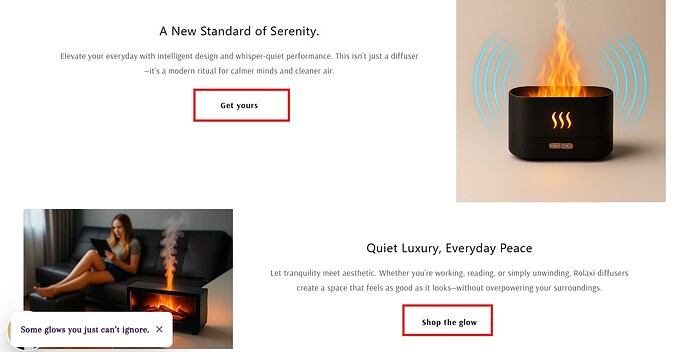
- Buttons like ā€œGet yoursā€ or ā€œShop the glowā€ are too soft and blend into the background. Shoppers may scroll past without realizing they’re clickable.

- Try using a stronger color contrast and clearer text so they stand out as real action points. This small change can lift conversions a lot.

4. Content & SEO

- Starting a simple blog is a smart move. Sharing about ā€œsmart living,ā€ product use tips, or lifestyle around your gadgets can bring organic traffic from Google.

- It also makes your brand feel more knowledgeable and connected to the customer’s daily life.

5. Inspiration

If you check other online gadget stores in the premium space, you’ll notice some common things: consistent brand colors, strong homepage flow (Hero → Value → Products → Social Proof → CTA) and product pages that mix lifestyle visuals with trust elements.

For inspiration, you can explore collections at here or here.

Hope this helps! Let me know if you have any further questions.


WizzCommerce

Explore our top-rated Shopify solutions:

BOGO+ Free Gift & Buy X Get Y | Snap Bundle Volume Discounts | Snap Cart Drawer Progress Bar | and more
1 Like

Hi @Rolaxi

I just checked your store pages and based on the experience I got from other stores, I find out one thing which may affect your store SEO. It is better to take a look on your side and optimize it properly.

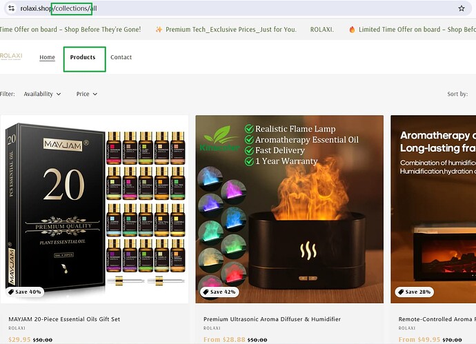
I firstly thought you have no Collection page when firstly accessing your store, but after clicking Product menu on navigation bar, I realize that it is the Collection page. However, it displays very differently if you compare the page title with page URL. From the perspective of SEO, we usually suggest merchants to unite the page content with page URL, as it is good for indexing by Google and makes page look like structured. You can consider changing the name of Product into Collections on navigation bar, which will sync to page URL contents, and it will not affect your store contents so much. A kind reminder here and I really hope your store can perform better, no matter on customers side or Google end.

Thanks for ur feedbeck sir,
I will upgrade the logo and i have all contact info in the fotter { Contact information – Rolaxi } isn’t it good? Or i have to bring them to contact page.

Thanks for your time and feedbeck sir,
Actually i didn’t notice the page link before that’s why it got mismatch. Thanks a lot for this. Have a good day.

1 Like

Thanks a lot for your precious time.
I have understand all the things u have told about i will try to improve in those sections. I am new at here and always wanted to know ā€œWhat is the missing part of my storeā€œ. Ur guidence helps a lot for finding these. Once again thanks a lot!

1 Like

Both of them is good

Very welcome here @Rolaxi Happy to know you realize it properly. Have a good day also on your end :grin:

Hi Rolaxi, Everyone wants to look at the thing they are purchasing in every direction. You could insert some high-quality close-ups, such as the lighting, finish of the material, or even the appearance of the remote will give the product a feel of a higher quality and reliable. The essentials, such as dimensions, mist time, level noise, and power source would be useful right next to the images. Present this in a tidy format (perhaps with tabs, or bullet points) so that shoppers can peruse it with ease and gain assurance. You are able to employ delicate feels. An urgency creating stock marker such as Only 5 left can be used (assuming it was true). Noticed a review where they said delivery in 7 days, you might mention that on the product page that fast shipping is always appealing to people. Keep the Add to Cart or Buy Now button in full view, ideally above the fold. You can also think about a sticky bar which remains on the screen when scrolling, so that users cannot miss the option to buy when they are into reading. There are phrases such as limited time offer that appear severally on the homepage. This way, it is possible to cut the redundancy without losing urgency, every message is acuter and receives more attention. Such calls to action as the Shop Now or See It Before It Is Gone button are present, yet they can be made to be even more noticeable. In a bolder hue, a little larger, or in a novel way Thanks, These are my simple views

1 Like