LeyDE
1
Hello Dear community.
Im using the focal theme and I want to have the left and right padding of my website only on mobile view to be 0.
What do I need to code exactly?
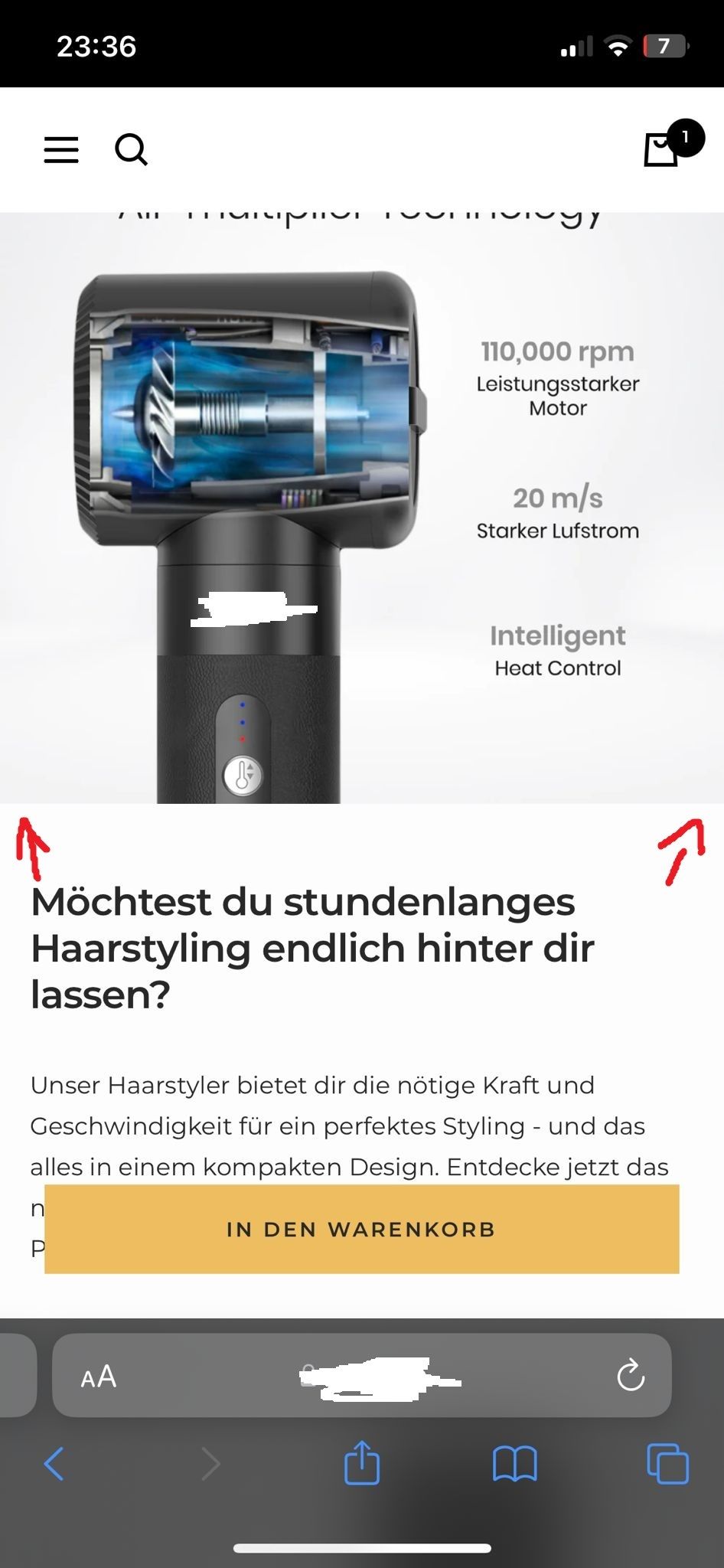
Would be very happy if you could help. I attached an example of how I would like to have it and how it is on my website right now.
https://leyah.de/products/5-in-1-haarstyler
Thanks.
-
Navigate to your theme’s code editor: Online Store → Themes → Edit code → assets → theme.css
-
Add the following CSS code to the bottom of the file:
@media screen and (max-width: 480px) {
  .image-with-text .container {
    padding-left: 0;
    padding-right: 0;
  }

.image-with-text__content-wrapper {
    padding-left: 24px;
    padding-right: 24px;
  }
}
Let me know how it goes!
LeyDE
3
Thanks for the fast reply!
Unfortunately, this method did not work for me. Nothing changed.
Okay, try this:
@media screen and (max-width: 480px) {
  .image-with-text {
    padding-left: 0;
    padding-right: 0;
  }

  .image-with-text .container {
    padding-left: 0;
    padding-right: 0;
  }

.image-with-text__content-wrapper {
    padding-left: 24px;
    padding-right: 24px;
  }
}
If it still doesn’t work, I can send a request to access your theme code and fix it
LeyDE
5
This did not work either!
Okay, I’ve sent a request 
LeyDE
7
I got it now! I just had to paste it in the custom css on the product page.
Thank you Fadi!
Have a nice day!