emjayp
April 24, 2024, 7:02pm
1
Greetings everyone
I am currently using the Prestige theme.
I have edited my footer and my footer menus a certain way and it looks good on desktop view.
Here it is:
However, on mobile it does NOT look like that. Instead, the menus are all stacked up.
Here is the mobile view:
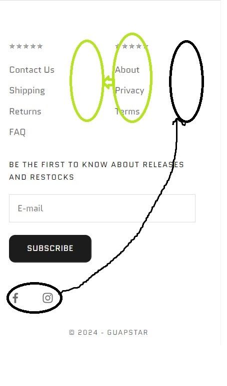
I want the menus to be aligned just like how it is on the Desktop view.
Here is a rough example of what I mean:
What can I do to fix this issue?
The preview link to my store is: https://a0spw3a94zu46nim-58420330671.shopifypreview.com
Thank you and any response would be appreciated!!
*Hi @emjayp *
You can add code by following these steps
Go to Online Store → Theme → Edit code. 2. Open your theme.liquid file
Paste the below code before on theme.liquid
(Other way could be adjusting the div from code for which access to store is required)
Was my reply helpful? Click Like to let me know!
Was your question answered? Mark it as an Accepted Solution and click like.
Hi @emjayp ,
Go to Online Store → Theme → Edit code.
@media only screen and (max-width: 768px) {
.footer__block-list > .footer__block:nth-child(2){
margin-left: 38px;
}

.footer__block-list{
  display: flex;
  flex-wrap: wrap;
}
}
Thanks!
emjayp
April 24, 2024, 8:19pm
4
Hey thanks for response.
This code seems to just nudge the bottom menu (about, privacy, terms) slightly to the right on mobile
emjayp
April 24, 2024, 8:21pm
5
Hello thanks for your response
Unfortunately the code did not change anything. I would share access to the store but I am currently working on a COPY of an updated version of prestige. The current live store is using an outdated version of prestige.
Could you please provide a screenshot when you’ve implemented the code?
Changed the code @emjayp
@media only screen and (max-width: 600px) {
    .footer__block-list {
        display: grid !important;
        grid-template-columns: repeat(2, 1fr) !important;
        gap: 20px;
    }

.footer__block.footer__block--newsletter{
    width: 200% !important;
}
}
Please remove the code you added and replace it with this code.
@media only screen and (max-width: 600px) {
    .footer__block-list {
        display: grid !important;
        grid-template-columns: repeat(2, 1fr) !important;
        gap: 20px;
    }

.footer__block.footer__block--newsletter{
    width: 200% !important;
}
}
1 Like
emjayp
April 24, 2024, 8:50pm
10
AWESOME! Thank you so much
While I have you here, is it okay if I ask one more question?
I want to place the social media icons on the same level as the menus and move the (about,privacy,terms) menu slightly to the left so everything fits neatly. Something like this:
Would that be possible?
Thank you so much again!


