emjayp
1
Hello,
I am currently using the Prestige theme.
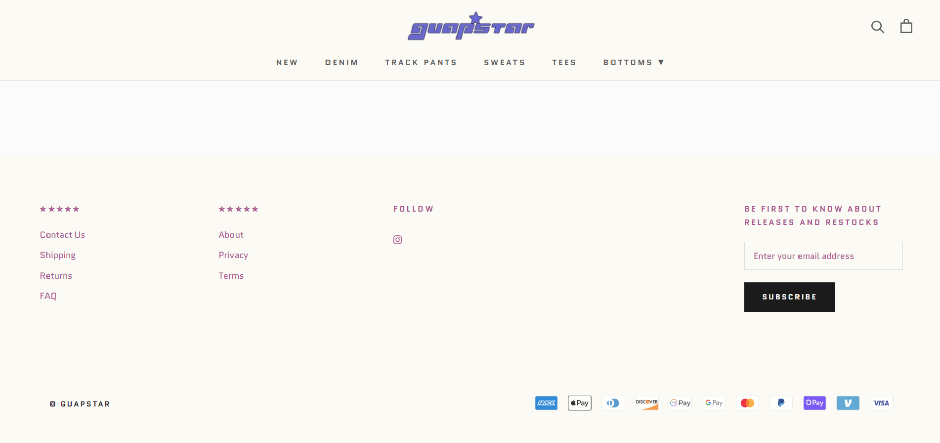
I have edited my footer and my footer menus a certain way and it looks good on desktop view.
Here it is:
However, on mobile it does NOT look like that. Instead, the menus are all stacked up.
Here is the mobile view:
I want the menus to be aligned just like how it is on the Desktop view.
Here is a rough example of what I mean:
What can I do to fix this issue?
If needed, my store is www.guapstar.com
PW is: gstar00 (upper right hand corner)
Any response will be appreciated, Thank you very much!
Hi @emjayp ,
You can follow the instruction below:
- Go to Online Store->Theme->Edit code
- Asset->/theme.css->paste below code at the bottom of the file:
@media (max-width: 640px) {
    #shopify-section-footer .Footer__Inner {
        display: flex;
        flex-wrap: wrap;
    }
    #shopify-section-footer .Footer__Inner .Footer__Block {
        width: 33%;
    }
    #shopify-section-footer .Footer__Inner .Footer__Block:not(.Footer__Block--newsletter) {
        margin-top: 0;
    }
    #shopify-section-footer .Footer__Inner .Footer__Block.Footer__Block--newsletter {
        width: 100%;
    }
}
I hope it would help you.
@media only screen and (max-width: 600px) {
    #shopify-section-footer .Footer__Inner {
        display: flex !Important;
        flex-wrap: wrap!Important;
    }
    #shopify-section-footer .Footer__Inner .Footer__Block {
        width: 33% !Important;
    }
    #shopify-section-footer .Footer__Inner .Footer__Block:not(.Footer__Block--newsletter) {
        margin-top: 0 !Important;
    }
    #shopify-section-footer .Footer__Inner .Footer__Block.Footer__Block--newsletter {
        width: 100% !Important;
    }
}
@emjayp
Kindly follow this steps:
- Navigate to Online Store->Theme->Edit code
- Asset->/theme.css or base.css or theme.scss->paste Above code at the bottom of the file.
- Save it.
This code is not working on my site? Please can you assist.