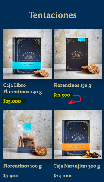
I need to know how to fix the price alignment in the featured collection when one product name is bigger than the other. In my case, I´m having the problem just on mobile but it would be nice to know how to fix it in both cases.
Thanks.
A user encountered misaligned prices in their featured collection when product names varied in length, affecting both mobile and desktop displays.
Issue Details:
Solution Provided:
.card__content .card__information:
display: flexflex-direction: columnjustify-content: space-betweenOutcome:
The CSS fix successfully resolved the alignment issue across all devices. The user confirmed the solution worked perfectly.
I need to know how to fix the price alignment in the featured collection when one product name is bigger than the other. In my case, I´m having the problem just on mobile but it would be nice to know how to fix it in both cases.
Thanks.
Hi @OnlyS
Would you mind to share your store URL? Thanks!
Hi @OnlyS
You can try to add this code to Custom CSS in Online Store > Themes > Customize > Theme settings and check again
@media (max-width: 749px) {
.card__content .card__information {
    display: flex;
    flex-direction: column;
    justify-content: space-between;
}
}
Actually, I can’t, because of my client rights. 
Hi @OnlyS
Please change the cod to this to make it works for both mobile and desktop
.card__content .card__information {
    display: flex;
    flex-direction: column;
    justify-content: space-between;
}
There we go! thanks!!
