Hey everyone,
I am about to launch my new website soon www.zvria.com , so i would like you all to give me a feedback about the design or anything else i can add to make it better overall.
Thanks.
Hey everyone,
I am about to launch my new website soon www.zvria.com , so i would like you all to give me a feedback about the design or anything else i can add to make it better overall.
Thanks.
The hero slideshow should be at the top just below the header, other than that your homepage looks really good!
Hi, I’m Wayne from Akohub. We have been working with many brands to run online stores. After viewing your website, I believe our expertise could add value to your business.
One key element that could significantly enhance customer engagement and retention is a a loyalty is adding a loyalty widget. Implementing a loyalty program is especially effective in niches like accessories because it encourages repeat purchases by rewarding customers for their continued support. you can tailor rewards to different customer segments, offer perks like early access or exclusive discounts, and create a sense of community that resonates deeply with your audience. This strategic addition would make your site more engaging and encourage visitors to keep coming back, ultimately driving sustainable growth.
If you have any questions about setting the loyalty widget or need a free professional consultation, feel free to let us know! We are always willing to help. Don’t forget to like and mark it as a solution if you find this helpful.
@ZvriaOfficial as someone else here said as well… the top slideshow should come after the hero banner.
Moreover, I see you’re using some guides/tutorials on your product pages. It would be better to use youtube videos or instagram/TikTok tutorials embedded there instead as it boosts user trust and conversions by 82%.
Moreover, the vibe and theme is great… but you need to make your product page expressive and self explaining. User should be able to inspect the quality of the product so they can feel confident when buying. This can be done through UGC, and embedding reviews from YT, Insta etc.
Use EmbedAny app for free if you want to try it out.
honestly not bad. don’t overthink site becasue it’s in good shape already. run with ads, organic, content, partnerships and grow the store and traffic.
Great job with the store — the announcement and promotion bars look really nice and the overall design follows a clean, consistent theme.
Just a few suggestions:
Some sections are way too large on desktop. The icons and text could be resized to make it look more balanced. It’s fine on mobile, but a bit much on larger screens — maybe make it more responsive.
Also, in the free shipping and promo bars, make sure the currency updates based on the visitor’s location — it’s important for clarity. For example, in my country I see dollars in product image but 2000/- or 3000/- in the marquee.
Everything else looks great — you’re on the right track! You’ve got a solid foundation—just focus on building trust and clarity step by step. Keep us posted on how it goes. ![]()
I have listed some contents which can be optimized in a better way:
The livechat icon and currency converter icon are overlapped each other.
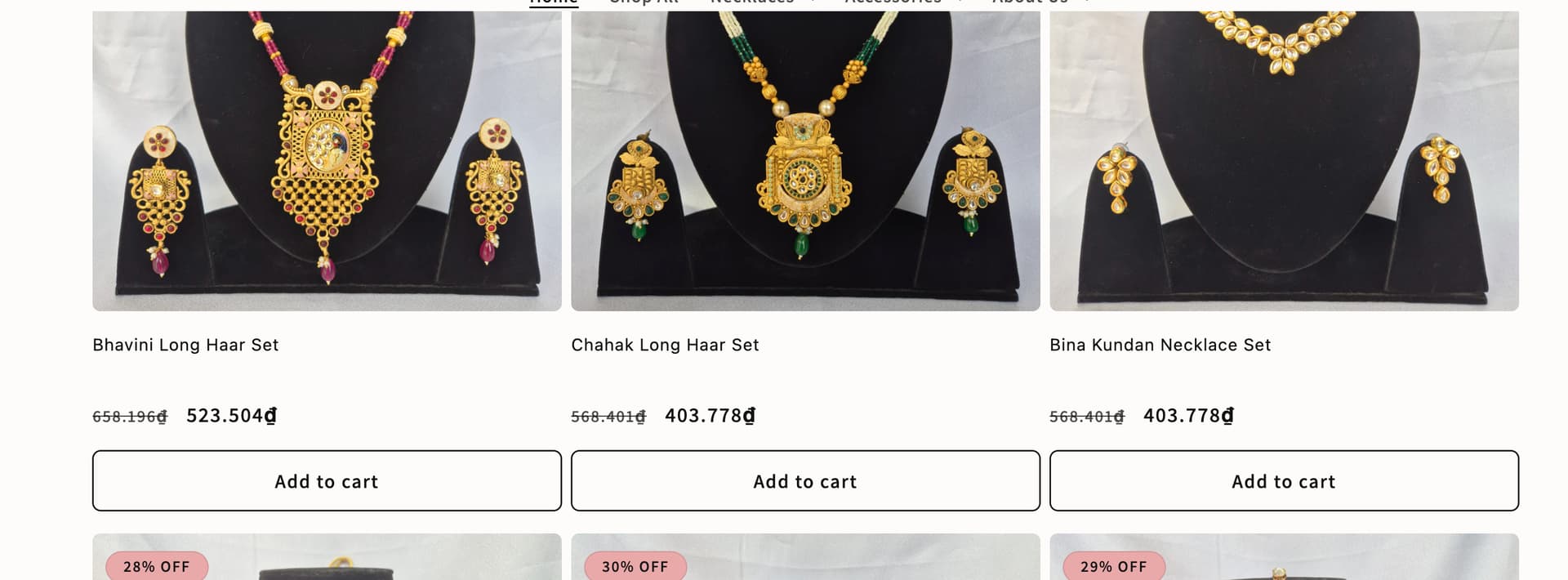
The positions of price and variants seem like not in good orders, you can consider reorganizing them to make them display accordingly.
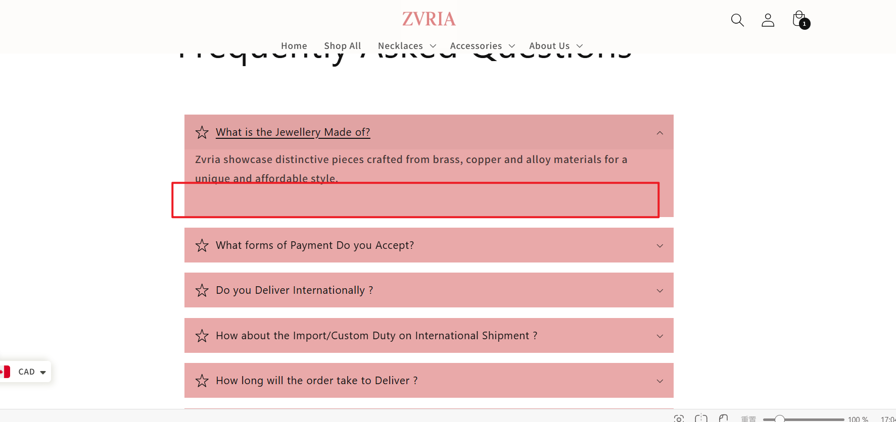
There exist unnecessary blanks in FAQ page, you can remove that to make it more organized.
I checked your site and the design looks solid, but you’re missing one of the easiest wins for jewelry stores: upselling. At the moment every product page leads straight to checkout with no prompts to add related items. Jewelry customers often buy in sets, so if someone picks a necklace you should be showing them matching earrings or rings before they leave the cart.
One simple way to do this is by adding a slide cart that suggests complementary products. That way, instead of just buying one piece, shoppers see a “complete the look” offer while they’re still in shopping mode. Apps like iCart make this pretty easy to set up without coding.
Your store already has a clean look, so adding an upsell flow would help increase average order value without driving more traffic.
Hey, congrats on getting ready to launch your store! That’s always an exciting step, I still remember the hype when I launched mine. That said, it’s important not to rush into a premature launch before your CRO basics are solid. Otherwise you’ll just waste any potential ad spend on a store that isn’t conversion-ready.
I had a look at your site and here’s my feedback: ![]()
General impression – It doesn’t look amateur. You clearly put effort in and it shows. But some of your design choices reveal a lack of CRO fundamentals, especially for mobile-first design, which is where 80–90% of your traffic will be if you’re running Meta or other social ads.
Banner & color choices – The top banner with that dark pinkish background hurts legibility on smaller screens. You always want strong contrast between text and background. Same issue with your second carousel image: pink text on an off-pink background is just hard to read and looks low quality. These choices instantly hurt professionalism and trust.
Hero/carousel images – Overall, the quality is good. They’re sized correctly and look polished. Just fix the color contrast issue mentioned above.
Discount badges – On the “new arrivals” section you’ve slapped big discount banners over your product mockups. That’s redundant (you already show the compare-at price) and it covers the images, making them harder to see on mobile. Remove those badges.
Product naming – Nicely done. Short and punchy, without the rookie SEO-keyword-stuffing mistake I see way too often.
Homepage sections – The “explore the world of fashion jewelry” part uses white text over a light background image. Again, poor legibility. Small thing, but it screams “jank” and lowers perceived quality.
Catalog pages – Consistent image quality, which is great. But on some product pages (e.g. the two-way CZ ring) the images are way too zoomed out. The product takes up maybe 20% of the screen. That looks unprofessional and hurts trust. Zoom in so the product fills the frame.
Reviews – Good that you’re using a review tool. Bad that you’ve left it active on products with zero reviews. That actually hurts trust. In your review app settings, only show the widget once a product has 3–5 reviews minimum.
Cart & checkout – Nice job on using a slide cart and free shipping bar. That’s conversion-positive. But you’re missing upsell opportunities here – bundles, related products, or gamified free shipping thresholds could all increase AOV.
About Us page – Weak. Just text. This is a big missed opportunity, especially for a small jewelry brand. Customers want to connect with the story and the face behind the store. Add pictures, personality, and context.
Email marketing – I don’t see any sign of an email list setup. Huge missed opportunity. For product-based stores like yours, your email list will eventually drive a huge portion of profits. You should be collecting emails and running campaigns from day one.
Overall: Your store looks decent but has too many legibility issues, redundant design choices, and missed fundamentals to be conversion-ready yet. Fix the color contrast, zoom in your product photos, remove redundant sale badges, clean up the About Us, and start building your email list.
If you’re planning to run ads, be very clear about which landing page you’re linking to (collection vs product vs homepage). That matters a lot.
I do specialize in helping product-based Shopify stores like yours, and I have a lot more to say about optimizing product pages, checkout, and ad structure. If you’d like to go deeper, feel free to DM me.![]()
Hi @ZvriaOfficial,
Your website looks very well put together - it’s clear you’ve invested time into making it professional, and the product images are beautiful. The different pages also feel complete and thoughtfully designed, which is a great first impression.
One small thing I’d suggest is adjusting the header on mobile. Right now it takes up a bit too much vertical space, so reducing the top and bottom spacing will help customers see your content faster. Another tweak could be refining the product cards so they appear more compact and uniform - this makes browsing smoother and more visually balanced.
Beyond design, here are a few areas that could help boost sales:
You’ve already built a store that feels premium - with a few adjustments and the right trust + marketing strategies, I believe your conversion rate will grow steadily. Wishing you the very best with your launch! ![]()
I checked out Zvria.com, and I can see you’re positioning it as a stylish jewellery store catering to a wide range of tastes—traditional, kundan, western, and modern styles. The product variety and discount offers already create a strong appeal. To help you sharpen things before or right after launch, here are a few suggestions:
1. Build Trust & Boost Credibility
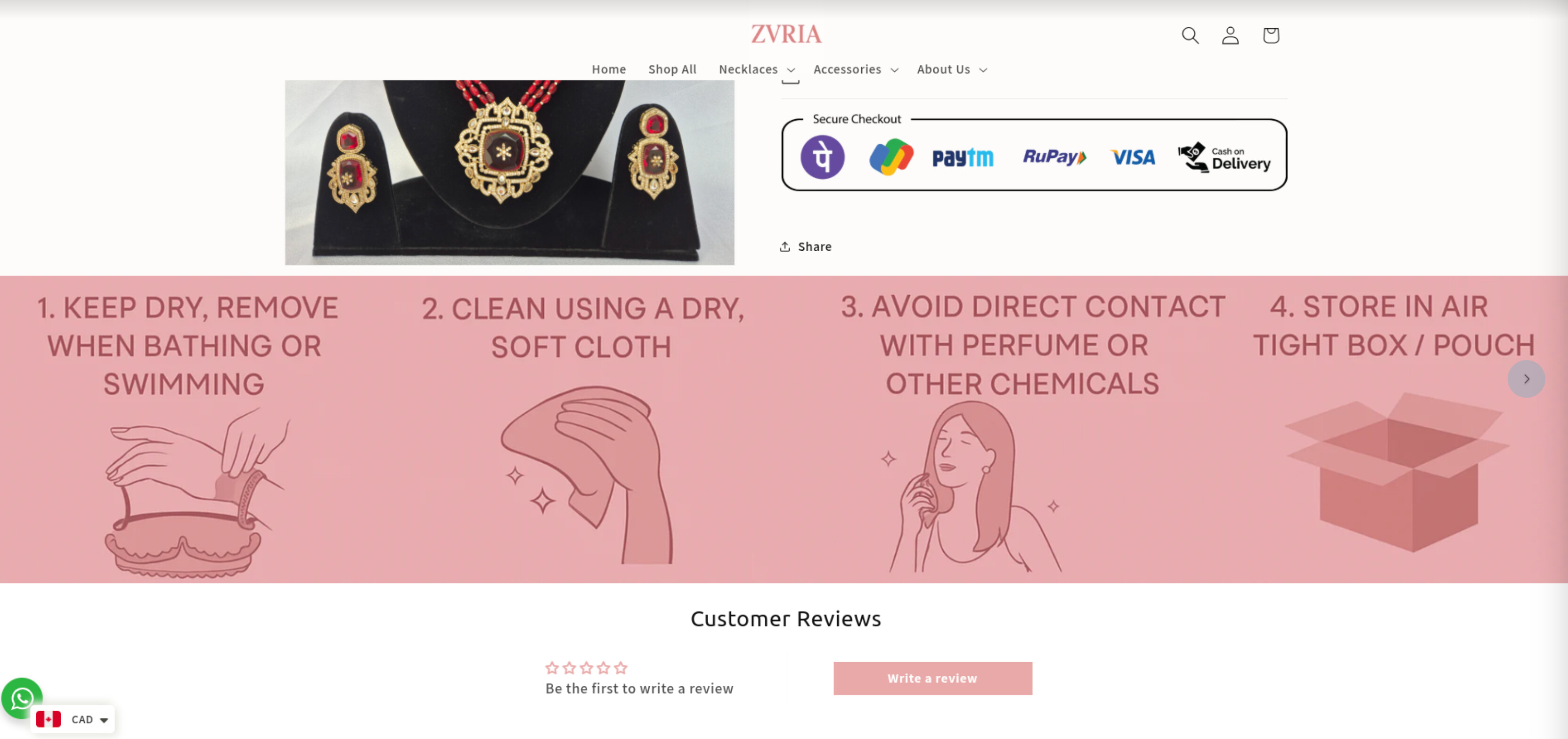
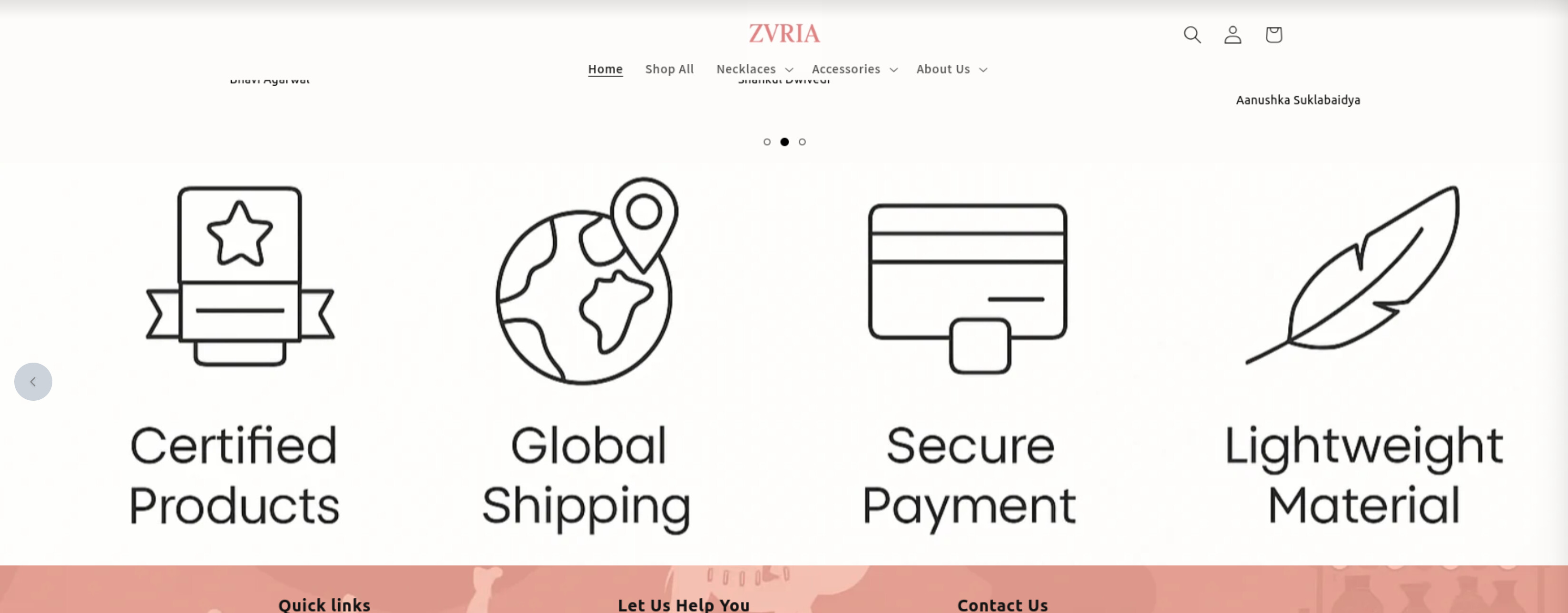
The “Google Verified Brand” tag is a great start. Strengthen it by adding visible trust badges (e.g., “Secure Checkout”, “COD Available”, “Easy Returns”) near your product pages and checkout.
Customers are more likely to purchase when they trust the store. You should add product reviews using a tool like ShopReviews ‑ Product Reviews - ShopReviews - Boost your sales with product reviews | Shopify App Store, which makes collecting and displaying real customer feedback seamless
Your testimonial section (“They Said It, Not Us!”) is nice, but placing reviews directly on product pages with star ratings will increase buyer confidence.
COD + clear return/exchange policies should be emphasized higher on the site.
2. Hero Section & Storytelling
Right now, the homepage jumps into collections/products quickly. Consider adding a hero banner with a tagline like:
“Handcrafted Jewellery for Every Occasion – Free Shipping Above ₹1000”
with a bold Shop Now button.
A short brand story (“Why Zvria?”) or seasonal highlight (e.g., Festive Collection 2025) will make your site feel more personal and engaging.
3. Navigation & Product Discovery
Your menu is broad, which is good, but can feel overwhelming. Simplify by grouping some categories (e.g., “Necklaces & Pendants” instead of two separate).
Add filters for price, material, and “New Arrivals” so visitors can find what they want faster.
Highlight “Bestsellers” or “Trending Now” to guide first-time visitors.
4. Product Pages: Conversion Optimisation
Your product pages show the jewellery clearly, but reviews, material info, and size/weight details should be more prominent.
Add urgency cues like:
“Only 2 left in stock” or “Ships in 2–3 business days” near the Add to Cart button.
Make promotions (e.g., Free Gift on Orders Above ₹2000) highly visible on product pages, not just banners.
5. Consistency & Engagement
Ensure all product photos are equally high-quality and consistent (background, lighting). This strengthens the premium look.
Showcase lifestyle photos (models wearing the jewellery) to help shoppers imagine themselves with the product.
Consider a first-time buyer pop-up (e.g., “Get 10% off your first order”) to nudge new visitors.
If you’re also selling on Etsy, consider using an app like Etsy Integration ‑ ShopList - ShopList - seamless integration between Shopify and Etsy | Shopify App Store . It lets you sync your products and orders between Shopify and Etsy automatically, saving time and helping you manage inventory more efficiently—perfect for handmade or customized products like yours.
Best Regards,
Waytoapps
Congratulations on your upcoming launch of www.zvria.com!
To make your store more appealing and boost sales from the start, here are some key suggestions:
Design & Usability:
Ensure your site has a clean, modern look with intuitive navigation. Make your main call-to-action buttons prominent and easy to find. Consider using thematic visuals that reflect your brand identity consistently.
Product Presentation:
High-quality images and detailed descriptions are essential. Think about adding product bundles or “Complete the Look” sections to help customers easily discover matching or complementary items.
Increase Average Order Value:
Apps like BiDeal Bundle Volume Discounts and BiSell Upsell & Cross Sell can help you showcase bundle discounts and personalized product recommendations on product pages and in the cart, encouraging customers to buy more.
Build Trust:
Display customer reviews, trust badges (secure checkout, money-back guarantees), and clear shipping & return policies. These elements help reassure visitors.
Mobile Optimization:
Make sure your site is fully responsive and easy to use on mobile devices since many shoppers browse and buy from their phones.
SEO & Speed:
Optimize your meta titles, descriptions, and page load times to improve your search rankings and user experience.
I hope these tips help make www.zvria.com a successful launch! Feel free to share your store link for more specific feedback or help with app recommendations.
Hi there @ZvriaOfficial I think your store would look and perform a lot better with some bundles for the products like necklaces and bracelets, etc. The app in my profile would be very helpful in this regard.
Would also be nice to add a few videos on the homepage for aesthetics.
I just wanted to mention that if you’re just launching your website, I don’t know if this data is valid or not, but if it’s just a template, removing it would increase the trust of your users. hope it helps