Seeking feedback on my new store

Hi everyone,

I hope you’re all doing well!

I wanted to tap into the amazing expertise in this community and kindly ask for your feedback on my store: coutureia.com

Fresh eyes and honest feedback from this community would help me refine and improve the store before diving deeper into marketing and optimization.

Thank you in advance! I truly appreciate your time and insight.

3 Likes

Hi @dgorsler

I take some time viewing your store pages and feel the contents. It is a very fashion store. I love the design and the feeling you would like to share with visitors. You must work so hard in the process of website building. Good job!

Apart from these good places, we need to take care of others, what we may miss or ignore on this store. I have collected some of my ideas below, and you can take your time to read and adjust accordingly.

  1. Pay attention to store speed. Your store is indeed beautiful and attractive, but it will be better if visitors can get a fast reaction when viewing your store pages. I have tested your store in Google PageSpeed Insights and the result is not so good. Maybe you can discuss with teammates or developers and find out a better way how to balance the store design elements and page speed together, so that your customers can not only enjoy the beautiful scenes, but also a fast page speed experience to leave a better impression on users and Google end both.


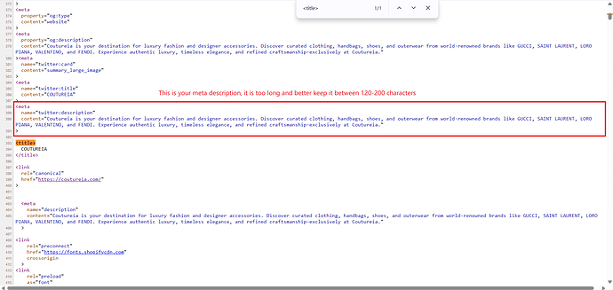
  2. Keep optimizing your store Meta Title and Meta Description. The meta title on your store is too simply, you can add more details like some adjective words to express your brand or store. The length of meta description is too long and excessive, you can shorten it between 120–200 characters and the good thing if you do so is to let meta description display in full when searching on Google.


  3. Missing H1 tag. This is a very crucial issue, as the H1 tag refers to the first and main header on a web page. If you do not have a main header on the store, Google will fail to know your page title correctly and affect the result of indexing. This refers to technical issue and if you would like to fix it properly, please consider seeking help from our APP Support Team by clicking here and we can help check, investigate and fix it permanently.

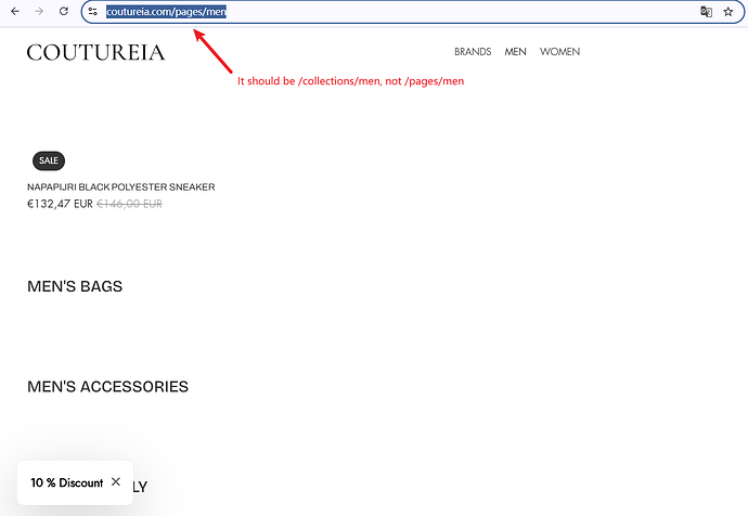
  4. Two categories not showing properly under Men Collection. This is what I find when checking your store pages. It will leave customers an unprofessional impression if they notice this, because you can remove or hide them if you indeed have no such products listed, rather than keep them empty. By the way, the page URL referring to Collection page is incorrect as well. The URL pattern should be https://coutureia.com/collections/men, rather than https://coutureia.com/pages/men. You should fully check the pages on navigation bar and correct URL pattern, as it affects store SEO performance as well very much.


Hi @dgorsler,

I had a look at your store and it’s clear you’ve put a lot of effort into the design - the overall look feels elegant and your collection presentation is on point. That said, I think there are a few areas you could refine to make the experience even stronger.

  • Homepage & layout: Consider simplifying the mega menu so visitors can focus more easily and get a clearer overview. The slideshow could be made more engaging with stronger content - even adding video can bring it to life. Collection titles should be visible immediately, or their effects aligned more consistently with the collection list below. You may also want to reduce the bottom spacing in the footer and streamline the payment and policy lists for a cleaner look. Finally, think about adding a product highlight section, such as a “Best Sellers” block, to guide customer attention.
  • Collection & product pages: At the moment, the collection pages don’t display filters well. Adding or improving filter options would help visitors browse more effectively. Also, investing more in product imagery would make a big difference - some images currently don’t capture as much attention as they could.
  • Trust-building: Don’t forget to include clear policies (shipping, returns, guarantees) and highlight customer experiences. These little signals go a long way in helping new customers feel confident.
  • SEO & performance: Make sure your site loads quickly and your content is optimized so people searching for your niche can find you more easily.
  • Marketing: Beyond ads, think about leveraging affiliate and referral channels - working with KOLs, micro-influencers, or even happy customers can amplify your reach. A tool like UpPromote can help manage this naturally in the background.

Overall, you’re off to a great start. With a few adjustments, I believe your store can feel even more polished and ready to convert. Wishing you the best as you continue building! :blush:

Hi everyone,

I just wanted to take a moment to say a big thank you to those of you who took the time to review my store so far. Your feedback has been incredibly valuable and motivating as I continue to improve.

It means a lot to have support from this community, especially in the early stages. I’m learning more every day, and your insights are helping guide that journey.

If you’re open to it, I’d love to stay connected and maybe return the favor one day!

Thanks again,
Daniel

1 Like

Hey @dgorsler

There’s some nice visuals and a good layout to give it more of a premium feel. One thing I would recommend doing is making your product pages as comprehensive as humanly possible, since that definitely helps with trust and conversion. You should also consider establishing social proof, reviews, or even a small affiliate setup in place at the beginning, through a tool like UpPromote, so others can help spread the word and credibility of your brand. You’re doing great!

Best,
Moeed

i would definitely say that your store design is flawless and one of the best i have seen. it gives a premium vibe and definitely catches attention.

although, several areas where you can further improvements include:

  1. these headers can be more benefit oriented. for example, ‘Get 10% off on your first order.’ that way, customers will be more inclined to click on them.

  1. in some banners, i found that the text overlaps with the image in the background. maybe a slight overlay can help improve readability and clarity. case in point, check the jewelry one below.

  1. i also went through your product pages. i felt they could be more detailed and well designed just like your home page. try adding more graphics (embedded with text) to give more context to your customers. add detailed product descriptions and also share its key features and benefits (or as they say product highlights) using pointers.
  2. at several places, i found the same CTA ‘Shop now’. Try and go with variations to break the monotony.

beyond that your store looks amazing! great work and hope you find these suggestions valuable.

Hey @dgorsler,

I took a look at your store, and I can see you’ve put in a lot of work. The layout and design are clean, but there are a few areas you can focus on to help improve your store’s performance and boost conversions.

First, your SEO definitely needs some attention. Basic SEO elements like meta titles and descriptions aren’t properly optimized, which means your store might not be getting as much organic traffic as it could. Updating these with relevant keywords and clear descriptions will help search engines understand what your store is about and improve visibility.

You’ve got a great range of products, from men and women’s clothing to jewelry, but there’s no upselling or cross-selling happening. For instance, if someone adds a dress to their cart, you could suggest matching accessories or shoes. This helps increase average order value and offers more value to your customers.

Another thing is your cart experience. It’s not optimized to guide users smoothly through the checkout process. Adding features like a progress bar or even a sticky add-to-cart button would help customers feel more engaged and less likely to abandon their carts. Product bundling is another great option, especially for clothing and jewelry. Offering related products as a bundle at a slight discount can encourage people to buy more.

Instead of installing separate apps for cart optimization, upselling, and product bundles, I recommend using an all-in-one solution like iCart. It allows you to manage upselling, cross-selling, progress bars, and more, all in one place, which is a smarter way to save time and avoid burning your budget on multiple apps.

Overall, with some improvements in SEO, cart optimization, and upselling strategies, your store will be much more equipped for conversions. Hope this helps, and best of luck as you move forward!

Thanks for the detailed tips! I’m new to SEO—can someone explain what the H1 tag is and how I can check if my Shopify store has one?

I had a look at your store, and in its current state you may get a few sales, but not at a level that will ever be sustainable. The overall design has a clear amateur feel with many beginner mistakes that show most strongly on mobile. If I had to guess, you are likely designing everything in the Shopify desktop editor and not checking how it looks on mobile, which is a critical mistake since 80 to 90 percent of your traffic will come from mobile shoppers.

Hero banner and homepage

  • The banner images themselves are decent quality, but the thin white text you placed over varied background colors makes the text almost unreadable. This looks amateur and kills trust instantly. You need stronger contrast, either by adding a stroke, shadow, or fading the background.

  • The homepage is cluttered with multiple pop-ups: a discount code, a “welcome” banner, and more. Covering so much mobile screen space leaves a bad first impression and feels like cheap Temu/AliExpress tactics, which doesn’t fit your luxury niche.

  • The rotating brand-name ticker is far too fast and disorienting. It looks like you haven’t tested the site yourself.

  • In luxury clothing and jewelry, customers are much less forgiving of design flaws. Every element needs to feel polished, otherwise trust is gone immediately.

Collection pages

  • You are showing sale information twice (a badge and a compare-at price). This is redundant, eats up mobile space, and looks amateur.

  • Product titles are long keyword-stuffed phrases that resemble Etsy or AliExpress listings. This might work on Etsy but it looks cheap and untrustworthy on Shopify. Customers in your niche expect clean, simple product names.

Product pages

  • Many of your product galleries repeat the same image two or three times, which makes it look like you didn’t check your own uploads. This lowers trust immediately.

  • You have reviews turned on even for products that don’t have any reviews. This does the opposite of what you want and highlights the lack of social proof. Turn the widget off unless you have at least three to five reviews.

  • The way you’ve done your descriptions is good: short, truncated text with bullet points. Keep that approach.

Cart and checkout

  • Your add to cart behavior reloads the entire page and pushes the customer to the cart. This is outdated and causes friction. The statistically best choice is the slide-out cart since it lets customers keep browsing, shows upsells, and supports a free shipping progress bar to increase AOV.

Overall
Right now your store simply does not pass the believability test for customers in your niche. Poor text legibility, excessive pop-ups, janky banners, repeated images, and unpolished product titles all combine to create a low-trust experience. Until these issues are fixed, running ads will just waste your budget because the store is not conversion-ready.

If you want more in-depth feedback on how to restructure your pages and create a proper checkout flow, feel free to DM me.

Hello, dgorsler, i checked out your store, your products look great. One quick tip: you might want to work on your product descriptions and add reviews. That alone can boost trust a lot. I struggled with the same thing when i launched my store, so I get

Hi @dgorsler

I browsed Coutureia, and I can tell you’re positioning it as a high-end, luxury fashion destination. The curated designer collections, clear navigation menus, and authentic brand names create an elite feel right off the bat. That’s a fantastic foundation. To help you sharpen things before going deeper into marketing, here are a few ideas:

1. Build Immediate Trust & Modern Credibility
The site looks premium, but sellers don’t always equate to authenticity in the eyes of new visitors. Since you rely on big fashion names, consider adding a visible “Authenticity Guarantee” badge or trusted third-party seals (e.g., Shop Pay or VeriSafe) close to product pages or hero banners.
I didn’t see customer reviews yet. Even a few reviews per style—especially around fit, material quality, or shipping—can reassure hesitant buyers.

Customers are more likely to purchase when they trust the store. You should add product reviews using a tool like ShopReviews ‑ Product Reviews - ShopReviews - Boost your sales with product reviews | Shopify App Store, which makes collecting and displaying real customer feedback seamless

2. Hero Layout & Storytelling
The tagline “ICONIC LOOKS START HERE” is strong, but a more specific hero banner could perform better: something like “Luxury Designer Styles for the Modern Wardrobe” paired with a “Shop Women” or “Shop Men” button would help anchor visitors immediately.
Right now, the homepage jumps into product navigation. A short intro or seasonal highlight (e.g. New Autumn Collection) near the top could create a more polished first impression.

3. Product Navigation & Discovery
Your menu covers a lot of categories, which is comprehensive—but it can feel overwhelming. Simplifying by combining similar categories (like “Clothing & Outerwear”) or adding a “Trending Now” or “Featured Brands” section might help guide visitors.
Consider adding filters for elements like price range or “New Arrivals” to help visitors quickly narrow down the catalog.

4. Product Pages: Clarity & Readability
The product pages are informative—they include brand story, fabric, pricing, and authenticity. But there are zero customer reviews and no way for users to ask questions—adding even a FAQ snippet or review section will help build trust.
Emphasize your USP with phrases like “Authenticity Guaranteed” or “Free Standard Shipping”, which are briefly mentioned but could be pulled up with clearer emphasis and contrast.

5. Consistency & Conversion Nudges
The “Over 7,000 Styles” line is impressive but slightly jarring if you have fewer—making sure your claimed inventory feels aligned with what’s visible builds clarity.
Grab visitor attention with limited-time highlights (“Just 3 left!”) or expedited shipping prompts (“Deliver in 1–3 business days with Express”) placed near CTAs.

If you’re also selling on Etsy, consider using an app like Etsy Integration ‑ ShopList - ShopList - seamless integration between Shopify and Etsy | Shopify App Store . It lets you sync your products and orders between Shopify and Etsy automatically, saving time and helping you manage inventory more efficiently—perfect for handmade or customized products like yours.

Best Regards,

Waytoapps

Hi @remakeraipro

In short, H1 tag refers to main title on a web page, and it is very important to exist, because it will be helpful to improve search results and let customers better know the page content as well as main topic.

There is a quicker way to self-check if H1 tag exists on your Shopify store, which is to use quick-key Ctrl+U to enable source code page and then search with:

<h1 or <h1>

If H1 tag exists, you can find one result after searching. But if you search out more than one H1 tag, that is not a good sign, and it means you have duplicated H1 tag, which will be bad for store SEO.

For instance, in this store https://coutureia.com/ I can search out one H1 tag result with keyword

<h1

in source code page, and it is under normal status.

I see you received a lot of technical improvements feedback already, so let me add some simple feedback regarding design.

  • Make your logo more clear in the header.
  • The logo positioning in the footer looks weird, perhaps make it slightly smaller and think about how to position and improve spacing.
  • Love the brand section in the header, very nice way to browse brands, especially if there are many.
  • The navigation bar is very organized with brands, men, women, but maybe try add more collections. It looks very empty. Add collections such as ‘new arrivals’ ‘sale’ or highlight trending collections.

Hi @Donahue your store does look really neat and well thought out. I love how so many categories were displayed, the amount of high-quality images, and the fact that you added a short video on the homepage (which is something I always suggest for store owners here). The only thing I would say was missing from first glance was the lack of customer reviews/testimonials which are very important for fashion based stores. I think once you can add a few authentic ones, your store pretty much goes to a 10/10.

Hi Daniel @dgorsler!

I have identified three key strengths and three key weaknesses of your store. I hope this will provide you with a clearer understanding of where your store stands.

Strengths

  1. The website looks polished and professional with clear product photos and detailed descriptions.

  2. It offers a wide range of luxury brands at discounted prices, which can be attractive for shoppers.

  3. The site runs on Shopify, a reliable platform, so checkout and payments are more secure than on a random custom site.

Weaknesses

  1. Adding genuine customer reviews, including photos from buyers, would build more trust and help new visitors feel confident about purchasing.

  2. Offering clear explanations for the large discounts, such as sourcing details or outlet partnerships, would reduce doubts about authenticity.

  3. Making the return and authenticity guarantee policies more transparent, with step-by-step instructions and clear terms, would reassure customers that their purchases are protected.

I believe that addressing these issues will greatly improve your store’s performance. Wishing you the very best with your business, and praying that you find success soon.

Regards,
Mustak @EmbedAny

Hi @dgorsler

Congrats on your store launch! For refining and improving your store coutureia.com before diving into marketing and optimization, here are some key suggestions:

  • Consider integrating bundle discounts and upsell offers to encourage customers to increase their order value. Tools like BiDeal Bundle Volume Discounts and BiSell Upsell & Cross Sell apps are excellent choices here. They offer easy setup for product bundles, volume discounts, and personalized product recommendations that can boost sales and average order size.

  • Make sure your product pages clearly communicate value with high-quality images, detailed descriptions, and social proof like customer reviews.

  • Enhance trust by displaying secure payment badges, clear shipping and return policies, and easy navigation.

  • Use optimized meta titles and descriptions as well as internal linking to improve your SEO and organic traffic.

  • Consider adding a blog or resource section around your niche to attract and engage visitors.

Starting with these improvements combined with targeted marketing efforts should help boost your store’s performance and customer experience.

Wishing you great success with your store! Feel free to reach out if you want any tailored tips or app recommendations.

@dgorsler

Hi team,

I’ve reviewed your store, and overall, the design looks great. The page structure is well-organized, making it easy to navigate products through the header menu as well as the collection pages.

In addition, the page load speed is quite good, even with many products, and does not negatively affect the customer’s shopping experience. You can also use the Google PageSpeed Insights tool to check your site speed and identify specific factors to optimize further.

That said, there are a few areas you could improve:

1/ Meta description for collections
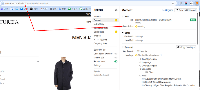
I checked one of your collection pages and noticed it’s missing a meta description. Since meta descriptions often appear on Google Search results, leaving them blank isn’t ideal.

  • To edit meta tags for a collection:
    Go to Shopify Admin > Products > Collections > Select the collection > Scroll down to “Search engine listing”. There, you can edit and add a meta description.
  • Tip: keep it under 160 characters, otherwise it will be truncated in Google search results.

2/ Product reviews on collection pages
Your collection pages look a bit plain without reviews. You might consider sending emails to customers encouraging them to leave feedback. For products with reviews, it’s best to display rating stars directly on the collection page to build trust.

If you have too many products but only a few reviews, I recommend creating a dedicated Review Page that includes all product reviews in one place on your storefront. Be sure to place it somewhere visible and easy to access (e.g., sidebar, floating button, etc.).

I hope my feedback is helpful to you. Thank you!

Best,
Lydia - AOVai Support Team